Tech Challenge for Lenders – UMDP Data Standardization to Aid Closing

UMDP Data Standardization

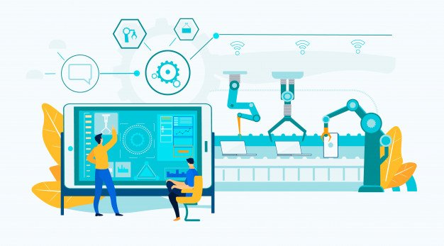
The mortgage industry overhauled its processes and technologies with the TILA/RESPA Integrated Disclosure (TRID) Act rolling out. Technology initiatives that created competitiveness between banks soon became the norm. Compliance needed to move north. Now, automation has made paperless mortgage a reality with loan origination software, retail point of sale, customer-direct solutions, and electronic documents providing complete end-to-end support. Regulations are constantly changing and lenders, still in their TRID hangover, need to do more.

What is UMDP?

In the pre-recession era (before 2008), borrower and loan information was sourced and stored by different agencies. Siloed information hindered different players from accessing true data and it was usually shared by email. This resulted in errors and insufficient access to data in the banking system.

Uniform Mortgage Data Program (UMDP) is the last leg to the realization of the electronic mortgage. Just as TRID brought in enhanced data quality in the origination, UMDP will improve data standards in closing disclosures and data interpretation. Government-sponsored enterprises (GSEs) have indicated, come 2017, they will refuse to buy loans that fail to conform to the Uniform Closing Dataset (UCD) standard.

The Federal Housing Finance Agency (FHFA) is directing government-sponsored agencies (GSEs) to create a common approach, protocol, and data set for mortgage data. The common data set, which is understood by all, will improve data accuracy. Definition ambiguities of loans purchasable by GSEs can be avoided. The lenders can capture granular data of a particular standard.

  • The Uniform Collateral Data Portal (UCDP) will be one electronic portal through which all lenders can submit appraisal data.
  • The Uniform Appraisal Dataset (UAD)will provide common definitions and requirements of appraisal data.
  • The Uniform Mortgage Servicing Dataset (UMSD) will define the data set with standardized definitions, formats, and values.
  • The Uniform Closing Dataset (UCD) will provide standard data for the closing disclosure form.

UMDP may have bestowed the entire industry with mortgage data becoming uniform and accurate, but the upgrades rigmarole still worry lenders. However, GSEs have chosen to be capable of verifying underwriting data and audit data anytime. Customer preference lies with a seamless closing process and the impetus for lenders will be to transition into e-mortgage.

Fannie and Freddie have already announced that they will purchase loans if the appraisals were submitted electronically and met the UAD standard. Technology vendors are already ensuring that their solutions transform appraisal information into data compliant with the Mortgage Industry Standards Maintenance Organization (MISMO).

Manual processes are slowly fading and lenders are going to cloud-based mortgage origination and servicing software. The entire process needs to be seamless to ensure compliance from origination to closing. Today, the challenge for loan origination software is compliance, but tomorrow the focus will be imminently on collaboration. It will be important to have data which can be shared and understood by all. Standardization helps loan originators and customers to access data from diverse sources and interpret them effectively.

Data standardization is the key driver for e-mortgage and paperless origination and closing. UMDP will be the “new normal” and help the industry to standardize their processes for better visibility and faith in the system.

Preethi vagadia is a business architect worked in Mortgage and Finance software department with top notch companies and has over 8 years of experience in Mortgage Lending Technology,Mortgage Technology software, mortgage management software, etc.  She has also worked on several process improvement projects involving multi-national teams for global customers in warranty management and mortgage.

Lucia Patterson is the woman behind TheLegalGuides, a blog solely focused on legal guides, tips, and advice. Lucia loves essay writing and blogs at EssayWritingGuides from her college days.

View all posts

Leave a Reply

Your email address will not be published. Required fields are marked *

Related

Company Website

How to Design an Effective Company Website

A website for your business gives you a lot of benefits. It makes information dissemination a breeze, allows potential customers to find you easily, provides your brand with an excellent professional image, gives you brand visibility and credibility, provides a way to showcase your work or market your product and services, and best of all, it saves you money in the long run. That’s why a company website should be well-designed.It must be able to provide a great experience to your customers when they visit. Whether they use their computer, tablet or mobile phone, they should be able to access your website and use it without a problem. Most important of all, it must be able to serve and respond to your customer’s needs. Whether they want to check your price list, find a product, browse through your new collection, or ask you a question, your website must be able to provide what they are looking for quickly.But, to be able to serve your customers well, you must know what elements are essential to a company website. Here are the things you should put on your site: Customer testimonials: Nothing beats hearing satisfactory remarks and praise from your customers. You shouldn’t just keep this to yourself. You should let these be part of your website, and you can do this by crafting a customer testimonial page.Having customer testimonials gives your business more credibility since these reviews are unbiased. Furthermore, customer testimonials are free marketing, so you can have a broader reach and attract many potential clients in the future. About page: An about page is crucial since it shows your brand identity. It will make you appear more credible and authentic to your customers. It also allows visitors of your website to know more about you and your company. Especially if it is the visitor’s first time to enter your site, most probably, he or she will first click on the about page to learn more about your business first before anything else. Contact us page: Of course, you cannot forget to put your contact details. This is critical information your customers need should any of them want to reach you to address their concerns or queries.  Having a contact page will also make your business look good since it means you are readily available to attend to your customers’ needs anytime. List of products and services: You should enumerate all your products and services on your website so that visitors of your site are well-informed of the product details and specifications including the benefits they’ll get with the product. Blog: A blog gives you a way to make yourself a thought leader in the industry. Writing informative articles that offer tips or advice to customers who visit your website will make you look credible. It means more people will trust your company and it will boost your sales.These are the essential elements you should put on your website. If you are unsure how to integrate these into your site, you should ask an expert in website design in Oxford to show you how to do it.Read Also:What Can I Do To Make My Company Website More Profitable And Powerful? How To Use Video Animation On Your Website

READ MOREDetails
mobile website

What Makes a Good Mobile Website

People are tethered to their phones even when they are not using it. When they are not doing anything, they remain close to their phones to hear any notification ringtone.More importantly, they use their phones to access websites, shop, watch YouTube, log on to Facebook or Instagram, or search on Google. By the end of 2019, the number of mobile Internet users would have grown to 4.68 billion.A mobile UX designer optimizes your website making use of the best practices for mobile users. If your website is not yet optimized, you need to do it right away.It’s projected that by 2021, 73% of all eCommerce activities will come from mobile users. Right now, China alone has 98% penetration rate in terms of mobile Internet. What Can a Mobile UX Designer Do for You? To answer that, you must first know what makes a good website. Google has attempted to answer this question by listing the following elements:Make the navigation easy for the user. Call to actions should take a prominent position The users can call customer service directly from the website Menus should be clear and concise Visitors tap the logo when they go back to the home page The local search box should be visible at first glance Add filters to narrow down the search, particularly for eCommerce sites In the same vein, the site should yield relevant results in response to site query Avoid site registration before users can explore your website Users can make a purchase even without registering to your site Quick sharing to social networks Quick links so they can email themselves and finish the task on other devices The website should be optimized for mobile, which means fonts are larger and the images are expandableWhat Can You Expect from a Mobile UX Designer? A mobile UX designer will make sure that people will have a positive user experience when they access your website through mobile devices.A good designer will:Conduct UX research to understand users’ needs and behaviors Cut out the clutter for easier navigation. The navigation should be intuitive Properly use colors, graphics, font, and negative space to highlight key content and promote activity Test your mobile website for optimum experience and functionality Make sure your website is stable for mobile use Insist on the consistency of themes and design across devices Ensure that important elements measure 18mm so they can be easy to tapFinally, the mobile UX designer should ensure that your website loads fast. According to Google, most mobile websites load at an average of 15 seconds.That won’t do. The same Google research warned that customers almost always leave when it takes more than 10 seconds for the mobile landing page to load. Even if the website loads for 1-3 seconds, the bounce rate will increase to 32%.The mobile app services of Sunlight Media include a dedicated mobile UX designer who will check and test the architecture and workflow of your app. They will work with you to achieve your goals and ensure the app will adhere to your style guide. Head to their website now or contact them at 323-868-3581.Read Also:Winning Tactics To Build A Competitive Service Delivery Website Top Utility Tools You Need For Your Website How To Design An Effective Company Website

READ MOREDetails
Infographic

10 Best Infographic Examples In 2022

The academics Mrudula Joshi and Latika Gupta have defined infographics as, “pictorial representations of information intended to disseminate information quickly and clearly”.Additionally, they state that the quality of an infographic is determined by its content and its visual appeal. Infographics are a useful way of conveying information visually and can be used in a wide variety of applications.Businesses often use infographics to convey information to their employees, shareholders, and the general public. Infographics use the language of visual media to convey information in a manner that is unique and can transcend language.This allows infographics to be very accessible which helps businesses convey information efficiently and effectively.Checkout Ten Best Infographic Examples In 2022:This article will analyze 10 of the best examples of infographics in 2022 and discuss the effectiveness of the infographics' use of visual language to convey information.1. Wyoming LLC Attorney: Everything Owned by NestléThis infographic breaks down the considerable number of brands that are owned by the multinational giant Nestlé. Through its use of simple outlines, it separates the brands into their different industries which makes visually reading the information easier.This also conveys the message behind the infographic which is that Nestlé’s brands are overwhelming the market and are not competing with each other but with brands that Nestlé does not own.2. World Resources Institute: The Carbon BudgetSource: World Resources InstituteThis infographic explains the carbon budget and its implications for society. This is a complex topic and it is effectively handled through a well-designed pathway that guides the reader through the infographic.This pathway is constructed in two ways: firstly the line which runs throughout the infographic and secondly through the gradual lightening of the background color.3. World Bank: Climate Extremes, Regional Impacts, and the Case for ResilienceThis infographic illustrates the increasingly prevalent effects of global warming on people and places in Africa and Asia. The infographic uses color in a particularly effective manner.The orange and yellow hues contrast pleasantly with the shade of blue. Color psychology informs us that blue as a color evokes emotions of trust and orange evokes emotions of friendliness. The infographic uses both colors to create a welcoming but informative tone.Source: World Bank4. Valentina D'Efilippo: Poppy FieldSource: Valentina D'EfilippoThis infographic uses the icon of the poppy to visually illustrate the number of deaths that have occurred during major conflicts since 1900. The size of the poppy represents the number of deaths that have occurred and the length of the stem represents the duration of the conflict. This is a visually striking infographic that creatively expresses statistics in a truly artistic manner.5. Udacity: How to Pick Your First Programming Language Based on the Life You WantSource: UdacityThis infographic breaks down the programming job market by programming languages as well as gives beginner programmers a better understanding of the application of different programming languages.The infographic uses a pleasant yellow background and subtle pops of color to distinguish between the different programming languages. This allows the reader to immediately know which language is being discussed without needing to check each time. Additionally, the infographic uses creative graphs which are both informative and aesthetically pleasing.6. Arnav Sameer: The Six Principles of DesignThis infographic dissects the six principles of design and the individual components which make up these principles. The infographic utilizes the elements of design that it discusses to enhance its visual appeal.This is satisfyingly coherent and it drives home the message of the infographic. Additionally, the use of color is very limited but this only serves to enhance the aesthetic of the infographic.Source: Folography7. Juan Martinez: History of LifeSource: Juan MartinezThis infographic presents the history of planet earth and life as we know it. It includes the different time periods of the earth as well as the positions of the continents and how they have shifted over time.It uses a strong circular design to draw the reader's eye to the center of the infographic. Additionally, further information is presented in a clear way that relates back to the central image.8. Venngage: Netflix Font PsychologySource: VenngageThis infographic analyzes the font that popular Netflix shows use for their titles. It breaks down the different categories of fonts and what these fonts say about the shows as well as their audiences.The infographic utilizes an almost black background to make its limited use of color particularly emphatic. This also functions as a means of placing a great deal of emphasis on the white text which reveals the font each show decided to use.9. Dorothy: A History of Hip-HopSource: DorothyThis infographic charts the history of the hip-hop movement using the style of a blueprint. It emphasizes the artists which have had the most significant cultural impact on hip-hop and link these artists to other prominent figures of the hip-hop movement.The design of the infographic encourages exploration of its intricacies through a web of interconnecting lines and bold use of only two colors.10. Rick Slusher: The Architecture of InceptionSource: Rick SlusherThis infographic condenses the complex plot of the film Inception into a digestible and visually striking piece of media. Each line represents a character and the warped layers of the central shape represent the layers of dreaming that the characters experience.This infographic proves that almost anything can be represented visually in a clear manner, even something as convoluted as the plot of Inception.Final ThoughtsThis list has compiled the best examples of infographics and illustrated how diverse and creative the medium of infographics is. Each infographic manages to condense a great deal of information into an easily digestible and visually appealing piece of media.The use of infographics is tremendously diverse and these infographics demonstrate the manner in which the medium can be used for any number of purposes.Read Also:Is Instagram Algorithm Easy To Beat?5 Benefits of Digitalization in MarketingLatest Trends of Graphic Design in London

READ MOREDetails