15 Ultimate UI/UX Website Inspiration For Developers

by

17 October 2023

Technology

UI/UX

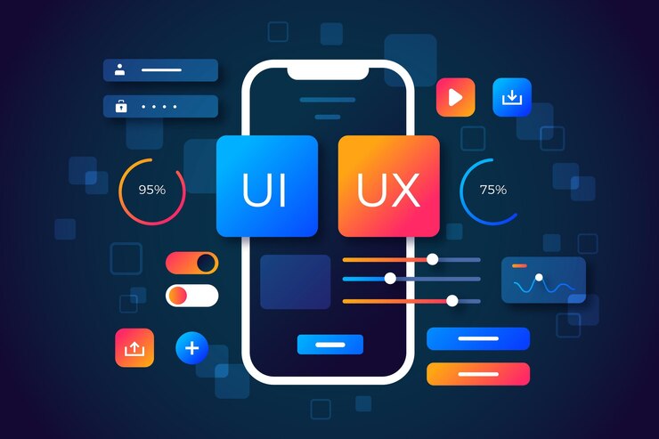
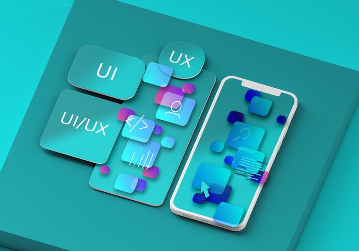
User behavior is observed by a UI/UX, and front-end expert to improve an application’s visual design. They have a thorough understanding of modern technology stacks and are skilled at designing aesthetically pleasing user interfaces.

Their key aim and objective is to improve user satisfaction. The objective is also to reduce user churn and make sure that the goals of the organizations are met. Enhancing the conversion of sales, increasing the email sign-up findings, and reducing the pain points are examples.

While some designers and developers opt to specialize in one area (for example, UI/UX, or front-end programming), this profession incorporates all of them, making it a unique designer-developer hybrid. It’s critical to understand how these three areas of knowledge overlap and intersect to locate the perfect applicant.

The user’s enjoyment of your software is central to user experience (UX) design. Front-end development (UI) is a technical term for implementing a software’s user interface. The graphical link between the two is UI design.

Where Do You Get The Right UI/UX Inspiration For Your Website From?

Right UI UX Inspiration

As you may be aware, design trends shift throughout time, so it’s critical to be mindful of the 2023 trends to stay current. In this article, we’ve compiled a list of the top 15 greatest UI/UX inspiration websites that we’ve hand-picked for you to read, learn from, and be inspired by. 

May these websites assist you in your own UI/UX efforts. These sites have been hand-picked to keep you up to date on the most recent design trends. 

These are also the best (or still best) websites. They include the year’s most recent and up-to-date design trends. 

Here are the top 15 best UI/UX inspiration websites:

Waveguide

Waveguide aspires to be a one-stop shop for design information and real-life design examples. They provide the best design assistance, recommendations, and inspiration. The Waveguide also ensures that all of their articles are of the greatest possible quality; therefore, they have a closed content creation system in place and don’t allow anyone to submit a guest post on their site (unless they’re a very experienced designer). 

Every piece of content you read is a genuine production based on knowledge and experience. If you’re looking for information or inspiration, Waveguide is a good start.

Lapa Ninja

Lapa was founded to serve as a source of influence for designers. They publish a variety of designs, including blogs, e-commerce, landing sites, and more. They make certain to pick the best examples and keep their lists up to date daily.

Uplabs

Uplabs is the place to go whether you’re looking to design for the web, iOS, macOS, or Material Design. This website contains the most up-to-date information about the design of such software. User interfaces, experiments, open-source programs, libraries, and ready-to-use products are among the items available here. 

Unlike the other websites on this list, Uplabs was established to allow design theory and practice experimentation. There are other tools there that you can utilize that will further your investigation.

SiteInspire

SiteInspire is devoted to showcasing the most innovative and cutting-edge web interactive design. They feature web pages that site owners have submitted to them. The site currently receives 200 submissions every day on average, and they carefully select the best sites to help you find inspiration. If you’re looking for design inspiration for your website or if you have a website with interesting graphics, you might want to check out SiteInspire or submit your design.

Dribbble

What’s the deal with “Dribbble” (yep, it’s triple B)? Because Dribbble allows users (such as you) to share miniature screenshots of their designs (known as “shots”) with other users. Isn’t it cool? Dribbble is a social media platform that allows designers to connect, share their work, improve their talents, and be hired by the world’s most prestigious firms. 

Dribbble, unlike the other sites on our list, genuinely enables you to meet other creatives and designers, collaborate with them, or seek and provide advice to one another. Dribbble is the ideal platform for getting discovered by huge firms like Apple, Facebook, Google, and Shopify. If you want to be a part of this expanding designer network, go to their website and sign up!

Related: 9 Tools To Test If Your Website Is Mobile Friendly

Niice

Niice is a similar design platform; however, it serves a distinct function. Unlike Dribbble, a design-sharing platform, Niice functions as a collaborative workspace comparable to Slack or Trello. Niice, on the other hand, is designed with designers in mind. The following is how it works: Have everyone and everything in one location – this is what they term “boards,” which allow you to communicate with your team. You can upload your work there if you wish to share it with your colleagues for feedback or advancement. Easier feedback — their approach is designed to make it simple for others to provide you with comments. 

Niice is built to accomplish this work for both of you, whether you need thorough input from your client or just a “Yes or No.” 

Real-time feedback is offered to you! a design library – Look at the work of your teammates for inspiration or new ideas. If you’re working on a large project, Niice can be a useful tool for you and your team.

Behance

Behance is a social media site where all designers and creatives may showcase their work. Unlike other social media platforms, Behance’s primary goal is to help designers and creatives. As a result, if you want to join a community of fellow creatives, you should go to Behance and sign up.

Pinterest

Pinterest is one of the top image and video sites for people to develop new ideas and get inspired to accomplish what they love. This portal features information, such as designs and home décor, among many other things.The users of Pinterest can communicate by liking, commenting on, and replying to each other’s creations.

Creativity Bloq

One of our favorite design-related websites is Creative Bloq. According to their About page, Creative Bloq provides a blend of guidance and inspiration for all, including traditional and digital artists, graphic designers, web designers, 3D and VFX artists, illustrators, and more.” 

True to their word, their website offers a variety of design ideas and some guidance for your upcoming projects. Creative Bloq also ensures that they stay on top of current trends so that you don’t miss out on anything.

DesignBetter.co

Design better. Co is a great place to go if you want to seek help from designers themselves. This website features short podcast shows with some of the top designers and creatives in their areas. You’ll get many useful information and ideas that will help you with your current or future projects. Listen to these design gurus, take notes, be inspired, and make something beautiful!

Prototypr.io

According to their About page, “Daily design news, inspiration, and deals: Everything you need to supercharge your design talents,” Prototypr.io is your source for news and even offers in UX and design technologies. They keep track of the most recent UX design trends, so you don’t miss anything. 

They also provide a wealth of design ideas, inspiration, and recommendations to help you keep moving forward.

UsabilityGeek

As a personal pastime, Justin Misfud started UsabilityGeek in 2011 to spread the word about the significance of website usability.” His goal is to raise awareness about the relevance of usability because he believes that just a few designers and developers understand its importance at the time. He attempted to tie theoretical and practical work together in his discussion of usability. 

As the blog grew in popularity (IA), it covered topics like conversion, user experience (UX), human-computer interaction (HCI), and information architecture. If you want to learn more about this topic, go to UsabilityGeek.

UX Collective

For practically any topic you can think of, there are many articles available on the Internet. UX is no exception. However, most UX papers are difficult to understand, especially for those new to the field. As a result, UX Collective was born. 

It was created to write simply digestible UX content. In this way, even novice users can quickly master UX. This website may be useful if you’re having trouble reading about UX.

UX Movement

If UX Collective was created to help you understand UX principles, UX Movement was created to show you the consequences of both good and bad UX designs. The goal of the UX Movement is to teach you which UX techniques to use and which to avoid for improved human interaction outcomes. 

They point out that while many UX experts prioritize functionality and design, they frequently overlook the importance of psychology and human interaction in the designs they create. The UX Movement is a behind-the-scenes look at how humans interact with UX programs and how to attain the results we want.

UX Myths

This is probably one of the simplest web pages in terms of design. Don’t be deceived, though. As the name implies, UX Myths seeks to dispel myths about UX practices. To begin with, defining exactly what UX is difficult; therefore, some of the features of UX written about can be shady and ambiguous enough. UX Myths tries to dispel this misunderstanding by separating myths from reality. 

They cover not only user experience but also design and psychology. Overall, this is an intriguing site for anyone interested in learning more about UX or simply having fun. It might be enjoyable to debunk the beliefs you once believed.

Conclusion

These are the top 15 UX/UI websites to inspire you while working on your projects. The best approach to get inspired is to see a work of art or to have a new idea on how to do something. 

Alongside getting the right inspiration, you should ensure that your website lives up to the UI/UX standards required by enterprises. Browser testing platforms like LambdaTest are playing a crucial role in helping web developers and testing professionals to keep their applications result-oriented, highly usable, and robust.

With LambdaTest, you can test website UI/UX across 3000+ browsers and OS combinations. You can test your website UX on a real device cloud (Android and iOS) in real-user conditions. LambdaTest also allows you to perform automated device testing on real Android smartphones and real iPhones/iPads.

These websites don’t just provide you with counsel and information, as you’ve just learned. Some of them are centered on knowledge and information sharing. Others allow you to meet and network with other designers. 

While some are just there to inspire you by exhibiting actual gorgeous designs, others are more than that. Regardless of how you use these sites, we hope they provide you with one thing: inspiration, information, and ability in your field.

Read Also:

Arnab is a professional blogger, having an enormous interest in writing blogs and other jones of calligraphies. In terms of his professional commitments, He carries out sharing sentient blogs.

View all posts

Leave a Reply

Your email address will not be published. Required fields are marked *

Related

Mobile Friendly

9 Tools To Test If Your Website Is Mobile Friendly

Nowadays mobile traffic has extended as more and more people are using mobile devices to access the internet. And their choice of searching required information on Google ranking websites has also increased because of their mobile-friendliness. Hence to maintain such wide users is essential to develop and provide a fully functioning mobile-friendly website regardless of the screen size or device they are using. Before moving ahead it is important to understand what exactly we mean when we say a website is mobile-friendly and what Mobile Friendly Test is? Website mobile-friendliness is the overall performance of a website on mobile devices that provides a quality experience to mobile users. Thus enhancing website performance on any mobile is crucial because mobile device usage is growing day by day.  Checking mobile friendliness without any assistance is difficult. That is why Google has introduced search calculation guidelines. With the help of this, it becomes easier to find out how user-friendly your website is and whether it is easily accessible or not. Mobile-Friendly Test is a special tool that helps to see how friendly your website is operating on different devices. It allows you to easily carry out a mobile site test and tells a website’s score in terms of its performance on all mobile devices. The test score will enable you to have an idea of whether your website is providing a good mobile user experience or not. It also says that the website falls into the mobile-friendly category and shows good results in the mobile-friendly test. With the help of this test, you will also get specific instructions on what on your site needs to be updated, fixed, or modified to make it work better on all mobiles. Making the site fast and good only on desktop but slow and not so good on mobile will not only lead to poor ranking but also to reduced traffic which ultimately causes less revenue. By making a website mobile-friendly, you will not only please your users, but you can also remarkably improve your search engine ranking by appearing higher in search engine positions. Google search calculation parameter has been confirmed as a part of the overall ranking criteria. This is a set of factors provided by Google that help in determining how convenient your site’s mobile version is to users. Previously Google has put a fine on sites that offer a poor experience to mobile users and gives much importance to the websites that take relatively less time to load and look good on all mobile devices. The more quickly you make your site mobile-friendly and ensure that  Google recognizes it, the faster it can be ranked applicable by Google. However, testing your site on mobile devices can be time-consuming and expensive due to the availability of a large number of different mobile devices. But there is a way out of that. There are Mobile-friendly testing tools available online that measure how adaptive a website appears on mobile.  Most of these tools can suggest ways to make your websites look better and faster on mobile. They also suggest needed adjustments in particular areas. The testing score will also give you an idea of your website's appearance on mobile and its performance for mobile users. Nine Best 9 Tools To Test If Your Website is Mobile Friendly Here we will discuss 9 such tools that can give you a brief about your website's mobile-friendliness. 1. Google Mobile-Friendly Test This is the most popular and easy-to-use mobile-friendly tester. This tool is developed and managed by Google. You just need to put your website URL and this tool will analyze your site on mobile. It helps you find out issues that prevent your site from appearing in the google searches on mobile. If your site is mobile-friendly and meets google standards it gives you a green signal. And in case it does not pass the test and fails it announces it as not mobile-friendly. This tool tells you if Google sees your page as mobile-friendly or not. If it says "no" then the page will be set down in the mobile search results and approve similar pages from other sites that are mobile-friendly. 2. MobiReady MobiReady is a very innovative and useful website testing tool that shows how a particular page appears on different mobiles. You can see how your site performs on multiple sizes of mobile devices at once. It compares your sites against popular websites and gives specific recommendations of areas you need to do well and need improvement to climb up. This tool also provides a detailed report of scores between 0 and 5 with 5 being the highest. The higher the score the more the web page is capable of performing and giving a great user experience on any mobile device. A low score indicates that the webpage is slow to load having components that can break the quality user experience. 3. W3C Mobile OK Checker The World Wide Web Consortium (W3C) works to develop web standards. They have a handy mobile checker that provides specific recommendations on how to make your site more mobile-friendly and lets you know what changes need to be done.  You don't require any special skills to use this tool. You just simply need to enter your URL address and a series of tests will be run on your website to determine how mobile-friendly it is. After completion of the test, you will get detailed information and analysis of your site whether it is low, medium, or severely critical. This helps in making necessary changes to improve the mobile-friendliness of your site. 4. Page speed insight Use Google’s page speed insight tools to test the speed of your website for both mobile and desktop. It helps in providing specific recommendations to increase your website speed on different devices. It shows screenshots of how your website looks on mobile and desktop as well as gives you speed scores for both mobile and desktop as well. analyzing your website in PageSpeed Insights will give you a detailed analysis of what needs to be fixed and things that have already been done correctly. 5. Google AMP testing tool  AMP means Accelerated Mobile Pages. This tool is developed by Google with the goal to make fast-loading pages that look good on mobile devices and deliver the best possible mobile experience to its users. In today's time having mobile-friendly websites is very important for your online presence.  Using the AMP testing tool you can check the validity of an AMP page. This test will also enable you to create mobile-optimized content to load instantly on all devices no matter what type of mobile devices you are using.  It also finds out issues related to AMP that are preventing your site's appearance in search results. 6. Google TestMySite Speed matters in ranking no matter how fast your site is on the desktop. If the site speed is slow on mobile it may affect your ranking position. TestMySite is a mobile testing tool from Google that analyzes how fast a website is on mobile and it also provides ways to make the site faster and enhance users' mobile site experience. With the help of this tool, you can see the load time of your site on mobile.  It also generates a personalized report to each audience with all major and minor details and also tells the next step to be followed. 7. Varvy Mobile SEO Varvy Mobile SEO ( Search Engine Optimization) is one of the most simple and useful mobile-friendly mobile SEO testing tools. It will test your site and help to know whether it is mobile-friendly and is complying with Google guidelines and SEO practices or not. This tool is simple to use, you just need to enter your URL and Varvy will provide you with helpful insights like page load quickly, the right security and accessibility, paid links, a page displaying well on mobile, and many more. Additionally, it gives recommendations of what is exactly wrong and what adjustments are needed to be done  8. RankWatch RankWatch is a simple tool to check the mobile-friendliness of your website. It provides descriptive information on whether the site is mobile-friendly or not, it also provides you with precise rankings of your website in popular search engines like Google, Bing, etc.  Testing with RankWatch will give you the page score of your website. You can easily get the result containing information about the mobile viewport, its content, the size of text and links, and whether the buttons on the website are mobile-friendly or not. 9. LambdaTest’s mobile-friendly checker LambdaTest is one the most widely used tools to test a website's mobile-friendliness.  It offers you an extremely handy mobile site test that allows you to check the friendliness of your mobile device. It helps you to assess your website's friendliness on a cloud of more than 3000 real devices, browsers, and operating systems on a wide range of different resolutions. Using the LambdaTest platform you can test and debug your mobile website on multiple mobile handsets of different screen sizes connected to a live mobile network in different locations. Once you run your website mobile test you will be able to see how your website is performing on a mobile device.  After completion, it generates a website performance report that helps in identifying underlying issues affecting your website's performance. Hence helping you in making the required changes. Additionally, it provides you with the feature of recording the entire test session in a single video and capturing screenshots so the other team members can get access to the entire test session easily. Moreover, LambdaTest’s LT Browser helps you to view your mobile testing of websites on different preinstalled mobile device viewports. LT Browser is a developer-friendly browser that is more powerful than the default Android and iOS browsers and helps you debug and test any mobile website flawlessly. Read Also: Understanding The Role Of SEO In B2B Digital Marketing: Optimising Your Website For Success Interactive Website Tools: Exploring Strategies For Engagement And Conversion What Are Piracy Websites? | Top 10 Pirated Websites In The World

READ MOREDetails
Octetnews com

Is Octetnews Com Receiving A Well Deserved Hype? What Is Its Current Position In The Digital Media Landscape?

In today's world, there is a lot of information available, making it hard for readers to find reliable news sources.   Octetnews com is a new player in digital publishing that combines technology reporting with general news.  But does it really deliver? In this review, we will look closely at Octetnews.com to assess its content quality and user experience.  Additionally, I will also discuss its credibility. Then, I am sure we will know whether you should include it in your daily news routine.  What Is Octetnews Com All About? Octetnews.com is a digital news site that covers multiple topics. While many websites focus on a single area, like finance or cybersecurity, Octetnews aims to be a one-stop source for the modern informed reader.  The site targets two main types of visitors:  The Tech Enthusiast: People interested in the latest news about AI, gadgets, and software.  The Generalist: Those who want to stay updated on global events, lifestyle trends, and helpful tips.  By merging these two areas, Octetnews.com aims to help users avoid “tab fatigue,” where they need to visit multiple websites to get a full picture of the day's news.  What Are The Three Pillars Of The Content Vertical Of Octetnews Com? I believe that the best way you can assess any site is by looking at what sort of information it provides.  So, since we are dealing with a news site here, I would see what are the different categories of news it covers.  1. AI And Technology  Technology news today is largely about Artificial Intelligence (AI). But then, what makes Octetnews com stand out?   This platform not only reports what happened. Rather, it explains how it affects users.  Firstly, you will get to see a series of gadget reviews. Additionally, I would like to mention that these reviews are nothing like the standard review sites.  Rather, Octetnews focuses on how gadgets are useful.   Whether it’s a new smartphone or a specialized wearable, the analysis is aimed at everyday consumers.  In addition, you will also get updated on the recent AI developments. So, the site shares timely news on AI.  This includes updates from OpenAI and Google’s Gemini.   Also, it simplifies complex technical terms into clear insights.  2. General Global News  The General section serves as a digital newspaper. But what are all the topics it covers?  Let’s check these out:  Firstly, it covers all the world's events. So, you will receive all the quick updates on major stories around the world.  Secondly, it has a strong focus on lifestyle & trends. So, you will get good Information on health and wellness. In fact, you will also get to read about cultural changes.  Finally, you will get daily economic snippets. I am talking about the short updates on market trends that impact people's finances.  3. Guides, Tips, And Tutorials  This section is key to keeping readers engaged over time.   The site offers “Evergreen” content—articles that remain helpful long after they are published.  Tech Tutorials: Guides like “How to secure your smartphone” or “Best hidden features of Windows 11.”  Life Hacks: Useful tips on productivity and organizing digital life.  What Are The Different Factors Covered By Octetnews Com UX And Design Structure? A news site is only as good as its readability. If a website is filled with distracting ads or takes too long to load, visitors will leave quickly. User experience is key to retaining readers and keeping them engaged.   1. Speed And Performance    Octetnews.com is designed for speed, ensuring fast loading times. Our analysis shows that it performs well in Core Web Vitals, which is essential for Google rankings.   Quick loading speeds are crucial, especially for users on 4G mobile connections.   Fast performance helps retain readers and enhances overall satisfaction with the site.  2. Mobile-First Design    More than 70% of people read news on their mobile devices nowadays. Octetnews.com features a responsive design that looks good on all screen sizes.   The text is easy to read, buttons are easy to tap, and the navigation menus are user-friendly.   This mobile-first approach caters to the growing number of users who rely on their phones for news updates.  3. Clean Layout    Many news sites are criticized for being cluttered with ads. Octetnews.com stands out by keeping a clean design that minimizes distractions.   While it does have ads to support its operation, they don’t overwhelm the reading experience.   This thoughtful layout fosters trust among readers and encourages them to return for more content.  How Can You Evaluate The Credibility Of Octetnews Com As A Trustworthy Platform? We live in such an era where misinformation has become the new norm. This is why I was a little skeptical about the trustworthiness of Octetnews Com.  But then I observed some of the factors that really boosted my faith in this site. Let’s check these out then:  Octetnews.com effectively uses reliable sources and gives context for its claims.   The site updates its content frequently, which is important for a news platform.   Its reporting style is mostly neutral. It avoids sensational headlines that many blogs use and prefers straightforward and honest titles.  Where Does Octetnews.Com Stand Compared With Alternatives?  Octetnews.com is a better news website because it makes news simple, fast, and easy to access.   Also, I want to add that this site is not at all like the other sites that are full of ads or hard to read.  Rather, Octetnews.com has a clean design and organized sections. So,  readers can quickly find the news they want.   In addition, the site covers many topics, including:   Technology  Business  Science  Entertainment   Lifestyle  World Events   This helps users stay informed without visiting multiple websites.   Octetnews.com also works hard to provide accurate and reliable information.   They check facts before publishing, so readers can trust what they read.   The platform works well on phones, tablets, and computers. So, this makes it convenient for people on the go.   Additionally, the platform has all the features that can make it the talk of the tech town, such as:  Speed  Clarity   Reliability   Easy Navigation   So, these help Octetnews.com stand out from other news websites.  What Are The Advantages And Disadvantages Of Octetnews Com? These are the various pros and cons of Octetnews Com. I have organized everything in the table below. Let’s have a look at it:   Features Pros Cons Variety In Content You will find information on whichever topic you like, from Artificial intelligence to fashion. To cover a lot of topics, they don’t have the option to do extensive research on any one topic. User Interface The user interface is quite fast and simple. Also, it is mobile-friendly.  You cannot consistently apply the dark mode.  Frequency It daily updates stories with trending and fresh stories When you are posting content frequently, it will lead to shorter articles. Authority The platform uses reliable sources.  It doesn’t have a comment or community section.  What Are Some Strategies That Would Be Good For The Site?  To turn Octetnews.com from a “good” site into a “dominant” site, it can make a few changes:  Firstly, it can incorporate short videos. These will summarize tech reviews. Then, these would attract younger readers, especially Gen-Z.     Additionally, I suggest that conducting Q&A sessions with experts in AI or Finance would make the site more authoritative.  Also, I think a weekly email that highlights the best content would help build a loyal reader community that returns each week.  Is Octetnews Com Worth It?  Octetnews.com gets a rating of 9.5 out of 10 after a complete review of its content, performance, and market position.   This news site is fast and reliable. Additionally, it meets the needs of today's readers.   Also, it is useful for students who are seeking quick tech tutorials.  In fact, if you are one of the professionals wanting updates on AI, this platform will become your go-to.  In addition, all the casual readers who are interested in world events can resort to this as well.   Octetnews.com offers a clear experience that helps you find what you need without the clutter. 

READ MOREDetails
Why I Can’t Download From Google Drive

Why I Can’t Download From Google Drive? How To Fix It?

Why I can’t download from Google Drive remains to be one of the most generic questions that bug every user. Google Drive, as you are all aware of is the most popular component of Google that provides users with a great number of functions and features. It is extremely feasible to access, and people won’t have any trouble understanding the ways of its work. Many users around the world prefer this platform over any other to store their folders and files. The problem that we are elucidating on remains that sometimes it is not possible to download files from this Drive. Therefore, we are here to find a solution. What Is Google Drive? Google Drive is basically a storage solution powered by Google that is cloud-based. With the assistance of Google Drive, you will be able to save files online. It can be accessed at any time from devices such as tablets, smartphones, and computers or laptops. There are many advantages to being able to use Google Drive.  It is quite feasible to share as well as store your files in a reserved location. This software has built-in integrations associated with the suite of Google’s services and products and even makes use of various collaborative tools. If you are already signed up on Google, be sure to acquire an additional space of 15 GB on the Drive.  Why I Can’t Download From Google Drive? Google Drive, as you know, provides us with several benefits to help ease our work over the internet. It also allows us a great deal of storage space that is adequate for standard use. However, at times you might be faced with a few problems occurring around Google Drive. The most general of all these issues is that you can’t download from Google Drive. There are two major reasons that cause this problem of not being able to download from Google Drive.  The first cause is that the number of file downloads is generally limited by the software. This is because many people can get access to the file within a span of twenty-four hours. Whenever someone shares the files on Google Drive, this scenario pops up. Hence, these occurrences will deny your file download.  There might be another irrelevant issue that will make you realize that you can’t download files from Google Drive. The reason is a poor internet connection. Since the Drive is a cloud-based file storage system, the user must have a proper net connection at all times for getting access to the files.   How To Fix Can’t Download From From Google Drive? There are various ways to fix your problem of why can’t I download from Google Drive. Let us have a look at some of those: 1. Restart Your PC No matter which operating system you are working on from Mac or Windows, restarting your computer is always the best initial solution before hopping on to other solutions.  2. Few Other Methods Method 1 Right-click on the file you want to download. From the drop-downRight-click menu, choose the download option. If more than one file is to be downloaded, select the desired number of files. Right-click on any of these files and select the download option from the menu.  The files will now be downloaded.  Method 2 Choose the folders or files you want to download. On the top right corner, you will find the three-dot icon. Click on it. From the drop-down menu, select the download option.  Method 3 Open the file if you wish to download any specific photo or video. Click on the download icon at the top right corner.  The file, image, or video will now be downloaded. Method 4 If you do not have any Google accounts and are still using Drive, then on the file list view, you will find the download icon on the right-hand side. Move your mouse towards that part and click on the icon that appears. This will allow your file to be downloaded. 3. Enable Cookies Open Google Drive in Chrome Browser. As you find a tiny lock icon on the left side of the address bar, click on it.  From the list, click on cookies. You will find a pop-up window appearing. Here, you need to click on the Blocked Tab option.  Find out any link that is related to Google and click on it. Next, tap on the allow button at the bottom.  Finally, choose Done. Restart the browser or page, and you will have the downloading options open to you again. 4. Switch Google Accounts A user needs to be signed in with the same account to get access when someone else sends a Google Drive link for downloading files. The file-sharing permission of Google Drive follows two considerations. The user can easily be able to view or download the files if the owner who generates the link has made it accessible for all. However, on the other hand, the owner of the link can even limit the number of users who can get access to the file by mentioning their email ids. During such a case, if you aren’t signed up as a Google user, you might witness errors in the file not opening. This way, you can’t download from Google Drive. Thus, you need to choose and switch for the correct account on Google.   Final Thoughts Well, I hope now you have a clearer picture of why you can’t download from Google Drive. However, in this article, every aspect of this issue has been covered. The ways how to overcome this problem have also been explained in various steps. Thus, you just need to read through and understand so that it won’t be any difficult task for you to face such an error. More Resources: How to Free Up Space on Your Mac Top 10 Computer Security Mistakes Best Server Management Tips for Startups

READ MOREDetails