Simple Packaging: Your Guide to Branded Design

Published on: 12 May 2018 Last Updated on: 08 August 2019
simple packaging

Packaging. Such a common, everyday word.

It has become embedded in the lives of consumers that, unfortunately, many businesses have forgotten just how important and valuable it is.

The thing is, even that seemingly simple packaging holds immense power. It can either make a buyer spend money or make them put it back on the shelf and pick up another similar item.

After all, consumers, for the most part, see only the packaging when they purchase items directly from a store. Just think about it, packaging covers about 100% of most products you see in stores.

There’s also the fact that what covers a product – and what’s on it – makes up about a third of most purchasing decisions.

If you’re having trouble thinking up methods on how to design packaging and custom boxes, worry not, as we’re here to help. In this post, we’ll give you some of the best packaging design tips.

It All Starts with Understanding How Packaging Works :

First, let’s talk about what packaging is and how essential it is to branding. Why it has grown to become a $9-billion industry.

At its core, the packaging is the method and the materials used to contain, cover, safeguard, and transport items. The methods can vary from cleaning to preserving. Materials differ too, with the most common being cardboard, paper, plastic, metal, glass, and metal.

The thing is, packaging has many more roles than just giving products a pretty face. Indeed, it’s a powerful tool to attract the attention of buyers. It’s crucial in branding awareness and recall.

More than that though, it’s vital in helping reduce product waste. For instance, research has shown its great importance in keeping food and beverages edible.

In other industries, its ability to protect items significantly reduce potential damages, which then lessens the need to throw them out for replacement products.

In the food industry, effective packaging for food products can be made with sustainable materials.

In fact, a recent study noted that socially-responsible packaging now plays an important role in buying decisions. More than half (52%) of the study’s participants noted they spent money on a product/service from companies using eco-friendlier packaging methods.

Also, take note that packaging also has a lot to do with product safety. This is especially true for products that are for human consumption, including food, beverages, and medication (including vitamins and supplements).

You want your customers to safely reap the most out of their purchase, and at the same time, remain in compliance with packaging laws and regulations.

Simple Packaging and the Immense Branding Power It Boasts Of :

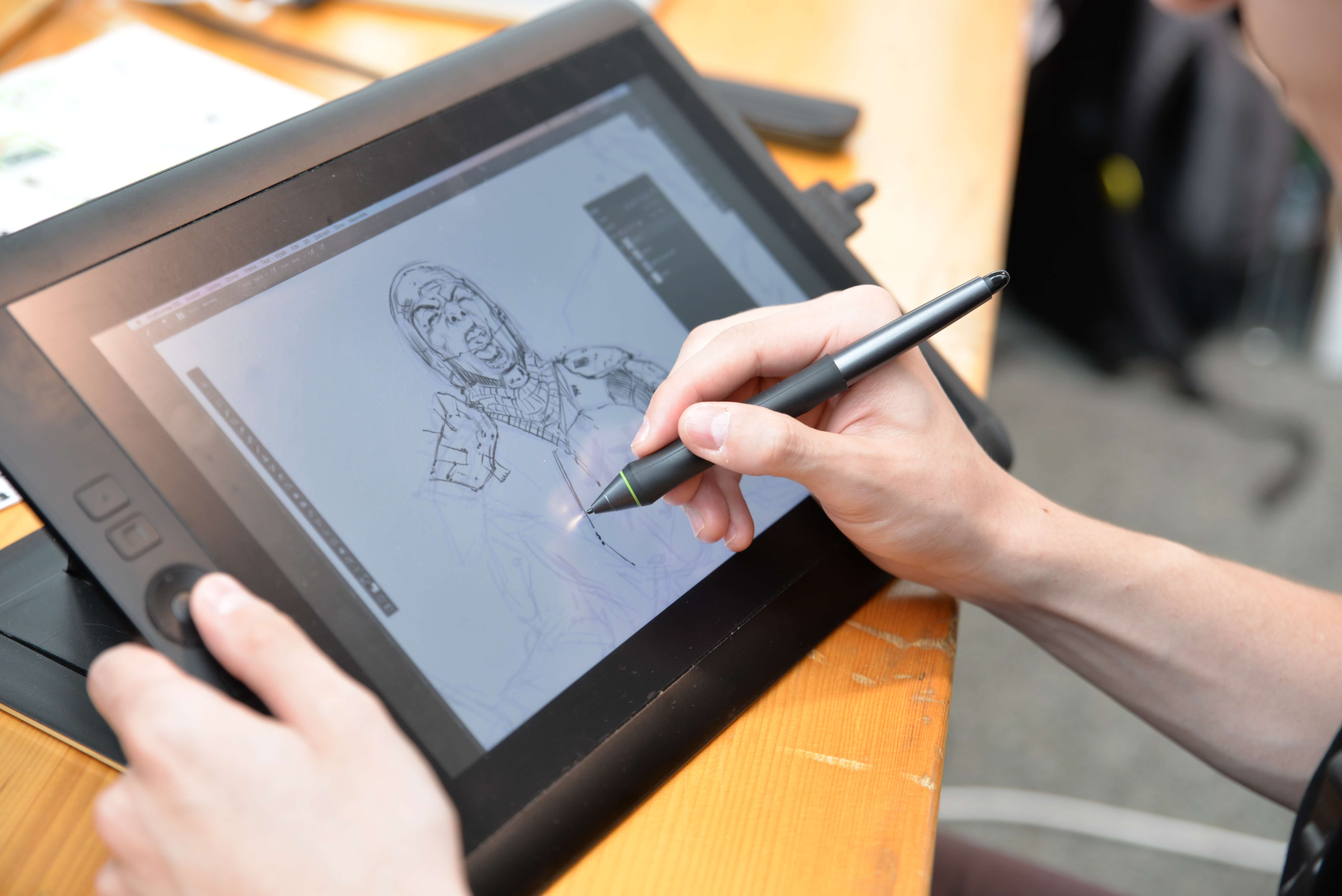
You want to make sure your product, as soon as it’s ready, goes on display right away. But you can’t really say it’s ready, not unless you’ve also made certain that its packaging is 100% ready to go.

Whether you go for a box, bag, wrapped, taped, or glued packaging elements, every element of your packaging should incorporate what’s mentioned above. You also need to ensure that it possesses all the right components for effective branding.

Consider this:

The average grocery stores now sell 40,000 more products than they did two decades ago. In a place where your products compete with many of these said items, how you package your brand’s offers can make or break the deal.

Again, it can either make consumers want to put it in their shopping carts and pay for it or put it back on the shelf and buy a competitor’s product instead.

Essentially, product packaging is your primary selling tool. After all, it’s the most tangible method to represent your product and brand to your target market.

Keep in mind that you only have seven seconds to leave a positive impression on consumers, so you need to make them see instantly why they’d want to spend money on your offers.

All these said you need your product packaging to have eye-catching features. But it also needs to retain functionality and should be economical. And for eco-friendly consumers, sustainable materials.

The Right Elements that Go into Successful Packaging :

Just as how you’d carefully review all the elements of your social media marketing campaign on Facebook, the same goes true for inspecting all your product packaging elements.

Again, how you package items can instill better brand awareness and recall. For it to help your brand achieve success, it needs to boast of the right elements.

What elements are these? Brand logo, color, shape, and typography are the most essential.

Brand Logo :

The position itself of your brand on your packaging can also make or break a buyer’s decisions.

Therefore, you want to implement the best positioning strategy for your brand logo for consumers to notice it right away. Also, keep in mind that logo placement affects brand recall.

Color :

Color affects – either in a positive or negative manner – consumer buying decisions.

For instance, studies reveal that 85% of consumers buy products because of its color. They also cite that color can raise brand awareness up to a whopping 80%!

Of course, you still need to base the colors you choose on your products/services. For example, if you want to stir emotions of urgency and leave an “energetic vibe,” you’d want to consider using red as a primary color.

Just check this service and see how your mind and body reacts to it.

Shape :

Even the shape of your product packaging can already say a lot about the product it contains!

You should then use this as another tool to better market your brand’s offers. For instance, angular shapes speak to men, while curved shapes are more ideal for female-centered products.

Packaging for Ease of Use and Better Branding :

These aren’t the only reasons you need to be more aware of the great power behind the packaging.

Even simple packaging can elicit an “Ooh” from potential buyers rather than just a regular “Ahh.” So, as early as now, especially before launching new products to the market, make sure your packaging has all the vital elements for better branding.

And for more business tips and tricks that’ll help you better shape your brand, make sure you check our blog.

Read Also :

I enjoy writing and I write quality guest posts on topics of my interest and passion. I have been doing this since my college days. My special interests are in health, fitness, food and following the latest trends in these areas. I am an editor at Content Rally.

View all posts

Leave a Reply

Your email address will not be published. Required fields are marked *

Related

Graphic Design in London

Latest Trends of Graphic Design in London

Out with the normal combination of basic typographic logos, choosing of backdrop shade, and pleasant phrasing, blending has perished. Instead of embracing a trend that tends to make it too easier to be overlooked, brands need more uniqueness. Following that, a reversion to clarity and stark minimalism might appeal to a post-pandemic ethos more explicitly. Subtle shading palettes with a flash of color, moderate typefaces, and geo-referenced layout patterns will provide warmth and concentrate on the content. New trends are catching up more efficiently than relying on the traditional graphic design tools. Students are opting for diverse graphic design in London to align their academic aspirations with the latest trends in the industry. Here is a selection of the top graphic design trends in London that will help you make your job more interesting: 1. New Hippie trend:  In 2021, even after several seasons of sleek modern, Scandia-influenced style, a novel paradigm known as 'New Hippie' will be introduced. It's essentially a streamlined version of 1960s hippie culture, with a primary emphasis on divine and self-care tossed in for good measure. This trend started in the fashion industry. Interior design, product design, and even more notably graphic design have all been influenced by the bright colors and textures of the 1970s. This trend has given rise to a new type of service, such as tea, coffee substitutes, cosmetics, and incense businesses that are evocative of the old hippie culture. Alessandro Michele's Gucci, a revitalization of the trademark with a fresh sense of '70s brightness, exemplifies the trend. 2. Bold Minimalism: Anti-Design, New Pulse, and Loud Monochrome are all on the decrease, whereas Bold Minimalism is on the increase. Elaborate Anti Design and new wave designs with demanding color schemes, repetitive evocative text, and visual effects have had a rebirth in recent years. 3. Uniqueness: Branding is a good way to characterize the technique of streamlining a brand. As a result, a dense, ornamental logo is now a simple, type-only design. When an overall look becomes too complicated, it is reduced to duotone or monotonous. Simple forms are in, while complexity is out. 4. 3D High Gloss Rendering:  Latest design concepts are frequently influenced by technical advancements. Adobe Dimension is a 3D modeling and design program that lets you input pictures, models, and textures to generate attractive mockup images. It's included in the Creative Cloud software package. The creation of award-winning Brazilian designer and visual artist Leo Natsume, known as the "Always On" campaign that he did for Facebook Brazil, exemplifies the 3D rendering that we predict to burst over the world in 2022. 5. Maximalist Color Palettes:  In terms of color palettes, the design industry is going from minimalism to minimalism. A six- to the seven-color palette is becoming increasingly popular among designers. This opens up the possibility of blending certain hues and having them act as gradients in tandem with their solid equivalents. BEHAVE Candy's website, built by Brooklyn Company Gander, is a good demonstration of this where they combined neon and pastel tones for excellent impact. So, if you are enthusiastic about this domain, then you must sign up for this course now! Read Also: How Does Web Design Affects SEO? 6 Reasons Why Infographics Are Important in Media Marketing SEO Website Design Tips for Small Businesses Functionality – an important aspect of good web design: Sydney digital marketing services for your growth

READ MOREDetails
slider-img

Patient Portal Development Company Addresses Technology

Healthcare industries are focusing more on technology and better patient engagement to fuel the population health. But for the patient portal development company, it is necessary to address the technical shortcomings as well that limits interoperability for healthcare systems. Once all technical and political barriers will be considered well then it would easy to make better healthcare decisions effectively. Till now, healthcare systems are more rhetoric than real but making them result-oriented is still a challenge. The healthcare industries usually try to make patients more engaged and empowered otherwise any patient portal will not work at all. Patient engagement will struggle with certain political and technical barriers as information access may be challenging for consumers. Some of the main barriers in healthcare technology adoption are interoperability, data access, non-incentive payment options, etc. Here, this is the responsibility of the patient portal development company to address the technology shortcoming for better interoperable healthcare systems. There is not only a single place where you can download health records so you have to be cautious when working with external data sources. But the problem is people always want easy solutions that can be availed with a single click only. TO make data access that much easy, it is easy to work on big data analytics for better record management and organization. To bridge the gap between healthcare industries and patients, patient portal development company has developed better consumer-driven systems that completely focus on customer requirements. Further, it is necessary to aware people about the benefits of better patient engagement to improve the overall quality of care and healthcare services. According to the latest research and study, better consumer engagement improves health outcomes and reduces overall costs too. Experts have also defined strategies to address various technical barriers in most effective without putting many efforts and cost investments. Read More: Best Therapies To Cure Pain And Discomfort Using Digital Signage To Improve Your Business Top 6 U.S. Universities That Offer Health Science Course

READ MOREDetails
Infographic

10 Best Infographic Examples In 2022

The academics Mrudula Joshi and Latika Gupta have defined infographics as, “pictorial representations of information intended to disseminate information quickly and clearly”. Additionally, they state that the quality of an infographic is determined by its content and its visual appeal. Infographics are a useful way of conveying information visually and can be used in a wide variety of applications. Businesses often use infographics to convey information to their employees, shareholders, and the general public. Infographics use the language of visual media to convey information in a manner that is unique and can transcend language. This allows infographics to be very accessible which helps businesses convey information efficiently and effectively. Checkout Ten Best Infographic Examples In 2022: This article will analyze 10 of the best examples of infographics in 2022 and discuss the effectiveness of the infographics' use of visual language to convey information. 1. Wyoming LLC Attorney: Everything Owned by Nestlé This infographic breaks down the considerable number of brands that are owned by the multinational giant Nestlé. Through its use of simple outlines, it separates the brands into their different industries which makes visually reading the information easier. This also conveys the message behind the infographic which is that Nestlé’s brands are overwhelming the market and are not competing with each other but with brands that Nestlé does not own. 2. World Resources Institute: The Carbon Budget Source: World Resources Institute This infographic explains the carbon budget and its implications for society. This is a complex topic and it is effectively handled through a well-designed pathway that guides the reader through the infographic. This pathway is constructed in two ways: firstly the line which runs throughout the infographic and secondly through the gradual lightening of the background color. 3. World Bank: Climate Extremes, Regional Impacts, and the Case for Resilience This infographic illustrates the increasingly prevalent effects of global warming on people and places in Africa and Asia. The infographic uses color in a particularly effective manner. The orange and yellow hues contrast pleasantly with the shade of blue. Color psychology informs us that blue as a color evokes emotions of trust and orange evokes emotions of friendliness. The infographic uses both colors to create a welcoming but informative tone. Source: World Bank 4. Valentina D'Efilippo: Poppy Field Source: Valentina D'Efilippo This infographic uses the icon of the poppy to visually illustrate the number of deaths that have occurred during major conflicts since 1900. The size of the poppy represents the number of deaths that have occurred and the length of the stem represents the duration of the conflict. This is a visually striking infographic that creatively expresses statistics in a truly artistic manner. 5. Udacity: How to Pick Your First Programming Language Based on the Life You Want Source: Udacity This infographic breaks down the programming job market by programming languages as well as gives beginner programmers a better understanding of the application of different programming languages. The infographic uses a pleasant yellow background and subtle pops of color to distinguish between the different programming languages. This allows the reader to immediately know which language is being discussed without needing to check each time. Additionally, the infographic uses creative graphs which are both informative and aesthetically pleasing. 6. Arnav Sameer: The Six Principles of Design This infographic dissects the six principles of design and the individual components which make up these principles. The infographic utilizes the elements of design that it discusses to enhance its visual appeal. This is satisfyingly coherent and it drives home the message of the infographic. Additionally, the use of color is very limited but this only serves to enhance the aesthetic of the infographic. Source: Folography 7. Juan Martinez: History of Life Source: Juan Martinez This infographic presents the history of planet earth and life as we know it. It includes the different time periods of the earth as well as the positions of the continents and how they have shifted over time. It uses a strong circular design to draw the reader's eye to the center of the infographic. Additionally, further information is presented in a clear way that relates back to the central image. 8. Venngage: Netflix Font Psychology Source: Venngage This infographic analyzes the font that popular Netflix shows use for their titles. It breaks down the different categories of fonts and what these fonts say about the shows as well as their audiences. The infographic utilizes an almost black background to make its limited use of color particularly emphatic. This also functions as a means of placing a great deal of emphasis on the white text which reveals the font each show decided to use. 9. Dorothy: A History of Hip-Hop Source: Dorothy This infographic charts the history of the hip-hop movement using the style of a blueprint. It emphasizes the artists which have had the most significant cultural impact on hip-hop and link these artists to other prominent figures of the hip-hop movement. The design of the infographic encourages exploration of its intricacies through a web of interconnecting lines and bold use of only two colors. 10. Rick Slusher: The Architecture of Inception Source: Rick Slusher This infographic condenses the complex plot of the film Inception into a digestible and visually striking piece of media. Each line represents a character and the warped layers of the central shape represent the layers of dreaming that the characters experience. This infographic proves that almost anything can be represented visually in a clear manner, even something as convoluted as the plot of Inception. Final Thoughts This list has compiled the best examples of infographics and illustrated how diverse and creative the medium of infographics is. Each infographic manages to condense a great deal of information into an easily digestible and visually appealing piece of media. The use of infographics is tremendously diverse and these infographics demonstrate the manner in which the medium can be used for any number of purposes. Read Also: Is Instagram Algorithm Easy To Beat?5 Benefits of Digitalization in MarketingLatest Trends of Graphic Design in London

READ MOREDetails