FPPT.com: 10k+ Free PowerPoint templates for Awesome Presentations

by

17 April 2020

Dev & Design

FPPT

When it comes to presentations, you have to capture your audience from the get-go. This means creating a great impression within the few seconds that you’re in front of your audience.

However, if you want your presentation to really shine, it’s not enough that your first slide has the “wow” factor. You have to sustain your audience’s interest throughout the rest of your deck. And this is why your presentation should have the perfect balance of information and good design.

Many presentation pros would swear by free PowerPoint templates from none other than, as the name implies, Free PowerPoint Templates (FPPT).

Free Templates for Any Topic and Purpose

With free presentation templates and backgrounds by FPPT.com, you can cut in half the time it takes to create slideshows. Furthermore, because it’s free, you don’t need to pay anything to get high-quality designs for your presentations.

This said, you can save time and money, especially when compared to creating presentations from scratch, or paying a professional to create a design for you.

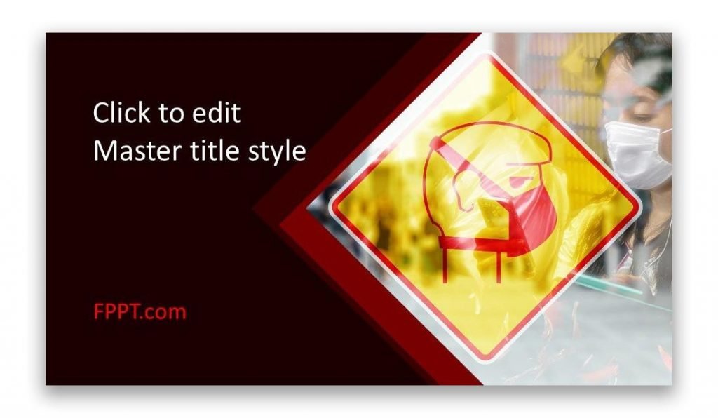
Coronavirus PowerPoint template

Another thing great about FPPT templates is that you don’t also need to sign up for a subscription or membership to be able to download an unlimited number of slideshow templates. No obligations and no hidden fees.

Furthermore, just because it’s free doesn’t mean it’s limited. There are many ways that you can modify and customize your template to match your topic and to make it truly yours.

Fully Customizable Templates for PowerPoint

All the FPPT templates are customizable so you can give it your branding and personal spin. The templates are made for PowerPoint so you don’t need to download a separate app to modify the template’s design. The Master View can allow you to change the layout and color scheme as well as the theme of your slides. PowerPoint’s Design feature also works seamlessly with the templates for more dynamic looking slides.

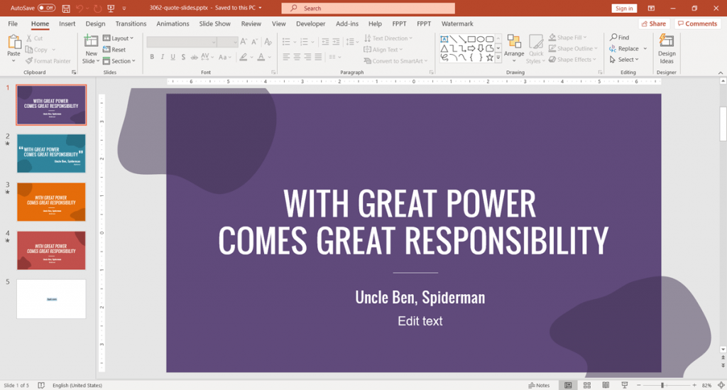
Quote slide design template

To find the best template that suits your purpose or topic, you may go over the vast collection within the FPPT portal. It contains over 10,000 slideshow templates, specialized slides, and slide backgrounds. You will always find anything that you need.

You may look for your desired template according to Categories. FPPT has hundreds of categories to carefully organize the templates. You may also search for templates according to the most popular tags or keywords. If you’re looking for a specific color scheme, there is also an option to choose templates according to the slideshow’s most predominant background colors. You can also simply type in your keyword in the search box.

However you choose, you will see that the portal gives many results so you can choose the best one for your needs.

The Presentation Portal Trusted by the Pros

Aside from thousands of templates, FPPT is also filled with numerous resources about presentations. The blog has some of the most trusted advice and tips for newbies and professional presenters alike to help them become the best in their presentations.

By using free templates by FPPT, you can create awesome, professional-looking slides in half the time so you can focus more on rehearsing, gathering data, or preparing your event. This will also allow you to be more confident once you’re in front of your audience. And, as we all know, confidence on stage can be felt by your audience, resulting in a better presentation overall.

Get your free PowerPoint templates at FPPT.com.

Read Also:
Content Rally wrapped around an online publication where you can publish your own intellectuals. It is a publishing platform designed to make great stories by content creators. This is your era, your place to be online. So come forward share your views, thoughts and ideas via Content Rally.

View all posts

Leave a Reply

Your email address will not be published. Required fields are marked *

Related

web design

Functionality – an important aspect of good web design: Sydney digital marketing services for your growth

The success or failure of any website is determined by its usability, functionality, and visual design. Keeping webpage visitors engaged and stimulating them to interact is a leading task for designers and web developers. If the visual components are balanced and exist in harmony, it inspires confidence. Also, with great and user-friendly web design, Sydney business owners can easily gain the following goals: win loyalty and establish clear communication with the target audience; become the leader in the industry; inform and inspire potential buyers; increase profitability; work with negative reviews, improving your promotion and advertising strategy; enter new markets. But the task of developing a highly-effective web resource doesn’t seem to be a straightforward one. Here are some valuable tips on building not just a web page that represents your business, but an indispensable tool to increase sales, overcome Australian competition, and grow your brand. Top web design features Internet users value: 1. The first impression matters Everything begins when a user enters your website. Thus, determining how users will interact with site content is just as important as taking care of the visual appeal of your pages. It’s all about a competent arrangement of colors, fonts, and elements on a page without unnecessary and distracting attention details. The key principle is to deliver only the needed information to the viewer. With the right visuals, you promote interactivity. With professionally written content, you will be able to highlight the features of your product or service. And by placing high-quality images, animations, infographics, and photos, you will fuel your overall marketing efforts. But remember, excessive visuals can harm your strategy, so apply graphics wisely. 2. Simple navigation enhances SEO From a user point of view, the navigation of the site should be intuitive. Then visitors can easily find exactly what they need, and search engines can index your pages without obstacles. After all, a disoriented visitor will simply go to your business opponents. Usability significantly affects a site's ability to rank higher in search results. If functionality and convenience won't be ignored, visitors will have a good impression of the brand. Also, the ranking algorithms will definitely take into account these two crucial for SEO aspects. 3. Build trust through the color scheme Pick colors that evoke the desired emotions in your visitors. For example, blue is associated with trustworthiness and professionalism, while red causes enthusiasm and joy. Beautiful and aesthetic pleasing web design with bold colors catch the minds and motivate for making instant purchases while weaker colors create contrast and strengthen the perception of the material. 4. Web design approach with mobile-first in mind.  If you want your site to be a stable source of organic traffic, invest in content optimization. Unresponsive websites won’t be able to hold mobile users until they will be ready to buy. Losing traffic due to poor mobile-friendliness leads to a decrease in sales. Prioritize the mobile-first factor and you will reach the top. 5. Slow loading speed alienates While slow sites kill conversions and your online reputation, faster sites obtain more clients, handling harsh competition environment.   Seeking solutions to boost site functionality and retain more customers, you should rely only on proficient web design Australian services offered by web agencies like Shtudio. Delivering powerful web creations through digital innovative tools, you will get impressive online marketing solutions, and more than just a website. Read Also: Questions To Ask When Working With A Web Developer 6 Things To Know Before Choosing Web Hosting For Your Website

READ MOREDetails
Custom Banner

How To Design Your Custom Banner That Works

Whether you want to attract new customers or promote an event, a custom banner can be a powerful way to drive your message. But how do you design one that works? The first step is to consider your marketing goal. Once you know what you're trying to achieve, all of your other decisions will fall into place. Here Are Four Prime Steps To Design Your Custom Banner: 1. Colors When designing a custom banner, you want to be sure to choose colors that will help grab your audience's attention. The wrong colors can make your banner look dull, while too many can take away from your message. When it comes to choosing the right colors for your banner, the best approach is to use bright hues that stand out against a neutral background. These can be anything from radiant yellow to fiery red. A contrasting color like this makes your sign more eye-catching and helps potential customers identify it from a distance. It also helps create a visual hierarchy to help your audience better understand what you're advertising. For example, a fast food chain might use a combination of yellow and red for advertising its products because it's easy for people to recognize and remember. It's also a great contrast to the black background of their logo. You should also consider the type of font you'll be using for your custom banner printing. If your banner is intended for a small business, for example, it might be best to stick with plain text that's easy to read from a distance. If your banner is intended for an event, a more detailed font might be a good choice. However, if you're designing a one-time-use banner, it's best to avoid putting too much information on it. This is because people don't have time to read a lot of information at once, so it's important to keep it brief. Generally, you'll want to have a big font for your primary message and smaller text for any additional information, such as a description of an event or a contact number. The next thing you should keep in mind when choosing colors for your custom banner is how far the colors will be from each other. The farther the colors are from each other, the more likely they'll be to confuse people or distract from your main message. For this reason, it's important to choose a background color that compliments your business theme and a font that's easy to read. A quality online banner printing company can provide you with advice and recommendations for the perfect colors and designs for your business. 2. Typefaces Custom banners are one of the most effective advertising mediums for reaching new customers. But it’s important to design them right. This means choosing the best typefaces and keeping them simple enough to be read quickly by people driving by or walking by your store. The most important thing to remember when designing your custom banner is to choose a font that’s easy to read. There are many different font types to choose from, and selecting the right one can make or break your design. There are five main types of typefaces: Serif, Sans-Serif, Script, Condensed, and Italic. Each has a unique personality and can be used for different purposes. Serif typefaces typically feature slight decorative strokes at the ends of letters, which give them a traditional appearance. They’re popular for brands and products that want to create a sophisticated, classy, and trustworthy image. Another important consideration is the typeface’s weight. Font weights range from thin (also called hairline or light) to black, with a lot of different options in between. Using too thick or too thin fonts can make it difficult for people to read your message, and can even confuse them. Using too light or too dark can also have the same effect, so it’s crucial to know which option is most suitable for your needs. The best fonts for a custom banner are those that are easily readable in all sizes. For example, Verdana is a widely used typeface that’s easy to read on smaller devices. Sans-Serif typefaces are generally preferred for large banner signs that will be seen outdoors. These fonts are usually bold, but they can also come in regular and italic styles. They’re often used for titles and call-to-actions, but they can be a bit on the thin side when it comes to body text. If you’re planning on adding a lot of copy to your custom banner, it may be best to use a font like Quattrocento Sans. If you’re looking for a banner that mimics the look of typewriter letters, Veteran Typewriter is a good choice. This font is easy to read and emulates the typewriter letters that are commonly found in magazines. 3. Backgrounds If you want to make sure your banner is eye-catching, the background is a key component. You can choose from a range of options, including illustrations, color overlays, and custom backgrounds. When choosing a background, keep in mind that the size of the image will affect how it looks when printed on your banner. The best type to use is a vector file since these files can be scaled without losing image quality. It's also a good idea to save your design as a flattened file in Photoshop or Illustrator before sending it to a printing company. Another important consideration is glare. If the background of your banner is too bright or dark, it can cause your logos to appear distorted. You can avoid this by using an off-white color for your background, which will absorb light and minimize glare. It's also a good idea to choose a background that complements the main text and logos on your banner. This will ensure that your brand's colors stand out from the rest of the background, and your logos will pop. A background can also help convey a specific message, such as a call to action. For instance, if your business is based at an unremarkable location, a colorful banner could help you draw attention to your building and services. The right banner will communicate your message quickly and clearly. Whether you're promoting a new event or announcing a product launch, it's important to make your banner easy to read from a distance. This means avoiding fonts that are too chunky and contrasting colors and sizes. To design your custom banner, start by selecting a template from Canva's collection. Once you've done this, you can add images and other elements to your design. Before you start adding your elements, take some time to think about your message and what action you want people to take after they see your banner. This will guide the rest of your design and ensure that your message is clear and impactful. You can use Canva's free templates to get started on your design, or you can create a more professional look with a paid account. The site has thousands of images, so you'll be able to find the perfect one for your banner. You can even search for specific graphics if you'd like to incorporate a specific piece of artwork into your design. 4. Images If you're designing a custom banner for your business, it's important to use images that will grab the attention of viewers. The right images will help your message get across, entice people to visit your site and encourage them to take action. When designing a banner, you can either use a pre-made template or create your own from scratch. There are several factors that go into designing a banner, including color, text size and placement, and image quality. One of the best ways to make your banner stand out is to use contrasting colors. For example, a white background with red or yellow text will draw the eye. This will also make your message pop out in a crowd of competitors' ads. You can also add photos to your banner from the Web by using an online image editor. Kapwing, for example, is a collaborative image and video editing platform that allows you to use copyright-free content from huge image libraries like Unsplash and Pexels. Once you've selected the photo you want to use for your custom banner, resize it to fit your dimensions. You can do this by using the "Resize" button on the toolbar or by manually inputting the appropriate picture sizes. After you've resized the image, it's time to decide on a background color. You can choose a color that fits your brand's colors or another neutral shade that complements your design. You can change the color of your background in several places, including the Banner Styling menu and in your template's guide. When deciding on a background color, be sure to consider the opacity of your banner's text and graphics. A light background will make your text and graphics harder to read and will be less noticeable, while a dark background can help the elements of your banner stand out from the rest of the page. Once you've finished selecting your background color, it's time to add text to your banner. You can add text with the Text tool (the big letter "T" in the toolbar), or by clicking on the banner to access its text editing bar. This way, you can add any text to your custom banner and modify its size, fonts, and colors. Read Also: How To Make Sure You Get The Best Service From Your IT Supplier 5 Content Ideas to Use with Instagram Influencers 5 Benefits of Digitalization in Marketing

READ MOREDetails
simple packaging

Simple Packaging: Your Guide to Branded Design

Packaging. Such a common, everyday word. It has become embedded in the lives of consumers that, unfortunately, many businesses have forgotten just how important and valuable it is. The thing is, even that seemingly simple packaging holds immense power. It can either make a buyer spend money or make them put it back on the shelf and pick up another similar item. After all, consumers, for the most part, see only the packaging when they purchase items directly from a store. Just think about it, packaging covers about 100% of most products you see in stores. There's also the fact that what covers a product - and what's on it - makes up about a third of most purchasing decisions. If you’re having trouble thinking up methods on how to design packaging and custom boxes, worry not, as we’re here to help. In this post, we’ll give you some of the best packaging design tips. It All Starts with Understanding How Packaging Works : First, let's talk about what packaging is and how essential it is to branding. Why it has grown to become a $9-billion industry. At its core, the packaging is the method and the materials used to contain, cover, safeguard, and transport items. The methods can vary from cleaning to preserving. Materials differ too, with the most common being cardboard, paper, plastic, metal, glass, and metal. The thing is, packaging has many more roles than just giving products a pretty face. Indeed, it's a powerful tool to attract the attention of buyers. It's crucial in branding awareness and recall. More than that though, it's vital in helping reduce product waste. For instance, research has shown its great importance in keeping food and beverages edible. In other industries, its ability to protect items significantly reduce potential damages, which then lessens the need to throw them out for replacement products. In the food industry, effective packaging for food products can be made with sustainable materials. In fact, a recent study noted that socially-responsible packaging now plays an important role in buying decisions. More than half (52%) of the study's participants noted they spent money on a product/service from companies using eco-friendlier packaging methods. Also, take note that packaging also has a lot to do with product safety. This is especially true for products that are for human consumption, including food, beverages, and medication (including vitamins and supplements). You want your customers to safely reap the most out of their purchase, and at the same time, remain in compliance with packaging laws and regulations. Simple Packaging and the Immense Branding Power It Boasts Of : You want to make sure your product, as soon as it's ready, goes on display right away. But you can't really say it's ready, not unless you've also made certain that its packaging is 100% ready to go. Whether you go for a box, bag, wrapped, taped, or glued packaging elements, every element of your packaging should incorporate what's mentioned above. You also need to ensure that it possesses all the right components for effective branding. Consider this: The average grocery stores now sell 40,000 more products than they did two decades ago. In a place where your products compete with many of these said items, how you package your brand's offers can make or break the deal. Again, it can either make consumers want to put it in their shopping carts and pay for it or put it back on the shelf and buy a competitor's product instead. Essentially, product packaging is your primary selling tool. After all, it's the most tangible method to represent your product and brand to your target market. Keep in mind that you only have seven seconds to leave a positive impression on consumers, so you need to make them see instantly why they'd want to spend money on your offers. All these said you need your product packaging to have eye-catching features. But it also needs to retain functionality and should be economical. And for eco-friendly consumers, sustainable materials. The Right Elements that Go into Successful Packaging : Just as how you'd carefully review all the elements of your social media marketing campaign on Facebook, the same goes true for inspecting all your product packaging elements. Again, how you package items can instill better brand awareness and recall. For it to help your brand achieve success, it needs to boast of the right elements. What elements are these? Brand logo, color, shape, and typography are the most essential. Brand Logo : The position itself of your brand on your packaging can also make or break a buyer's decisions. Therefore, you want to implement the best positioning strategy for your brand logo for consumers to notice it right away. Also, keep in mind that logo placement affects brand recall. Color : Color affects - either in a positive or negative manner - consumer buying decisions. For instance, studies reveal that 85% of consumers buy products because of its color. They also cite that color can raise brand awareness up to a whopping 80%! Of course, you still need to base the colors you choose on your products/services. For example, if you want to stir emotions of urgency and leave an "energetic vibe," you'd want to consider using red as a primary color. Just check this service and see how your mind and body reacts to it. Shape : Even the shape of your product packaging can already say a lot about the product it contains! You should then use this as another tool to better market your brand's offers. For instance, angular shapes speak to men, while curved shapes are more ideal for female-centered products. Packaging for Ease of Use and Better Branding : These aren't the only reasons you need to be more aware of the great power behind the packaging. Even simple packaging can elicit an "Ooh" from potential buyers rather than just a regular "Ahh." So, as early as now, especially before launching new products to the market, make sure your packaging has all the vital elements for better branding. And for more business tips and tricks that'll help you better shape your brand, make sure you check our blog. Read Also : 5 Ways To Reduce The Packaging Cost In Your Business Make Sure Your Product Hits The Market As Soon As Possible

READ MOREDetails