Advance Copier: Printing Quality Business Cards On Your Own Computer

Published on: 18 July 2018 Last Updated on: 05 July 2022
Printing Quality

There is a relatively small list of things necessary to design and print business cards of your own without the help of a commercial printing company or advance copier. These things include common types of software, access to a laser or inkjet printer, business card stock. Generating business cards yourself can often yield real savings in both money and time, especially when all that is needed is a set of temporary cards or just a small number of cards. The card quality that can be achieved is more than sufficient for hobbyists or home-based entrepreneurs.

Of course, if a large volume of cards is required, it is worth making specific price comparisons between DIY cards and professionally printed ones. Printer cartridges are not cheap, and if you plan to make a lot of cards, the expense can accumulate quickly. It is easy to purchase perforated, blank business card stock at most office supply retailers. There are numerous design software options for business cards both online and in stores. It may be that your existing word processing software has an integrated business card template that can make everything quite easy. The choice is yours.

Essential Business Card Printing Supplies:

Business Card Printing

Most office supply stores stock perforated sheets specifically made for business card printing. It is often possible to find a number of available choices in terms of colors and paper finish styles. Select and, if necessary, install the business card design program onto your computer. Those with older versions will want to locate the business card template by moving toward the “Tools” tab, choosing “Letter and Mailings,” and then selecting “Labels.” From there, it is necessary to choose the correct brand name of the business card stock purchased. Word versions that are from 2007 or later will click on the tab entitled “Mailings,” choose “Labels” at the upper left, go to “Options” in the dialog box and select the card manufacturer, product number, and printer.

Designing The Cards:

Once you begin designing a business card, you will want to determine which printing method to use. Process colors or spot color may be best if you want to take your design to a commercial printer. Of course, cards that have been designed on Publisher are printable on your own desktop or sent to a professional printer, based on your unique needs. Take a close look at some of the business cards you have received along the way or check out some online examples so that you can have a strong grasp of the important elements of design. That way, your cards will turn out to be extremely appealing to the eye. Be sure to follow the software program’s instructions for designing a card.

You will want to include relevant text, a border, perhaps a logo, and additional elements of design, as needed. Name your file and save it in a location you can easily remember and retrieve. To steer clear of irritation and disappointment, be sure to grasp the limits on what your home printer can really do. It must be remembered that professionally printed cards will likely utilize a range of processes and techniques, based on the design chosen. These could include raised printing, engraving, foil stamping, graduations and more. Obviously, these types of enhancements cannot be recreated with a home printer. Some of the essential elements of any home-produced business card include:

  • Name and perhaps a logo of the company
  • Your own name and formal title within the company
  • The physical address, telephone, and fax numbers
  • Email contact information
  • Address of company website

Printing The Final Product:

Printing

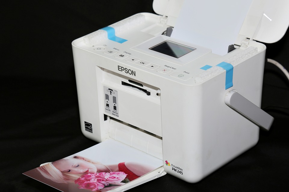
If you are not using the best printer, ink type and paper quality, your brilliant designs will not reflect into successful physical products. Most businesses make the mistake of investing in the graphic design part, while compromising on the final print quality. This is something that should be avoided at all costs. Make sure that whenever you are going to print business cards, you are doing it using the highest quality printers, inks/dyes and the best paper. This is what will help you achieve top-notch results for your business cards.

Now it is time to load the perforated sheets into your own printer, taking care to follow the instructions provided with the product. Go to the file containing your design and choose “Print,” which is typically found under the “File” tab. Run a practice print job of one sheet just to make sure that the design is well-aligned, prints clearly and looks the way you want it to. After this, print the rest of the sheets until you have the number of cards desired and then tear at the perforation lines. Verify that sufficient ink is available to create the full quantity so that you do not end up wasting the prefabricated card sheets.

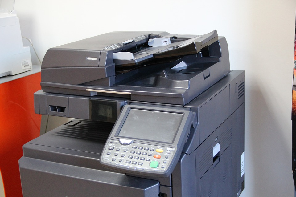
Also, take care to sit near the printer for the entire process so that you can keep an eye on print quality and address mechanical jams that can arise. The type and weight of business cards that can be done at home are limited due to the capabilities of most personal printers. If card material that is heavier than the printer can handle, jamming and potentially permanent damage can occur. Depending on the type of enterprise involved, using home-printed business cards may not be the wisest option, merely because they may be viewed as the mark of an amateur in the relevant industry. However, for certain other purposes, they fit the bill perfectly. If you are searching for an advance copier or printer for your business card needs, consider Advanced Business Copier, the #1 choice.

Read Also:

Content Rally wrapped around an online publication where you can publish your own intellectuals. It is a publishing platform designed to make great stories by content creators. This is your era, your place to be online. So come forward share your views, thoughts and ideas via Content Rally.

View all posts

Leave a Reply

Your email address will not be published. Required fields are marked *

Related

UX Design

Simplifying Finance: The Role Of UX Design In Financial Services

Exposure to financial services in this busy economic market is sky-high. However, not every financial service is up to the mark with its customer-centric approaches. In turn, FinTech is the next big thing in the financial world. Digital platforms are engaged in interacting and perceiving with the users. The innovative capabilities of FinTech applications largely determine user experience (UX). To make financial services more accessible and approachable to users, ux design financial services are far better than traditional complex financial services. The world of digital finance might seem intimidating to many for its complex terminology and lengthy processes. Moreover, a lack of customer-centricity is the main concern for many while dealing with the complex economic market. Simplifying finance is best possible through “Humanizing FinTech,” which is largely convinced with UX design. What is UX design? Well, at the core, the main terminology here is to define an intuitive design to embrace a better user experience and bridge the gap between financial services and users. Prominent Roles Of Ux Design In Financial Services The pivotal experience of financial service should be ecstatic for the users. It cannot be complex and boring. Financial aspects are already boring, and things need to be easy with digitalization. So, FinTech, through UX designs, can be more accessible and engaging for the users. Every financial sector is trying to solve the users' problems and manage the people's concern. Apart from that, a financial service cannot be vulnerable to its security aspects. However, the best part is that UX designs can provide you with a streamlined process to simplify financial services and engage better digital finance to ensure security while bridging the services gap with users. Bridge The Gap One of the main roles of UX design is to eliminate the gaps between user understanding and financial services. UX designers want users to understand the financial concepts and also become intuitive to the processes. What do you want? A boring spreadsheet? Or a colorful graph with pie charts? No one wants a boring data sheet that is complex to navigate and also not eye soothing. In contrast, UX designers help accomplish financial tasks quite easily for any user. For instance, transferring funds, managing insurance policies, and considering stocks are different financial services, but UX designs make it all easy for you to understand and navigate. No one wants to increase their learning curves while using financial services. Common people do not use complex financial data. They are unaware of the critical financial exposures but need to manage their finances instead. So, if you are using an app, you would like to get some attractive features that are easy to understand and ready to help you with colorful approaches. Well, demystifying complex financial data and presenting it easily to the users is the foremost priority of a UX designer. Focusing On User Trust And Security The role of UX design in financial applications is fostering customer loyalty and creating a positive user experience. However, gaining the audience's or users' trust in the FinTech industry is quite tough. Well, a streamlined process is the only solution to generate an intuitive design for a better user experience. However, it does mean anything to gain the trust of the users. If you want to trust them, you must focus on creating a better security process. For instance, if you use a biometric authentication process like facial recognition or fingerprint scanner, it can generate a better user experience. These are the ultimate solutions to present a user-friendly approach in advanced ways to engage people in a non-intrusive way. Reinforcing the trust of the people is best possible with UX designs like encrypted notifications and secure connections. So, it is time for you to foster user experience and gain their trust. Streamlining The Complex Financial Process The biggest role of UX design is to transform the traditional banking process into a digital landing platform. Well, what are the features of the traditional banking process? Lots of paperwork. Lack of transparency. Lengthy approval times. However, with digitalization, things are changing. Financial sectors are becoming more and more efficient in dealing with the instances of consumers and getting friendly. This is where digital landing platforms efficiently manage your concern with various features. Real-time updates. Time efficient services. Ensures transparency. The whole approach of UX design is to provide you better user experience by analyzing the streamlining process. So, now the loan approvals will be quick through digital applications, and you will also get the best seamless experience. Engaging User Satisfaction The difference between UX designers and graphic designers is that UX designers follow a user-focused and multidisciplinary approach. In contrast, Graphic designers maintain the curves with specialized pixel-focused consequences. Apart from that, emotional design, creative thinking, and prototyping are the common responsibilities of these designers. It is hard to believe that 90% of people stop using an app due to poor performance. So, a positive user experience with better quality and usability is expected. Enhanced user satisfaction with customization may increase the retention rate for a financial service. For instance, if you are using a banking app, you would like to check your account balance or transact money quickly. Now if it has an easy-to-use interface and you can work on it quickly, then you would like to keep the app on your phone. Digital financial services are difficult to avoid in this fast-paced world but also cumbersome to use in many cases. Finding a better UX-designed financial service is always a better resolution to avoid inconsistency and engage proximity. Read Also: Guide to Hiring a WordPress Developer 7 Advantages of Using Website Design Templates Why Prototype Design Is A Way To Make Your UX Design Perfect

READ MOREDetails
Board Artist

How Easy It Is Hiring A Story Board Artist?

Here we are talking about the easy ways by which you can hire a storyboard artist. But before getting into that let us tell you about exactly who are storyboard artists and what role they play and what is the agenda behind discussing them. A storyboard artist is a type of artist that makes a sequence of animated things that make it a film or a video which is used for the entertainment process. Storyboard artist usually is hired for the purpose of making animated short films or videos that are displayed before children. The process of storyboarding and evolution of storyboard artist emerged or was produced at the Walt Disney productions in the animation studios in the year 1930 and since then the animated movies are being made and for the sole reason of entertainment. Now if we talk about the purpose of making these movies in the earlier times these movies were telecasted on television but as far as today’s time is concerned, these movies are made for a special cause. Cause of hiring storyboard artists : We all are aware that today a lot of people are suffering from cancer and some of them even don’t have enough time or chance to combat the disease and they very well know the fact that one day they would be facing death. From those many people are also some kids that also suffer from cancer and have no expectation left of getting cured and have very less time left for embracing death. Hence it is our duty to make these children happy and also full the rest of their life left with happiness and as much as entertainment we can fill in their life so that they never feel afraid of their disease. This is a very noble cause as it imparts happiness to children and enables them to live a happy life. If you want to hire a storyboard artist you can just type famous frame artists and click here on the link provided to you. Hiring famous frame artists for a noble cause : We all know that kids love entertainment and animated movies hence by hiring storyboard artist we can make them watch the fun and entertaining animated movies which will fill their lives with happiness and this step would definitely impart a sweet smile on their face. Many NGO’s have already taken such steps to unite the public with such artist so that they can help the cancer patients in fighting the dreadful disease they are living and feeling in them daily. According to me this step taken by the socially active people who love serving mankind is extremely good and praiseworthy. Every child is special and a gift of God to mankind. And if in case they are going through any such condition their not is the duty of every individual to help them and encourage them to live their life with happiness and do something entertaining every day.    

READ MOREDetails
Custom Banner

How To Design Your Custom Banner That Works

Whether you want to attract new customers or promote an event, a custom banner can be a powerful way to drive your message. But how do you design one that works? The first step is to consider your marketing goal. Once you know what you're trying to achieve, all of your other decisions will fall into place. Here Are Four Prime Steps To Design Your Custom Banner: 1. Colors When designing a custom banner, you want to be sure to choose colors that will help grab your audience's attention. The wrong colors can make your banner look dull, while too many can take away from your message. When it comes to choosing the right colors for your banner, the best approach is to use bright hues that stand out against a neutral background. These can be anything from radiant yellow to fiery red. A contrasting color like this makes your sign more eye-catching and helps potential customers identify it from a distance. It also helps create a visual hierarchy to help your audience better understand what you're advertising. For example, a fast food chain might use a combination of yellow and red for advertising its products because it's easy for people to recognize and remember. It's also a great contrast to the black background of their logo. You should also consider the type of font you'll be using for your custom banner printing. If your banner is intended for a small business, for example, it might be best to stick with plain text that's easy to read from a distance. If your banner is intended for an event, a more detailed font might be a good choice. However, if you're designing a one-time-use banner, it's best to avoid putting too much information on it. This is because people don't have time to read a lot of information at once, so it's important to keep it brief. Generally, you'll want to have a big font for your primary message and smaller text for any additional information, such as a description of an event or a contact number. The next thing you should keep in mind when choosing colors for your custom banner is how far the colors will be from each other. The farther the colors are from each other, the more likely they'll be to confuse people or distract from your main message. For this reason, it's important to choose a background color that compliments your business theme and a font that's easy to read. A quality online banner printing company can provide you with advice and recommendations for the perfect colors and designs for your business. 2. Typefaces Custom banners are one of the most effective advertising mediums for reaching new customers. But it’s important to design them right. This means choosing the best typefaces and keeping them simple enough to be read quickly by people driving by or walking by your store. The most important thing to remember when designing your custom banner is to choose a font that’s easy to read. There are many different font types to choose from, and selecting the right one can make or break your design. There are five main types of typefaces: Serif, Sans-Serif, Script, Condensed, and Italic. Each has a unique personality and can be used for different purposes. Serif typefaces typically feature slight decorative strokes at the ends of letters, which give them a traditional appearance. They’re popular for brands and products that want to create a sophisticated, classy, and trustworthy image. Another important consideration is the typeface’s weight. Font weights range from thin (also called hairline or light) to black, with a lot of different options in between. Using too thick or too thin fonts can make it difficult for people to read your message, and can even confuse them. Using too light or too dark can also have the same effect, so it’s crucial to know which option is most suitable for your needs. The best fonts for a custom banner are those that are easily readable in all sizes. For example, Verdana is a widely used typeface that’s easy to read on smaller devices. Sans-Serif typefaces are generally preferred for large banner signs that will be seen outdoors. These fonts are usually bold, but they can also come in regular and italic styles. They’re often used for titles and call-to-actions, but they can be a bit on the thin side when it comes to body text. If you’re planning on adding a lot of copy to your custom banner, it may be best to use a font like Quattrocento Sans. If you’re looking for a banner that mimics the look of typewriter letters, Veteran Typewriter is a good choice. This font is easy to read and emulates the typewriter letters that are commonly found in magazines. 3. Backgrounds If you want to make sure your banner is eye-catching, the background is a key component. You can choose from a range of options, including illustrations, color overlays, and custom backgrounds. When choosing a background, keep in mind that the size of the image will affect how it looks when printed on your banner. The best type to use is a vector file since these files can be scaled without losing image quality. It's also a good idea to save your design as a flattened file in Photoshop or Illustrator before sending it to a printing company. Another important consideration is glare. If the background of your banner is too bright or dark, it can cause your logos to appear distorted. You can avoid this by using an off-white color for your background, which will absorb light and minimize glare. It's also a good idea to choose a background that complements the main text and logos on your banner. This will ensure that your brand's colors stand out from the rest of the background, and your logos will pop. A background can also help convey a specific message, such as a call to action. For instance, if your business is based at an unremarkable location, a colorful banner could help you draw attention to your building and services. The right banner will communicate your message quickly and clearly. Whether you're promoting a new event or announcing a product launch, it's important to make your banner easy to read from a distance. This means avoiding fonts that are too chunky and contrasting colors and sizes. To design your custom banner, start by selecting a template from Canva's collection. Once you've done this, you can add images and other elements to your design. Before you start adding your elements, take some time to think about your message and what action you want people to take after they see your banner. This will guide the rest of your design and ensure that your message is clear and impactful. You can use Canva's free templates to get started on your design, or you can create a more professional look with a paid account. The site has thousands of images, so you'll be able to find the perfect one for your banner. You can even search for specific graphics if you'd like to incorporate a specific piece of artwork into your design. 4. Images If you're designing a custom banner for your business, it's important to use images that will grab the attention of viewers. The right images will help your message get across, entice people to visit your site and encourage them to take action. When designing a banner, you can either use a pre-made template or create your own from scratch. There are several factors that go into designing a banner, including color, text size and placement, and image quality. One of the best ways to make your banner stand out is to use contrasting colors. For example, a white background with red or yellow text will draw the eye. This will also make your message pop out in a crowd of competitors' ads. You can also add photos to your banner from the Web by using an online image editor. Kapwing, for example, is a collaborative image and video editing platform that allows you to use copyright-free content from huge image libraries like Unsplash and Pexels. Once you've selected the photo you want to use for your custom banner, resize it to fit your dimensions. You can do this by using the "Resize" button on the toolbar or by manually inputting the appropriate picture sizes. After you've resized the image, it's time to decide on a background color. You can choose a color that fits your brand's colors or another neutral shade that complements your design. You can change the color of your background in several places, including the Banner Styling menu and in your template's guide. When deciding on a background color, be sure to consider the opacity of your banner's text and graphics. A light background will make your text and graphics harder to read and will be less noticeable, while a dark background can help the elements of your banner stand out from the rest of the page. Once you've finished selecting your background color, it's time to add text to your banner. You can add text with the Text tool (the big letter "T" in the toolbar), or by clicking on the banner to access its text editing bar. This way, you can add any text to your custom banner and modify its size, fonts, and colors. Read Also: How To Make Sure You Get The Best Service From Your IT Supplier 5 Content Ideas to Use with Instagram Influencers 5 Benefits of Digitalization in Marketing

READ MOREDetails