











In today’s digital landscape, mobile design dominates the web.
When you navigate to Facebook on a smartphone or a tablet, Meta automatically forces a lightweight, stripped-down mobile web version (://facebook.com).
While this truncated layout saves mobile data and speeds up loading times, it deliberately hides critical administrative settings and power-user privacy configurations. In addition, it hides the advanced Meta Business tools.
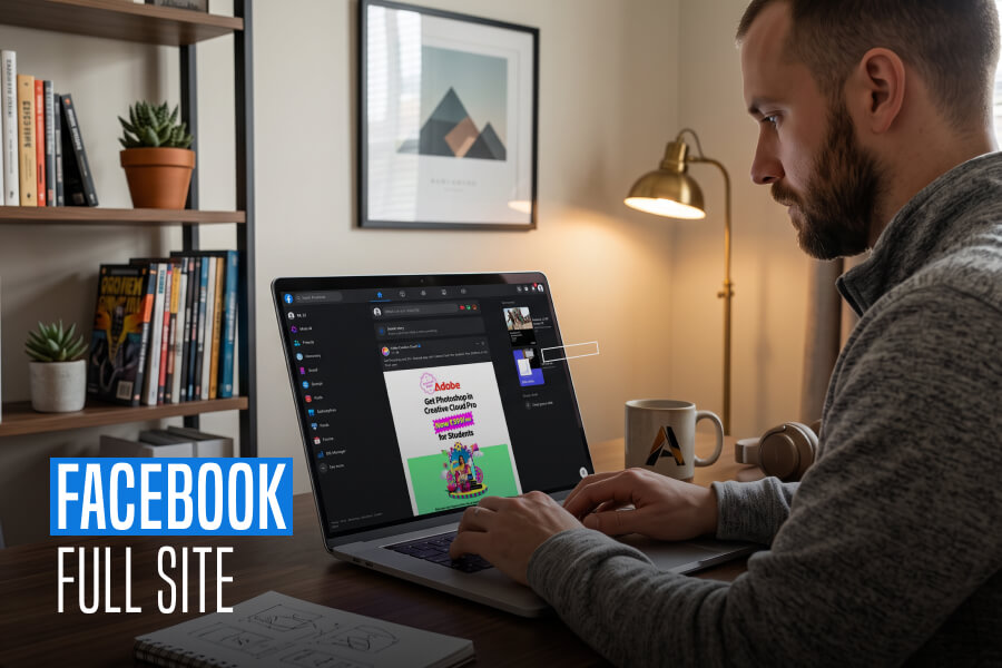
Fortunately, you are not locked into this restricted interface. You can bypass the standard mobile layout and load the Facebook full site directly through your smartphone’s web browser.
By doing so, you get total access to the exact desktop interface used on PCs and laptops. For example, you may need to fix broken notification groups, manage a professional business page, or use messaging tools.
That also without installing heavy secondary applications. As a result, the full site offers an instantaneous, zero-install solution.
This comprehensive guide will break down the exact technical methods, steps, and universal browser settings. These are requires to display the detailed desktop viewport layout on any iOS or Android device.
Direct Methods To Request The Facebook Full Site On Any Mobile Device
Loading the desktop interface on a handheld smartphone requires overriding your browser’s default User-Agent profile. This profile will identify your device to Meta’s servers as a smartphone.
Consequently, this prompts the server to push a mobile viewport.
By forcing a desktop request and editing the layout URL string, you can establish a stable connection to the Facebook full site dashboard.
Forcing The Desktop UI Inside Google Chrome (Android & iOS)
Google Chrome makes it incredibly simple to discard mobile-optimized designs in favor of full desktop architectures. Specifically, you can use these steps to launch the Facebook full site platform.
| Steps | Descriptions |
|---|---|
| Step 1 | Open the Google Chrome Mobile App on your smartphone device |
| Step 2 | Navigate directly to the standard Facebook Home URL |
| Step 3 | Tap the three-dot menu icon situated in the upper right-hand corner (Android) or lower right-hand corner (iOS) of your browser screen |
| Step 4 | Scroll down through the drop-down menu and check the box or toggle next to “Desktop site” |
| Step 5: The URL Override Step | If Chrome reloads but the URL bar still displays “://facebook.com,” tap the address bar, clear out the address, and manually type “://facebook.com” or “://facebook.com” to prevent the mobile system redirect. |
Activating The Full Layout Across Other Modern Browsers

Because different internet browsers handle website displays in their own way, forcing the desktop version requires distinct steps depending on your app choice.
Furthermore, changes implemented in 2026 have made Facebook's automatic mobile detection highly aggressive, making explicit manual workflows necessary.
Apple Safari Implementation For iPhone And iPad
If you use an iPhone or iPad, Safari is your default built-in internet browser.
Therefore, you must use the native layout engine tools to request the complete computer view.
- Step 1: Open the Safari app on your phone and head to the standard Facebook sign-in page.
- Step 2: Look at the address bar at the bottom or top of your screen and tap the “aA” icon on the left side.
- Step 3: Choose Request Desktop Website from the menu that pops up.
- Step 4: If the page reloads but still looks like a regular phone view, tap the address bar, clear it out and manually type in “://facebook.com”.
Mozilla Firefox Workflow For Android And iOS
Users with a preference for running Firefox on their mobile devices, switching to the desktop view will require a simple settings toggle.
- Step 1: Launch Firefox and type facebook.com into the main web address bar.
- Step 2: Locate the main menu button, which looks like three vertical dots on the edge of your screen.
- Step 3: Scroll through the options and turn on the switch next to Desktop site.
- Step 4: If the page fails to shift to the computer view, tap the address bar and re-type the link as “://facebook.com” to force the layout change.
Overriding Persistent Mobile Redirect Loops
Even after adjusting your browser settings, modern site filtering systems frequently deploy background detection codes to push mobile users right back to the phone view.
However, breaking out of these aggressive server loops requires cutting through saved network data that forces mobile design memory.
By executing a clean environment launch or clearing out old site records, you can keep the desktop display locked in place.
The Secret Computer Links
Facebook frequently attempts to push mobile web users back to the simplified phone view. If your browser keeps flipping back to the mobile layout despite your settings, it means your browser has remembered your old mobile session.
To completely break out of this loop, open a brand new Private or Incognito window in your browser and type one of these exact links directly into the top bar:
- https://www.facebook.com/home.php
- https://web.facebook.com/
- https://www.facebook.com/?theme=desktop
How To Reset Your Browser Memory
If using the links above still does not work, your browser's saved site memory is overriding your manual desktop requests.
Therefore, you must clear out this memory using the following simple path inside your browser settings:
- Open Settings: Go into your mobile browser's internal settings menu.
- Find Privacy Options: Locate and tap on the option labeled Clear Browsing Data.
- Isolate Cookies: Put a checkmark strictly next to Cookies and Site Data.
- Wipe Memory: Tap the final Clear or Clear Data button at the bottom of the screen.
Once this memory is wiped clean, activate your browser's "Desktop site" setting before typing the Facebook web address. This stops the website from labeling your device as a phone on your very first visit.
Key Benefits Of Using The Full Desktop Site On Mobile
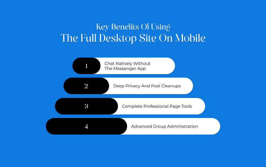
Using the full desktop layout to manage your social profile opens up a wide range of tools that phone screens block.
Chat Natively Without The Messenger App
The regular mobile website stops you from checking your inbox and forces you to download the separate Messenger app.
Alternatively, the full desktop view completely bypasses this rule.
As a result, you are allowed to read and send messages directly inside your phone's web browser. That also without downloading heavy extra applications.
Deep Privacy And Post Cleanups
The full layout opens up your complete Activity Log. This lets you delete old pictures and posts in bulk, view exactly who can see your profile details, and revoke permissions for sketchy third-party apps all from one dashboard.
Complete Professional Page Tools
Business owners and content creators cannot manage professional pages properly on a phone screen because detailed visitor stats and ad controls are hidden.
On the contrary, the full site layout displays your entire business dashboard so you can schedule posts and check ad metrics effortlessly.
Advanced Group Administration
Similarly, group owners can easily view pending member lists, set up automatic entry rules, hand out badges, and filter out comment spam using moderation panels.
Meanwhile, these are entirely missing from mobile apps.
Required Browser Versions For Absolute Stability
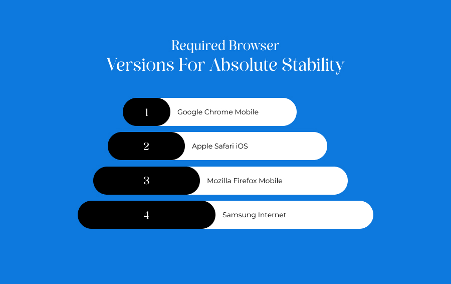
To load and handle a large computer website smoothly, your smartphone app must be reasonably updated.
Therefore, check your phone’s app store to ensure your browser meets these baseline versions:
- Google Chrome Mobile: Version 120 or newer ensures multi-window data routing and stops the website from automatically logging you out.
- Apple Safari iOS: Version 17.2 or newer supports advanced hardware viewport scaling and prevents the page layout from breaking.
- Mozilla Firefox Mobile: Version 122 or newer successfully hides your phone identity so the site thinks you are a PC.
- Samsung Internet: Version 23.0 or newer allows heavy, data-dense layout elements to load up without crashing.
Navigating A Desktop Layout On A Smartphone Touchscreen
Operating a massive website layout designed for a physical mouse and keyboard on a small touchscreen can be tricky.
However, you can make it much easier with two quick adjustments.
Tweak Your Internal Text Scaling
Instead of constantly pinching and zooming to read small text, use your browser's internal text tool.
Specifically, in Google Chrome, go to Settings, select Accessibility, and drag the text size slider. Do this until the print is perfectly legible without breaking the website columns.
Force Widescreen Horizontal View
Simultaneously, turn your smartphone sideways into landscape mode.
Consequently, this gives the website more horizontal room, tricking its layout into spreading out naturally across your screen. Moreover, this instantly stops text from overlapping and makes tiny links far easier to press.
Quick Fixes For Common Desktop View Problems
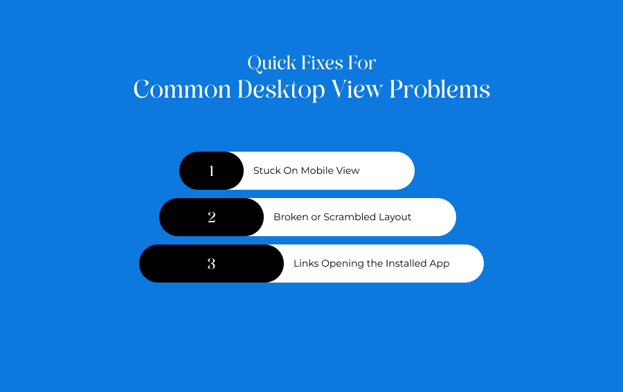
When forcing the computer view, you might run into minor layout bugs. Use this quick troubleshooting guide to fix them instantly.
- Stuck On Mobile View: Your browser has saved the mobile view in its temporary memory. Fix this by clearing your browser cookies and using an Incognito tab to load the site.
- Broken or Scrambled Layout: Your phone screen is physically too narrow to fit the text boxes side by side. Fix this by turning your phone horizontally into landscape mode to widen the screen view.
- Links Opening the Installed App: Your phone's internal settings are forced to open all Facebook links inside your downloaded app. Fix this by holding your finger down on the web link for two seconds and selecting Open in New Tab.
Data Consumption And Battery Safety Warnings
Running a full computer webpage on a small smartphone uses up a massive amount of phone resources.
Since computer layouts do not compress images or pause background tasks like mobile pages do, they consume roughly five times more internet data. Additionally, they draw heavily on your phone battery.
Because of this high resource drain, it is always best to use this workaround while connected to an unmetered Wi-Fi network.
If you absolutely must use your mobile data plan, close the browser tab the moment you are done to stop background activity from eating up your monthly data allotment.
Browser Updates And Website Layout Disclaimer
Web layouts, structural layers, and browser setups are updated constantly by their respective companies.
Therefore, the step-by-step instructions detailed throughout this guide are based on how mobile browsers and Facebook interact at this given time.
Since Meta regularly shifts its background layouts and tracking systems to keep mobile users on mobile screens, specific menu names, buttons, or links may move in future updates.
If a saved link format suddenly stops working for you, check your app store to ensure your browser app is updated to its newest possible version.
Additional Reading: