SEO Website Design Tips for Small Businesses

Published on: 10 February 2021 Last Updated on: 26 December 2024
Website Design

As a small business owner, you may feel like you need to do everything at once. Build your site, generate great content, advertise, keep up with search engine algorithms, learn who your audience is, learn who your competition is – and on and on that list goes. At these stressful moments, it is important to step back and remember the adage “slow and steady wins the race”. Your business wasn’t built overnight, and neither will your digital marketing be.

The key to effectively marketing your small business is knowing where to put your efforts first. Website design is one of the most important elements of that and is a great place to start. Once you have the basics of your web design ironed out, you can do more work here and there to complete your digital marketing strategies over time.

Not sure where to start? Our Nashville web designers offer six tips for getting started.

SEO Website Design Tips for Small Businesses

1. Learn how Google Crawls Your Site

As you are building your website and planning for your future in digital marketing, it is important to understand how Google crawls your site. That means understanding what it is that Google looks for on websites when they rank them in search engine results. Google’s algorithms change routinely, but there are a few concepts that are always the same – such as SEO and website design.

When ranking websites, Google looks at factors like:

  • Utility and usability (user-friendliness, page load speed, graphics loading, etc.)
  • Content (quality long-form content)
  • Long-tail keywords
  • Related key terms
  • Backlinks
  • Internal linking strategy
  • Optimized media

2. Choose a Clean and Simple Layout

As you get started with website design, one of the best ways to start is by choosing a clean and simple website layout. You want users to be attracted to your site and engaged with it, but you don’t want it cluttered or distracting. Choose a design that speaks to your brand and mission. Choose a color scheme that matches your logo and branding. Make sure your font is easy to read.  Use the same template style for all pages.

3. Make Sure Your Site Performs

Yes, Google crawls and ranks based on SEO, but they also crawl and rank based on performance. That means you should make sure your site is optimized for fast page load speed, mobile use, and image speed. If your site only works on a computer, you will lose an endless number of possible mobile users.

4. Use a Consistent Layout and Formatting

Web design is just one aspect of building your brand. You should make sure that your website layout and formatting is consistent with other marketing materials, such as social media. Being consistent helps you establish your brand and makes you easily recognizable to customers from various platforms.

5. Use Every SEO Opportunity

Search engines match up results with websites based on their optimization and relevance to the search term. That means you should use every SEO opportunity you have. That means including your keyword in the page title, meta description, and URL. If your page is titled “Best Dog Toys”, your meta description should include that phrase, and your URL should be something akin to www.yoursite.com/best-dog-toys.

6. Add Alternative Text on Your Images

Alternative text, or ALT text, is an SEO tactic that seems small but can have big results. When you add an image to your webpage, you will have an option to add ALT text or an ALT tag. You want to put your keyword in that box so that search engines know that your image also links to your keyword for the page. Your images are indexed just like content.

Put It All Together

As you can see, there are many aspects to web design. For a small business, one of the best things you can do is to make a plan for where you will start and what goals you want to accomplish here and there. By using these six tips as you build your website, you will have a solid foundation for your digital marketing that will last a long time. For the latest trends and challenges in SEO click: https://whitepeak.io/blog/seo-trends-challenges-2022/

Read Also:

Content Rally wrapped around an online publication where you can publish your own intellectuals. It is a publishing platform designed to make great stories by content creators. This is your era, your place to be online. So come forward share your views, thoughts and ideas via Content Rally.

View all posts

Leave a Reply

Your email address will not be published. Required fields are marked *

Related

Rago Fabrication Website

Seen the Rago Fabrication Website Guides & Videos?

I’ve got a 4Runner and I ordered an antenna mount for my new CB radio from the Rago Fabrication website. It took a couple of days to arrive and I was struck when I opened the packaging that the product itself was nice and robust and of high quality. I got to the weekend and I had a spare afternoon to try and install myself - as I wanted to save on the cost of having it professionally done. The problem is that I couldn’t quite work out how it bolted onto my Toyota, so I kinda thought “that was that” and that I should start calling around for a company to put it on for me. However, before I made that booking, I went back to the Rago Fabrication website to see if there was any help I could get. I was very pleasantly surprised. An Extensive Range of Install Guides & Videos: Most commercial websites out there will have some kind of FAQs section or an email address you can contact for post-sales support and whilst Rago’s site had one too, it also had much, much more. I don’t mind telling you that it blew my mind a little. I quickly found a video guide that detailed exactly how to fit my antenna mount in minute detail, so I was able to finish the fitting job myself and save quite a few dollars into the bargain. It wouldn’t be a stretch to say that the Rago Fabrication website over-delivered and then some! After I finished what I had to do for my vehicle, I went back again to see what else they had. I found video after video after guide after guide for customers to use for a wide range of products. It seemed that whatever product they sold, there was a way for those less technically minded to take care of their own installation. In fact, I found out that they have an entire YouTube channel dedicated to helping their customers. You can see it yourself by clicking this link. I Think Customer Service Really Matters: The quality of any merchandise you buy online is important - of course, it is. However, what also matters to people like me (and I think I speak for a lot of people) is great service. What these guides and videos have done for me as a customer is ensured that I go back again because I know I’ll be looked after. When a company takes this much care in providing these ‘how-to guides, it makes you realize that they’re going to be conscientious in lots of other areas too, like offering the best products. I Know Where I’m Going Next Time! I’m going to be upgrading and enhancing my 4Runner more over the next couple of years - as it’s a fun and enjoyable thing to do. What I know is that I’m going to be going back to the Rago Fabrication website again, as I now know what to expect - exactly what I need. Where you go is your prerogative, but if they don’t offer all of this great after-service, then I think you know where to go. Read Also: 7 Rules of Effective Ecommerce Web Design 5 Key Signs of Genuine Kundali Software Tips to Choose the Best Inventory Management Software Why Contract Management Software Is Essential for Your Tech Company

READ MOREDetails
Exploring Strategies For Engagement And Conversion

Interactive Website Tools: Exploring Strategies For Engagement And Conversion

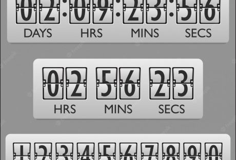
Beyond the aesthetics of modern web design lies a realm of functionalities designed to entice, intrigue, and encourage action. It's not just about displaying information anymore; it's about creating a dynamic dialogue between the site and its visitors. From clever countdown widgets that build anticipation to popups that capture attention at just the right moment, interactive tools are redefining the digital journey. As you embark on this exploration, you'll discover how these tools can be the key to not only attracting eyeballs but also driving tangible results. So, are you ready to unlock the next level of online engagement and conversion? Let's dive deeper. Interactive Tools For Websites: Why It Is Crucial In the vast universe of the Internet, websites often face the challenging task of standing out amidst a sea of competitors. It's no longer enough to simply be online; success hinges on how well a website can interact with its users. This is where interactive tools make a monumental difference. The Link Between Engagement And Conversion Every click, scroll, or hover on a website tells a story — a story of a user's journey from a curious visitor to a potential customer. Engagement is the first step in forging a connection. When visitors are actively interacting, they're investing their time and emotion into what the site has to offer. This active participation paves the way for conversions, whether it's signing up for a newsletter, making a purchase, or any other desired action. Simply put, higher engagement can often translate into higher conversion rates. Benefits Of Interactive Features For Visitors And Businesses For visitors, interactive features offer a personalized, immersive experience. Instead of passively consuming content, they're invited to participate, making their online journey more memorable and impactful. Whether it's a quiz that offers tailored product recommendations or a chatbot providing instant support, these features make the user feel valued and understood. For businesses, the advantages are manifold. Interactive tools can lead to increased dwell time, providing more opportunities for branding and message reinforcement. They offer valuable insights into user behavior, preferences, and pain points, allowing businesses to fine-tune their strategies. Pioneering Engagement Tools: A Closer Look Delving into the world of pioneering engagement tools reveals a medley of innovative strategies designed to enthrall users and drive conversions. Here's a closer look at some game-changing tools that have redefined the way we interact online. Countdown Widgets How They Work: At its core, countdown widgets for websites are digital timers, ticking away the seconds and minutes of a particular event or deadline. Be it heralding the launch of a new product, highlighting the end of a sale, or marking the start of a webinar, these widgets play on human psychology. The ticking clock creates a palpable sense of urgency and anticipation, compelling users to act before time runs out. To maximize the effectiveness of countdown widgets, it's crucial to employ them judiciously. Overuse can desensitize users to a sense of urgency. Moreover, always ensure that the event or deadline you're counting down to holds genuine value for the user. Pairing the widget with compelling visuals and concise, action-driven text can further amplify its impact. Popups [caption id="" align="alignnone" width="2400"] Popups[/caption] Different Types Of Popups: Popups are versatile tools that can serve various functions. Informational popups. These are designed to update users about essential website changes or privacy policies. They're typically concise and straightforward, ensuring users are informed without overwhelming them. Promotional popups. They are the digital equivalents of storefront sale signs. These might advertise a limited-time offer or discount. Feedback popups. They might ask for star ratings, brief comments, or even detailed reviews, helping businesses understand their strengths and areas of potential enhancement. Email subscription popups. These popups invite users to stay connected by subscribing to newsletters, updates, or exclusive offers. Exit-intent popups. Triggered when the system detects a user is about to close the tab or navigate away, exit-intent popups present a final, compelling offer or message. The key to popups is moderation. Bombarding users with incessant popup messages can swiftly turn intrigue into irritation. Timing is crucial. For instance, an exit-intent popup can be a last-ditch effort to retain their attention. Similarly, understanding the user's journey can help in strategically placing popups for maximum effectiveness without being intrusive. Interactive Surveys And Quizzes Surveys and quizzes engage users actively, making them feel part of a two-way conversation. When a user takes a quiz, they're not just absorbing information; they're sharing insights about their preferences and needs. This enables websites to tailor content and offers precisely to the user, enhancing relevancy and driving engagement. Beyond personalization, these interactive tools are goldmines of data. By analyzing responses, businesses can pinpoint audience segments, refine product offerings, and sharpen their marketing tactics. In essence, every user interaction becomes an opportunity for businesses to learn, adapt, and evolve. Live Chat Features Live chat serves as a digital concierge, connecting users with businesses in real time. No more waiting on hold or navigating through tedious email threads. With just a click, users can pose questions, raise concerns, or simply chat, fostering a sense of immediacy and personalized attention. Gamification Elements   Games aren't just for fun; they're powerful engagement drivers. By incorporating gamification elements like points, badges, or leaderboards, websites transform mundane tasks into exciting challenges. Whether it's completing a profile, sharing content, or making a purchase, gamification rewards users for their actions, making their digital journey feel more like an adventure than a chore. User Testimonials And Reviews Nothing vouches for a brand like the voice of its customers. User testimonials and reviews provide an unfiltered glimpse into real experiences, offering prospects both validation and reassurance. These authentic narratives, beaming with praise or constructively critical, solidify a brand's credibility, paving the way for trust and long-term loyalty. Avoiding Overwhelm: Less Can Be More In the intricate dance of digital engagement, it's not always about having more tools, but about wielding them wisely. While it might be tempting to incorporate every interactive feature available, bombarding users with too many stimuli can lead to cognitive overload. It's like walking into a room with blaring music, flashing lights, and a crowd vying for your attention all at once. The key is to curate and prioritize. A well-placed popup can be effective, but combine it with constant notifications, quizzes, and live chat prompts, and you risk alienating the user. Remember, the goal is to guide and engage, not to overwhelm. By being discerning in our choice of interactive elements, we can ensure that users not only stay but also enjoy their digital journey.

READ MOREDetails
Custom Banner

How To Design Your Custom Banner That Works

Whether you want to attract new customers or promote an event, a custom banner can be a powerful way to drive your message. But how do you design one that works? The first step is to consider your marketing goal. Once you know what you're trying to achieve, all of your other decisions will fall into place. Here Are Four Prime Steps To Design Your Custom Banner: 1. Colors When designing a custom banner, you want to be sure to choose colors that will help grab your audience's attention. The wrong colors can make your banner look dull, while too many can take away from your message. When it comes to choosing the right colors for your banner, the best approach is to use bright hues that stand out against a neutral background. These can be anything from radiant yellow to fiery red. A contrasting color like this makes your sign more eye-catching and helps potential customers identify it from a distance. It also helps create a visual hierarchy to help your audience better understand what you're advertising. For example, a fast food chain might use a combination of yellow and red for advertising its products because it's easy for people to recognize and remember. It's also a great contrast to the black background of their logo. You should also consider the type of font you'll be using for your custom banner printing. If your banner is intended for a small business, for example, it might be best to stick with plain text that's easy to read from a distance. If your banner is intended for an event, a more detailed font might be a good choice. However, if you're designing a one-time-use banner, it's best to avoid putting too much information on it. This is because people don't have time to read a lot of information at once, so it's important to keep it brief. Generally, you'll want to have a big font for your primary message and smaller text for any additional information, such as a description of an event or a contact number. The next thing you should keep in mind when choosing colors for your custom banner is how far the colors will be from each other. The farther the colors are from each other, the more likely they'll be to confuse people or distract from your main message. For this reason, it's important to choose a background color that compliments your business theme and a font that's easy to read. A quality online banner printing company can provide you with advice and recommendations for the perfect colors and designs for your business. 2. Typefaces Custom banners are one of the most effective advertising mediums for reaching new customers. But it’s important to design them right. This means choosing the best typefaces and keeping them simple enough to be read quickly by people driving by or walking by your store. The most important thing to remember when designing your custom banner is to choose a font that’s easy to read. There are many different font types to choose from, and selecting the right one can make or break your design. There are five main types of typefaces: Serif, Sans-Serif, Script, Condensed, and Italic. Each has a unique personality and can be used for different purposes. Serif typefaces typically feature slight decorative strokes at the ends of letters, which give them a traditional appearance. They’re popular for brands and products that want to create a sophisticated, classy, and trustworthy image. Another important consideration is the typeface’s weight. Font weights range from thin (also called hairline or light) to black, with a lot of different options in between. Using too thick or too thin fonts can make it difficult for people to read your message, and can even confuse them. Using too light or too dark can also have the same effect, so it’s crucial to know which option is most suitable for your needs. The best fonts for a custom banner are those that are easily readable in all sizes. For example, Verdana is a widely used typeface that’s easy to read on smaller devices. Sans-Serif typefaces are generally preferred for large banner signs that will be seen outdoors. These fonts are usually bold, but they can also come in regular and italic styles. They’re often used for titles and call-to-actions, but they can be a bit on the thin side when it comes to body text. If you’re planning on adding a lot of copy to your custom banner, it may be best to use a font like Quattrocento Sans. If you’re looking for a banner that mimics the look of typewriter letters, Veteran Typewriter is a good choice. This font is easy to read and emulates the typewriter letters that are commonly found in magazines. 3. Backgrounds If you want to make sure your banner is eye-catching, the background is a key component. You can choose from a range of options, including illustrations, color overlays, and custom backgrounds. When choosing a background, keep in mind that the size of the image will affect how it looks when printed on your banner. The best type to use is a vector file since these files can be scaled without losing image quality. It's also a good idea to save your design as a flattened file in Photoshop or Illustrator before sending it to a printing company. Another important consideration is glare. If the background of your banner is too bright or dark, it can cause your logos to appear distorted. You can avoid this by using an off-white color for your background, which will absorb light and minimize glare. It's also a good idea to choose a background that complements the main text and logos on your banner. This will ensure that your brand's colors stand out from the rest of the background, and your logos will pop. A background can also help convey a specific message, such as a call to action. For instance, if your business is based at an unremarkable location, a colorful banner could help you draw attention to your building and services. The right banner will communicate your message quickly and clearly. Whether you're promoting a new event or announcing a product launch, it's important to make your banner easy to read from a distance. This means avoiding fonts that are too chunky and contrasting colors and sizes. To design your custom banner, start by selecting a template from Canva's collection. Once you've done this, you can add images and other elements to your design. Before you start adding your elements, take some time to think about your message and what action you want people to take after they see your banner. This will guide the rest of your design and ensure that your message is clear and impactful. You can use Canva's free templates to get started on your design, or you can create a more professional look with a paid account. The site has thousands of images, so you'll be able to find the perfect one for your banner. You can even search for specific graphics if you'd like to incorporate a specific piece of artwork into your design. 4. Images If you're designing a custom banner for your business, it's important to use images that will grab the attention of viewers. The right images will help your message get across, entice people to visit your site and encourage them to take action. When designing a banner, you can either use a pre-made template or create your own from scratch. There are several factors that go into designing a banner, including color, text size and placement, and image quality. One of the best ways to make your banner stand out is to use contrasting colors. For example, a white background with red or yellow text will draw the eye. This will also make your message pop out in a crowd of competitors' ads. You can also add photos to your banner from the Web by using an online image editor. Kapwing, for example, is a collaborative image and video editing platform that allows you to use copyright-free content from huge image libraries like Unsplash and Pexels. Once you've selected the photo you want to use for your custom banner, resize it to fit your dimensions. You can do this by using the "Resize" button on the toolbar or by manually inputting the appropriate picture sizes. After you've resized the image, it's time to decide on a background color. You can choose a color that fits your brand's colors or another neutral shade that complements your design. You can change the color of your background in several places, including the Banner Styling menu and in your template's guide. When deciding on a background color, be sure to consider the opacity of your banner's text and graphics. A light background will make your text and graphics harder to read and will be less noticeable, while a dark background can help the elements of your banner stand out from the rest of the page. Once you've finished selecting your background color, it's time to add text to your banner. You can add text with the Text tool (the big letter "T" in the toolbar), or by clicking on the banner to access its text editing bar. This way, you can add any text to your custom banner and modify its size, fonts, and colors. Read Also: How To Make Sure You Get The Best Service From Your IT Supplier 5 Content Ideas to Use with Instagram Influencers 5 Benefits of Digitalization in Marketing

READ MOREDetails