Top Pages Report: Web Pages With Most Traffic and Engagement

Published on: 03 August 2021 Last Updated on: 11 September 2024
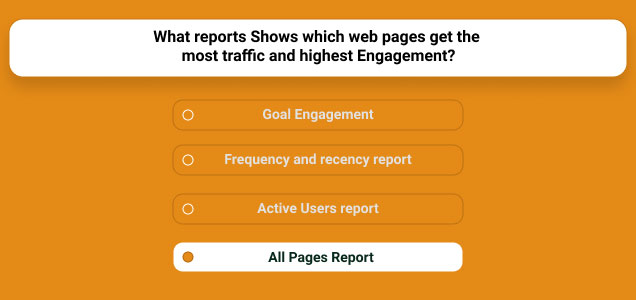
What Report Shows Which Web Pages Get The Most Traffic And Highest Engagement

What report shows which web pages get the most traffic and highest engagement? Google Analytics is the treasure trove of information, and with the help of this, marketers analyze the performance of their website from time to time. 
Web Pages Get The Most Traffic And Highest Engagement

In this article, I will explain in detail how Google Analytics Page Reports helps you access the performance of your content and the actions visitors take on your site. 

What Report Shows Which Web Pages Get The Most Traffic And Highest Engagement?

The answer to your question What report shows which web pages get the most traffic and highest engagement? is All Pages Report

This ‘Pages Report’ displays the top pages on your website based on traffic, page value, % exit, bounce rate, entrances, average time on page, unique page views, and each page’s page views.

At the same time, this report is going to help you to find quick and low-performing or low-quality pages that should be upgraded to enhance your content marketing strategies in the long run. 

Now, you need to understand that there is some difference between landing pages and all pages in Google Analytics. All Pages Report will show you the entire performance of your website, whereas landing pages will show you how people entered your website. 

How Can Pages Report Help You To Optimize Your Content?

Pages Report Help You To Optimize Your Content

Pages Report will help you to quickly view the top content along with the average amount of revenue each page makes. In addition, this report helps you determine what content performs best on your website.

At the same time, you will be able to view the top content section via this report. Keep in mind that this report will help you know where visitors are interacting with the events. This way, you will be able to determine both low quality and top pages on your website.

The low-quality or outdated pages can be improved with dates, images, videos, or even you can add the latest infographic to make the content more useful for the audience. Thus, this way, Pages Report can help you to optimize your content to a great extent.

Sample Site Content Report In Google Analytics

The site content reporting sections contribute unique content-focused views revealing how users can interact with your site content. 

1. Exit Pages Report: 

Report that highlights data related to where users leave your site form. This report is useful in calling the attention pages which should be given the most priority to drive traffic to your website.

On the other hand, it’s excellent that some pages should be left often that include high traffic pages, goal confirmation pages, order confirmation pages, etc. 

2. Landing Pages Report: 

Landing Pages Report

This report focused on examining landing page metrics and behavior. It analyzes pages from the view of how often your visitors are landing on your website and what their duration is. 

Moreover, landing pages are great for distinguishing which pages have the highest and lowest bounce rates. You can also identify conversions from this report. 

3. All Pages Report: 

Report that provides behavioral stats on every single page of your site. This includes page value, exit, entrances, time on page, page views, etc.

All Pages Report is one of the most important portions of Google Analytics that helps to improve the performance reports of your website. 

The Final Thoughts 

All Pages Reports is the answer to your question what report shows which web pages get the most traffic and highest engagement. I have tried my best to explain to you in detail about Google Analytics Page Report and its uses for your website. Besides, if you come across any doubts, please don’t hesitate to mention them in the comment section below!

More Resources:

Content Rally wrapped around an online publication where you can publish your own intellectuals. It is a publishing platform designed to make great stories by content creators. This is your era, your place to be online. So come forward share your views, thoughts and ideas via Content Rally.

View all posts

Leave a Reply

Your email address will not be published. Required fields are marked *

Related

Service Delivery Website

Winning Tactics To Build A Competitive Service Delivery Website

People usually search online when they require some services. To succeed as a service provider, one cannot afford to lag in this globally competitive market and increasingly innovative environment. The traditional marketing method cannot match up with the increasing global consumers' demand for quality and professional Service Delivery Website; hence, the need for an efficient service_based website. A quality and professional website does not just reflect information concerning a company's brand but a platform where consumers (customers) can relate adequately to any business organization. A well-articulated and professionally designed service_based website is capable of drawing online traffic to a business. This is due to desirable and emotionally appealing features which satisfy the yearnings and expectations of customers. Whether as a product_based website or service_based website, a professionally designed website plays a significant role as a global selling point. To get more information about a professionally designed website, check out  this  link: https://careerfoundry.com/en/blog/web-development/what-is-a-full-stack-web-developer A Service Delivery Website: A service_based website is a website designed for service rendering and not for product rendering purposes. It is intended for convincing and attracting internet users toward services rendered by a business organization. A professionally designed website for service delivery is to sell the individual or individuals behind the organization to the world. Since organization rendering services do not produce physical products but services such as finance, legal, hospitality, or entertainment, a service_based website presents the concepts and ideas of the man behind the business. The following principles can promote a professional website designed for service delivery; though some of them can as well support product_based site; Foundation Laying and Background Design: A professional business website will target the right customers; this forms the bedrock or foundation for designing a service_delivery website. The professionalism behind any service delivery website design will address the uniqueness of customers for which it was intended. The layout feature of a service_based website can have a single_pager or multi_pager outlook depending on the choice of the business owner. A single or one_pager design has one menu item leading to different sections or categories of the same page. The multi_pager design has different unique pages for each part of the website. However, the single or one_pager design has been found and recommended for new businesses or service delivery organizations due to its simplicity and secure management. Website Branding: A professional service delivery website speaks much about the individual or individuals driving the organization and not any physical product. So, a service_driven website must have useful concepts that relate to certain features of an organization such as domain name, logo, and visual representation. The domain name of a professional service delivery website must be very strategic to the principle and the mission of a business organization. The business logo as small as it may be, speaks volumes and should be reflected on the website design because it is a good selling point. The visual and color representation of a service delivery firm should be attractive and appealing to the emotions of online visitors who visit the site. Inclusion of Relevant Pages: A service delivery website can have many contents, but it should be professionally managed and structured to contain only essential and relevant pages. This section is highly critical and demanding because this is where the visitors interface and interact more with a business on the web. For instance, the home page is the first point of contact with a business organization online. It should be inviting and appealing to would_be customers but must pass the necessary information about the organization to the visitors. Though the number could be many, the relevant pages associated with a service_based website are; About page. This shows the personal description and background of oneself and the organization. The contact page is also vital as it is dedicated to reaching the business or the company's representatives through phone numbers,e_mails, fax, and social media channels. Service and Booking Feature: This is a very crucial part of service delivery website design because it's a section that requires customers to take individual decisions as regards the service rendered by a business organization. This requires that the services be well analyzed with necessary action to be made by clicking some service buttons. This includes negotiating prices, types of services rendered, and booking an appointment with the organization. Payment options available to customers and; how, when, and where the service will be provided are also spelled out. Testimonial and Quality Ratings: This is a section where satisfied previous customers express their views and assessments concerning the services rendered by the organization. They reveal their experiences with the services, which can also be star_rated based on what they got. Positive testimonials from previous customers will encourage new ones the organization for its services.  Feedback Channels: Feedback channels such as FAQ and the client's chat menu are essential in service delivery websites. Businesses can welcome customers' complaints and views and take proper actions to address them. Also, building a host community of loyal customers through social media outlets such as Facebook, Twitter, Instagram, and blog is essential to expand the scope of the service. Mobile Compliant Website: A professional service_based website should be mobile-friendly. It should be designed to work not only on PC's and laptops but with mobile phones. This creates unlimited access to a business by customers at any point in time. Website Promotion: It is not enough to launch a service delivery website, but it should be promoted to drive it towards the target customers. Although this can require the cost of promotional fees to be paid by the business owner. However, there are website promoters who offer low-cost promotional fees online. In conclusion, service delivery organizations do not sell physical products but ideas and concepts which require critical thinking to launch and promote online services. It is imperative, therefore, for service rendering organizations to pay more attention to building professional websites that can best promote their services. Read Also: What Are the Common Causes of Catastrophic Injuries? Top 5 Sites Like Solarmovie To Watch Movies Online Do I Have To Pay Out Of Pocket For Wisdom Teeth Removal?

READ MOREDetails
Ecommerce Web Design

7 Rules of Effective Ecommerce Web Design

Without a doubt, one of the most crucial parts of running a business — especially a business focused on eCommerce — would be to design the best possible website for online shoppers. If anyone is looking for proof that Atlanta web design is not to be underestimated, all they would have to do is look at how 2020’s holiday season has affected online business. There were so many online shoppers that any ecommerce website owner who managed a few best-practice methods benefited and made a lot of money. The use of Minneapolis web design is a great way to get started, though it pays to understand how web design can affect a business. While there are undoubtedly plenty of different ways to maneuver a company to success, most business owners simply have to worry about the overall optimization of the website. Here are seven rules of effective eCommerce web design that are crucial to the success of just about any eCommerce company. How a simple headline can catch the necessary attention For the most part, the only thing the business owner has to worry about would be attracting online visitors that intend to shop on the website. If the website owner has the necessary products and services, all that matters is to make them click past the homepage and toward a successful purchase. To get the job done, a succinct header is crucial. As a rule of thumb, try to get the point across in as few words as possible. Keep in mind that most online users do not have the patience to bother with a website that beats around the bush. A headline that gets to the point will let those in need of the company’s products know that they can find what they want within. Are the loading times acceptable? Keep in mind that an inspired website is not necessary to realize the full potential of eCommerce web design. Instead, it would be best to allow for simple designs that help users navigate quickly to what they need. Otherwise, they could lose patience and click away. Complicated web design is unnecessary, and could prove to be counterproductive if the store owner is not careful. For example, the use of widgets can often make the experience a little more fun and engaging for the user. However, keep in mind that the website is meant to sell products. Liberal use of site accessories will only bog things down. There are also the images to consider, as it is mandatory to utilize high-quality images, but resolutions that are much too high will also cause slow loading times. Study the bounce rate of the website The bounce rate is how likely an online user is to leave a website upon first viewing the home page. A high bounce rate means that most people are leaving before venturing further, which does not bode well for any eCommerce store owner. To help improve the bounce rate, there are a couple of things to consider. The headline has already been mentioned above, though there are quite a few more best-practice methods. Having programs that can help gather the bounce rate will help store owners figure out where they stand. Focus on the mobile app Without a doubt, if there is one thing most eCommerce stores have learned from the previous holiday season, it is that the mobile platform matters. While most people are staying at home, they still prefer using their smartphones over their computers, which means stores are leaving a lot of revenue out of the table by choosing to focus only on the browser experience. If the business owner wants to ensure that they future-proof their eCommerce website, it would be ideal to work on a mobile platform as soon as possible. Keep in mind that all of the web design tips for browsers count for the mobile platform. Keep the loading times low, and ensure that the header gets straight to the point! Ensure the website is easy to navigate! Even if the website might have all the products an online user needs, it will mean nothing if they can’t easily find it. Most people will choose to look for another store over having to jump through hoops to get what they need, which means a complicated design is out of the picture. Ensure that online shoppers have a quick and painless way to get to the products they need. Content marketing matters more than you might think! Making use of quality companies such as Minneapolis web design often shows businesses that there needs to be more in their online store than just a means to purchase products and services. Some online shoppers want to be encouraged to make the purchase, which is where content marketing comes in. The right type of content marketing involves relevant articles that can encourage users to purchase the products. It will not do to have subpar content for the website — all the content has to be unique and informative. It might take some doing, but it is well worth the effort. Stay consistent and vigilant Last but certainly not least, it is crucial to be as consistent and vigilant when it comes to matters involving web design. For example, having content marketing through blogs and articles are great, but it is also possible to elevate the content by adding videos. For those who are involved with link building through search engine optimization (SEO), ensure that there are no broken/dead links. The more the business owner can link toward their website, the easier it will be for others to find. Most online shop owners will be relieved to find that quality web design is more about keeping disciplined than having to learn various skills to get the job done. It can be even easier with the help of trained professionals, though the true magic of web design is that it is more than possible with a few best-practice methods. Effective eCommerce web design is all about simplicity and ensuring that online shoppers are happy with their visit. For further valuable insights on engaging a website design team, please explore this link: https://linkupst.com/services/hire-product-designers. Read Also: Tips to Explain with Your Web Designer for Starting the Job Functionality – an important aspect of good web design: Sydney digital marketing services for your growth 7 Advantages of Using Website Design Templates

READ MOREDetails
Website Design Company

Tips on Building Your Resume for a Website Design Company

Have you ever spent too much time staring at a blank document, just wondering how you can start your resume? Whether it’s your first one or your twentieth attempt, it’s safe to assume that you’re not unfamiliar with the concept of a resume. A website design company or best website design agencies will always seek for your technical skills in your resume before they hire you. Alright, now how about this: Are you someone looking to work in the tech industry? Or have you already found a stable job and you just want to know how to keep your resume updated? Because in this current market, nothing is secure. Much as you tried to prepare for the best, you also have to brace yourself for the worst. For a company to consider your application, your resume has to blow the socks off the employer. If done correctly, you can market yourself through your resume.  Tips on how to build your own resume for a website design company There are several tips you can follow for developing a resume for a website development company. You just need to follow these steps one after the other. 1. Research A lot of employees try to make one generic resume for all applications. That’s not exactly wrong, but there’s a better way to do it, and that’s to tailor each of your resumes to the company you’re applying for. Look at the job description carefully and try to see if it really does fit you and if your experiences will make you a strong candidate for the position. Research about the company and find that sweet spot on how you can tailor the voice and tone of your resume to speak to them. 2. Format Keep in mind that the hiring managers have probably seen hundreds of applications which may even have some of the best resume templates. Chances are, they are also experts in web design themselves. Making your resume flashy isn’t going to cut it. These people have seen the best in the same way that they’ve also seen the worst. Your resume has to stand out from the hundreds that they get. And how are you going to do that if you’re not supposed to be too flashy? Follow these guidelines: Keep it trendy but not too ornate. Keep the design functional but comfortable to use. Go for timeless designs and color schemes. Use easy-to-read fonts. Make use of headers for easy navigation. Strategically placed white blocks make it easy on the eyes. As for the information you need, make sure to include the following: Full legal name Contact information A professional summary Skills Job experiences Education Achievements Remember, you’re applying to be a web designer. So keep your resume design clean and straightforward, but not too basic that it underwhelms your skills. 3. Achievements Website design company hiring managers will focus on finding people who’ll help grow the company. They are also looking for candidates who can address specific problems they’re going through. You don’t necessarily need to give them a list on how you fit their descriptions to a T. What’s important is how your job experiences can help them address their problems. When talking about your job experiences, try not to give them too much of a description. Instead, tell them about what you accomplished during the time you were in that position. Your accomplishments are your own personal victories. It shows so much about how professional you are and your work ethics. 4. Remove Pronouns It may sound too simplistic but there are some who still forget. No “I’s,” “He”, or “She.” Write everything in plain no-pronoun-first-person POV. For example, instead of saying, “I raised customer satisfaction up to 35%.” you say, “Raised customer satisfaction up to 35%.” It sounds concise and avoids redundancy. 5. Technical Skills Since you’re applying for a web design position, you should reserve an entire section just for your technical skills. Here are a host of the skills most hiring managers are looking for in a web designer: UI/UX design Marketing Social media management SEO Design skills using Photoshop, Premiere, and Illustrator HTML and CSS familiarity Project management skills As a web designer, your technical skills are the major players in your resume. These could be the deciding factors in getting that initial interview. Conclusion Sure, you may feel like as a web designer, you won’t ever run out of clients to attend to – that jobs are simply lined up and waiting for you because you belong in a very in-demand market. That may be true, but at the same time, wouldn’t you want to be more in charge of your work, of your hours? With the right resume, you can negotiate. Why not see how far you can go by giving your resume a little revamp? Read Also: How To Design An Effective Company Website Top 8 Advantages Of Effective Web Design And Development

READ MOREDetails