The Best Photo Editing Software You Need to Know About

Published on: 12 April 2019 Last Updated on: 11 October 2019
Photo Editing Software

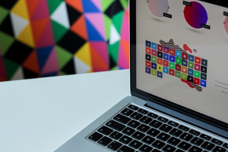
We all know the Photoshop tool, so much so that we call Photoshop retouching any photo editing. However there are many other photo software, but in this article, we are just highlighting the top 8 best photo editing software which you can use to edit your images without downloading the program. You can edit the image you want from any computer, and you will only need an Internet connection. But the best of all is that some are so simple that without any knowledge you can use them because they are very intuitive. How about? Has the bug bit you? Well, keep reading! So, let’s discuss more.

Eight Best Online Photo Editing Software:

 1. PicMonkey:

PicMonkey

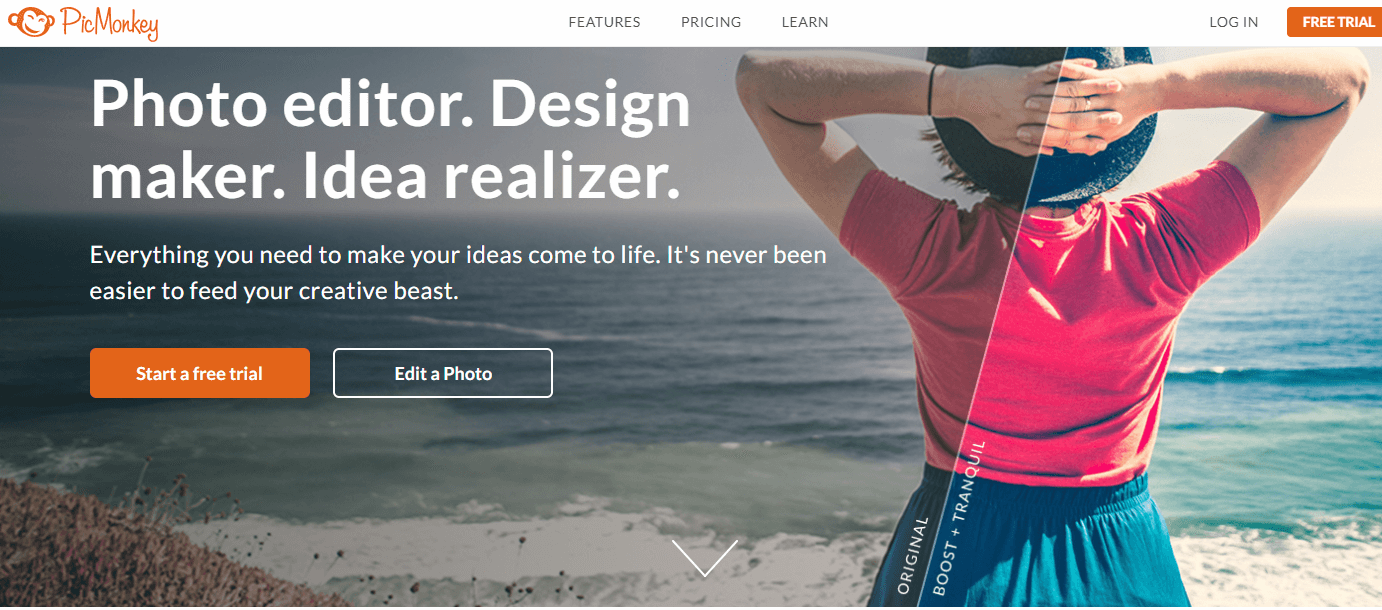
I start with this one because it is the one I use the most, it will surely not be the best, but it is effortless to use, and if you do not know Photoshop or other similar programs, it will be beneficial. With it, you can also create collage, design cards or make up the face of a photograph. Some of their tools are paid, but you can do thousands of things without having to pay a penny.

2. Adobe Photoshop Express:

Adobe Photoshop Express

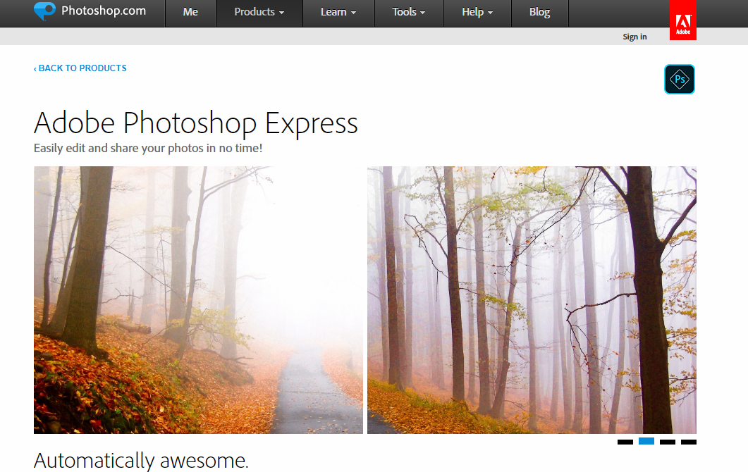
Very similar to the original program allows working by layers, select elements. It requires more knowledge and practice, but everything is to put and learn. Besides, some necessary actions you can perform without problems.

3. Skylumluminar:

Skylumluminar

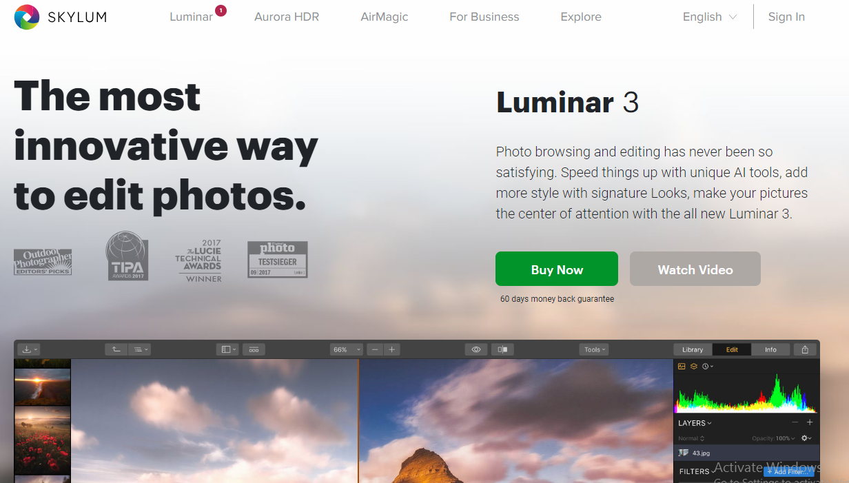
Skylumluminar is the more professional photo software that offers many editing features. Its artificial intelligence feature differentiates it from any other photo software. Skylumluminar’s beautiful Interface offers a sleek canvas to enjoy and enhance your photography without additional distraction. It is a one-stop-shop for photo editing that can be used by itself or as a plugin in with other photo software too.

4. Pixlr

Pixlr

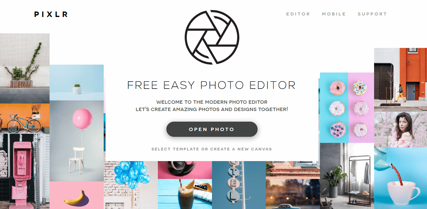
It is a complete editor with three variants:

  • Pixlr Editor: With an interface so similar to Photoshop Express that it seems that you are in it. It is complete and more professional, with a lot of tools and filters. You can also use keyboard shortcuts and even the right button. It happens to you like Photoshop, and it requires a bit more learning for more advanced editions.
  • Pixlr Express: More basic and at the same time more intuitive, it is above all for quick touch-ups. It allows us to open photos from the PC, a URL or even from Webcam. You can also make collages with this program.
  • Pixlr O-Matic: Much more comfortable to use, ideal for automatic retouching. A quick way to apply frames, filters, and effects. Of course, you will not find anything else, and you will not be able to select where to add them since they apply to the whole photograph.

5. Fotor:

Fotor

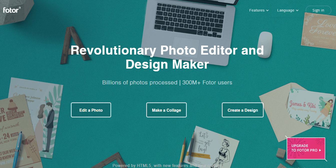
A very careful interface consists of five complete sections that will serve to edit, make collages, covers for your social networks, greeting cards and even “makeup.” As the last option offers to merge an HDR image by uploading three photographs with different exposures. Read for more information in Fotor Review.

The handling is very intuitive, you can add texts, and it offers a massive amount of creative filters, frames and clip art. And when you finish, you can share your image directly on social networks.

6. Phixr:

Phixr

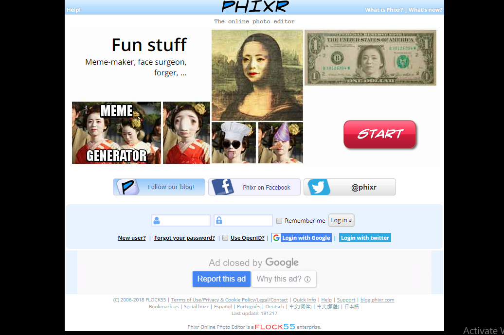
The editor is quite complete, allows to focus, blur, adjust exposure levels and color, reduce noise and many other options as well as filters and effects. I find it somewhat uncomfortable to work, but the worst is that the photo takes a long time to load at the beginning and can despair a little.

7. Pho.to Editor:

Pho.to Editor

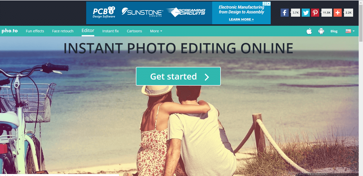
It happens the same as the previous one. It takes to load the image, although not so much. The options are minimal because the settings such as saturation, temperature, and filter application are automatic, so you cannot choose the intensity or graduated. It is simple to use and also allows you to share the result directly on social networks.

8. Befunky:

Befunky

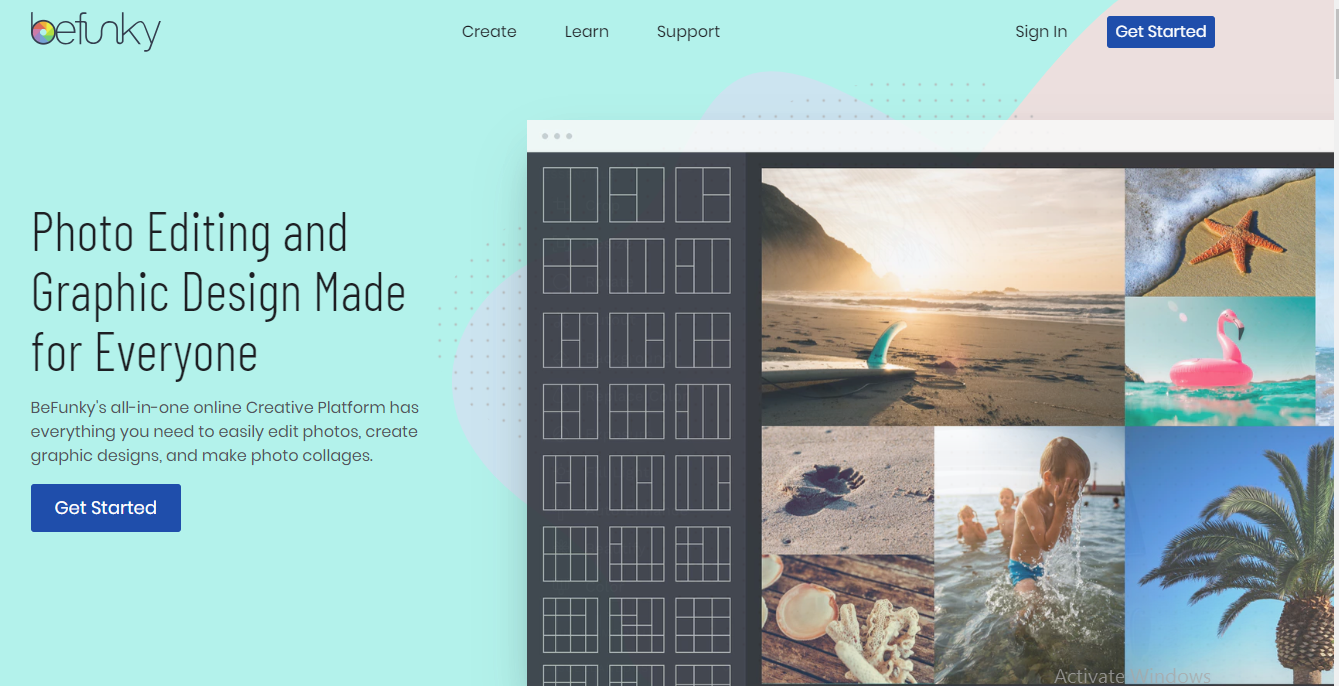
To edit and create collages. You can upload your photo from your computer, webcam or some social networks. The highlight is the number of filters, textures, and effects it offers, in addition to the frames. You can include your image in a lot of ways and even letters. It is effortless to use, and the changes are applied to the whole picture although you can choose the intensity or the size of the brush and they are displayed at the same time.

Read Also:

Content Rally wrapped around an online publication where you can publish your own intellectuals. It is a publishing platform designed to make great stories by content creators. This is your era, your place to be online. So come forward share your views, thoughts and ideas via Content Rally.

View all posts

Leave a Reply

Your email address will not be published. Required fields are marked *

Related

What Report Shows Which Web Pages Get The Most Traffic And Highest Engagement

Top Pages Report: Web Pages With Most Traffic and Engagement

What report shows which web pages get the most traffic and highest engagement? Google Analytics is the treasure trove of information, and with the help of this, marketers analyze the performance of their website from time to time.  In this article, I will explain in detail how Google Analytics Page Reports helps you access the performance of your content and the actions visitors take on your site.  What Report Shows Which Web Pages Get The Most Traffic And Highest Engagement? The answer to your question What report shows which web pages get the most traffic and highest engagement? is All Pages Report.  This ‘Pages Report’ displays the top pages on your website based on traffic, page value, % exit, bounce rate, entrances, average time on page, unique page views, and each page’s page views. At the same time, this report is going to help you to find quick and low-performing or low-quality pages that should be upgraded to enhance your content marketing strategies in the long run.  Now, you need to understand that there is some difference between landing pages and all pages in Google Analytics. All Pages Report will show you the entire performance of your website, whereas landing pages will show you how people entered your website.  How Can Pages Report Help You To Optimize Your Content? Pages Report will help you to quickly view the top content along with the average amount of revenue each page makes. In addition, this report helps you determine what content performs best on your website. At the same time, you will be able to view the top content section via this report. Keep in mind that this report will help you know where visitors are interacting with the events. This way, you will be able to determine both low quality and top pages on your website. The low-quality or outdated pages can be improved with dates, images, videos, or even you can add the latest infographic to make the content more useful for the audience. Thus, this way, Pages Report can help you to optimize your content to a great extent. Sample Site Content Report In Google Analytics The site content reporting sections contribute unique content-focused views revealing how users can interact with your site content.  1. Exit Pages Report:  Report that highlights data related to where users leave your site form. This report is useful in calling the attention pages which should be given the most priority to drive traffic to your website. On the other hand, it’s excellent that some pages should be left often that include high traffic pages, goal confirmation pages, order confirmation pages, etc.  2. Landing Pages Report:  This report focused on examining landing page metrics and behavior. It analyzes pages from the view of how often your visitors are landing on your website and what their duration is.  Moreover, landing pages are great for distinguishing which pages have the highest and lowest bounce rates. You can also identify conversions from this report.  3. All Pages Report:  Report that provides behavioral stats on every single page of your site. This includes page value, exit, entrances, time on page, page views, etc. All Pages Report is one of the most important portions of Google Analytics that helps to improve the performance reports of your website.  The Final Thoughts  All Pages Reports is the answer to your question what report shows which web pages get the most traffic and highest engagement. I have tried my best to explain to you in detail about Google Analytics Page Report and its uses for your website. Besides, if you come across any doubts, please don’t hesitate to mention them in the comment section below! More Resources: Make Your Business Popular Online What Are The Three Components In The Youtube Ecosystem? How To SEO Optimize Wordpress Category And Tag Pages

READ MOREDetails
Custom Banner

How To Design Your Custom Banner That Works

Whether you want to attract new customers or promote an event, a custom banner can be a powerful way to drive your message. But how do you design one that works? The first step is to consider your marketing goal. Once you know what you're trying to achieve, all of your other decisions will fall into place. Here Are Four Prime Steps To Design Your Custom Banner: 1. Colors When designing a custom banner, you want to be sure to choose colors that will help grab your audience's attention. The wrong colors can make your banner look dull, while too many can take away from your message. When it comes to choosing the right colors for your banner, the best approach is to use bright hues that stand out against a neutral background. These can be anything from radiant yellow to fiery red. A contrasting color like this makes your sign more eye-catching and helps potential customers identify it from a distance. It also helps create a visual hierarchy to help your audience better understand what you're advertising. For example, a fast food chain might use a combination of yellow and red for advertising its products because it's easy for people to recognize and remember. It's also a great contrast to the black background of their logo. You should also consider the type of font you'll be using for your custom banner printing. If your banner is intended for a small business, for example, it might be best to stick with plain text that's easy to read from a distance. If your banner is intended for an event, a more detailed font might be a good choice. However, if you're designing a one-time-use banner, it's best to avoid putting too much information on it. This is because people don't have time to read a lot of information at once, so it's important to keep it brief. Generally, you'll want to have a big font for your primary message and smaller text for any additional information, such as a description of an event or a contact number. The next thing you should keep in mind when choosing colors for your custom banner is how far the colors will be from each other. The farther the colors are from each other, the more likely they'll be to confuse people or distract from your main message. For this reason, it's important to choose a background color that compliments your business theme and a font that's easy to read. A quality online banner printing company can provide you with advice and recommendations for the perfect colors and designs for your business. 2. Typefaces Custom banners are one of the most effective advertising mediums for reaching new customers. But it’s important to design them right. This means choosing the best typefaces and keeping them simple enough to be read quickly by people driving by or walking by your store. The most important thing to remember when designing your custom banner is to choose a font that’s easy to read. There are many different font types to choose from, and selecting the right one can make or break your design. There are five main types of typefaces: Serif, Sans-Serif, Script, Condensed, and Italic. Each has a unique personality and can be used for different purposes. Serif typefaces typically feature slight decorative strokes at the ends of letters, which give them a traditional appearance. They’re popular for brands and products that want to create a sophisticated, classy, and trustworthy image. Another important consideration is the typeface’s weight. Font weights range from thin (also called hairline or light) to black, with a lot of different options in between. Using too thick or too thin fonts can make it difficult for people to read your message, and can even confuse them. Using too light or too dark can also have the same effect, so it’s crucial to know which option is most suitable for your needs. The best fonts for a custom banner are those that are easily readable in all sizes. For example, Verdana is a widely used typeface that’s easy to read on smaller devices. Sans-Serif typefaces are generally preferred for large banner signs that will be seen outdoors. These fonts are usually bold, but they can also come in regular and italic styles. They’re often used for titles and call-to-actions, but they can be a bit on the thin side when it comes to body text. If you’re planning on adding a lot of copy to your custom banner, it may be best to use a font like Quattrocento Sans. If you’re looking for a banner that mimics the look of typewriter letters, Veteran Typewriter is a good choice. This font is easy to read and emulates the typewriter letters that are commonly found in magazines. 3. Backgrounds If you want to make sure your banner is eye-catching, the background is a key component. You can choose from a range of options, including illustrations, color overlays, and custom backgrounds. When choosing a background, keep in mind that the size of the image will affect how it looks when printed on your banner. The best type to use is a vector file since these files can be scaled without losing image quality. It's also a good idea to save your design as a flattened file in Photoshop or Illustrator before sending it to a printing company. Another important consideration is glare. If the background of your banner is too bright or dark, it can cause your logos to appear distorted. You can avoid this by using an off-white color for your background, which will absorb light and minimize glare. It's also a good idea to choose a background that complements the main text and logos on your banner. This will ensure that your brand's colors stand out from the rest of the background, and your logos will pop. A background can also help convey a specific message, such as a call to action. For instance, if your business is based at an unremarkable location, a colorful banner could help you draw attention to your building and services. The right banner will communicate your message quickly and clearly. Whether you're promoting a new event or announcing a product launch, it's important to make your banner easy to read from a distance. This means avoiding fonts that are too chunky and contrasting colors and sizes. To design your custom banner, start by selecting a template from Canva's collection. Once you've done this, you can add images and other elements to your design. Before you start adding your elements, take some time to think about your message and what action you want people to take after they see your banner. This will guide the rest of your design and ensure that your message is clear and impactful. You can use Canva's free templates to get started on your design, or you can create a more professional look with a paid account. The site has thousands of images, so you'll be able to find the perfect one for your banner. You can even search for specific graphics if you'd like to incorporate a specific piece of artwork into your design. 4. Images If you're designing a custom banner for your business, it's important to use images that will grab the attention of viewers. The right images will help your message get across, entice people to visit your site and encourage them to take action. When designing a banner, you can either use a pre-made template or create your own from scratch. There are several factors that go into designing a banner, including color, text size and placement, and image quality. One of the best ways to make your banner stand out is to use contrasting colors. For example, a white background with red or yellow text will draw the eye. This will also make your message pop out in a crowd of competitors' ads. You can also add photos to your banner from the Web by using an online image editor. Kapwing, for example, is a collaborative image and video editing platform that allows you to use copyright-free content from huge image libraries like Unsplash and Pexels. Once you've selected the photo you want to use for your custom banner, resize it to fit your dimensions. You can do this by using the "Resize" button on the toolbar or by manually inputting the appropriate picture sizes. After you've resized the image, it's time to decide on a background color. You can choose a color that fits your brand's colors or another neutral shade that complements your design. You can change the color of your background in several places, including the Banner Styling menu and in your template's guide. When deciding on a background color, be sure to consider the opacity of your banner's text and graphics. A light background will make your text and graphics harder to read and will be less noticeable, while a dark background can help the elements of your banner stand out from the rest of the page. Once you've finished selecting your background color, it's time to add text to your banner. You can add text with the Text tool (the big letter "T" in the toolbar), or by clicking on the banner to access its text editing bar. This way, you can add any text to your custom banner and modify its size, fonts, and colors. Read Also: How To Make Sure You Get The Best Service From Your IT Supplier 5 Content Ideas to Use with Instagram Influencers 5 Benefits of Digitalization in Marketing

READ MOREDetails
slider-img

Patient Portal Development Company Addresses Technology

Healthcare industries are focusing more on technology and better patient engagement to fuel the population health. But for the patient portal development company, it is necessary to address the technical shortcomings as well that limits interoperability for healthcare systems. Once all technical and political barriers will be considered well then it would easy to make better healthcare decisions effectively. Till now, healthcare systems are more rhetoric than real but making them result-oriented is still a challenge. The healthcare industries usually try to make patients more engaged and empowered otherwise any patient portal will not work at all. Patient engagement will struggle with certain political and technical barriers as information access may be challenging for consumers. Some of the main barriers in healthcare technology adoption are interoperability, data access, non-incentive payment options, etc. Here, this is the responsibility of the patient portal development company to address the technology shortcoming for better interoperable healthcare systems. There is not only a single place where you can download health records so you have to be cautious when working with external data sources. But the problem is people always want easy solutions that can be availed with a single click only. TO make data access that much easy, it is easy to work on big data analytics for better record management and organization. To bridge the gap between healthcare industries and patients, patient portal development company has developed better consumer-driven systems that completely focus on customer requirements. Further, it is necessary to aware people about the benefits of better patient engagement to improve the overall quality of care and healthcare services. According to the latest research and study, better consumer engagement improves health outcomes and reduces overall costs too. Experts have also defined strategies to address various technical barriers in most effective without putting many efforts and cost investments. Read More: Best Therapies To Cure Pain And Discomfort Using Digital Signage To Improve Your Business Top 6 U.S. Universities That Offer Health Science Course

READ MOREDetails