Common Printing Problem and It’s Solution

by

01 October 2019

Dev & Design

printing problem

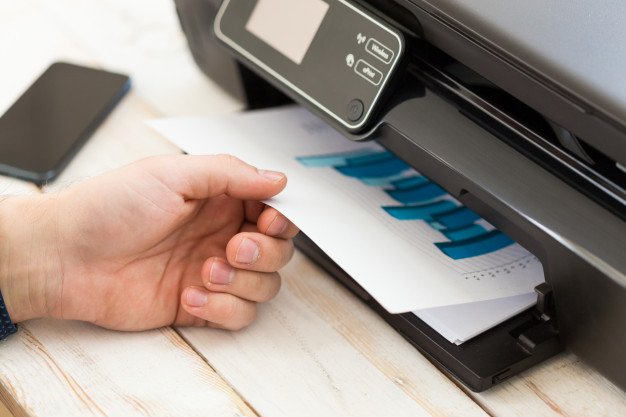
Printing in the office can be a headache for IT professionals. Problems such as server errors and employee access issues would arise. And more often than not, it leads to the IT professionals devoting more time to fix the problem, which then drives the company to incur more expenses.

Employees would sometimes forget the password to the printers around the office, making them rely on one printer only, which makes it a very inefficient process, hindering productivity at work.

In other cases, people in the office would forget to refill the paper and ink cartridges. It then leads to more wasted time trying to source paper and ink around the office or looking for a functional printer.

How Do We Fix This?

The solution to this fiasco is installing a Print Server for the office that the entire company can benefit from. It creates an optimal workplace with no speed bumps, such as printing problems, to hinder workplace productivity.

Instead of having to constantly remember different passwords and fumbling around with individual printers, have it all consolidated on a server that can manage all devices connected to it, ensuring a hassle-free printing experience. Take the first step to peak productivity by learning more about the print server.

Printing in the office is more accessible by installing a Print Server with its easy user interface. It reduces employee confusion which in turn can make them focus more on their work. By installing a print server, you can strategize and make more plans for your business instead of worrying about how to get different computers to print from different printers.

Print servers also analyze how different printers around the office use much paper and ink. It can reduce costs for the company by giving data on how much ink and paper are needed for each printer, promoting peak efficiency.

A Print Server can also perform common tasks which means that employees can focus on other things, such as achieving corporate goals, instead of being inefficient by focusing on the mundane.

What Makes RPM the Best Option for You?

Remote Print Manager is focused on peak productivity in the office and reducing expenses for the company. Unlike other print servers that simply register printers on computers, RPM will consolidate user information and generate insights that the organization can use for its benefit.

By monitoring the usage of printers across the office, RPM can help the company maintain printers making it ready for the employees to use.

RPM can also perform mundane digital or paper-based tasks so that employees can focus on bigger tasks. RPM also supports multiple data formats and can convert them into other file types. It provides a simple user interface that can get employees to accomplish their printing tasks swiftly.

RPM provides the print server technology you need to improve workplace efficiency. It redefines what print servers are meant to be by providing an all-round way to maximize productivity in the office by reducing printing issues and generating insights regarding usage to reduce company expenses.

Read Also:

Content Rally wrapped around an online publication where you can publish your own intellectuals. It is a publishing platform designed to make great stories by content creators. This is your era, your place to be online. So come forward share your views, thoughts and ideas via Content Rally.

View all posts

Leave a Reply

Your email address will not be published. Required fields are marked *

Related

Infographic

10 Best Infographic Examples In 2022

The academics Mrudula Joshi and Latika Gupta have defined infographics as, “pictorial representations of information intended to disseminate information quickly and clearly”. Additionally, they state that the quality of an infographic is determined by its content and its visual appeal. Infographics are a useful way of conveying information visually and can be used in a wide variety of applications. Businesses often use infographics to convey information to their employees, shareholders, and the general public. Infographics use the language of visual media to convey information in a manner that is unique and can transcend language. This allows infographics to be very accessible which helps businesses convey information efficiently and effectively. Checkout Ten Best Infographic Examples In 2022: This article will analyze 10 of the best examples of infographics in 2022 and discuss the effectiveness of the infographics' use of visual language to convey information. 1. Wyoming LLC Attorney: Everything Owned by Nestlé This infographic breaks down the considerable number of brands that are owned by the multinational giant Nestlé. Through its use of simple outlines, it separates the brands into their different industries which makes visually reading the information easier. This also conveys the message behind the infographic which is that Nestlé’s brands are overwhelming the market and are not competing with each other but with brands that Nestlé does not own. 2. World Resources Institute: The Carbon Budget This infographic explains the carbon budget and its implications for society. This is a complex topic and it is effectively handled through a well-designed pathway that guides the reader through the infographic. This pathway is constructed in two ways: firstly the line which runs throughout the infographic and secondly through the gradual lightening of the background color. 3. World Bank: Climate Extremes, Regional Impacts, and the Case for Resilience This infographic illustrates the increasingly prevalent effects of global warming on people and places in Africa and Asia. The infographic uses color in a particularly effective manner. The orange and yellow hues contrast pleasantly with the shade of blue. Color psychology informs us that blue as a color evokes emotions of trust and orange evokes emotions of friendliness. The infographic uses both colors to create a welcoming but informative tone. 4. Valentina D'Efilippo: Poppy Field Source: poppyfield.org This infographic uses the icon of the poppy to visually illustrate the number of deaths that have occurred during major conflicts since 1900. The size of the poppy represents the number of deaths that have occurred and the length of the stem represents the duration of the conflict. This is a visually striking infographic that creatively expresses statistics in a truly artistic manner. 5. Udacity: How to Pick Your First Programming Language Based on the Life You Want This infographic breaks down the programming job market by programming languages as well as gives beginner programmers a better understanding of the application of different programming languages. The infographic uses a pleasant yellow background and subtle pops of color to distinguish between the different programming languages. This allows the reader to immediately know which language is being discussed without needing to check each time. Additionally, the infographic uses creative graphs which are both informative and aesthetically pleasing. 6. Arnav Sameer: The Six Principles of Design This infographic dissects the six principles of design and the individual components which make up these principles. The infographic utilizes the elements of design that it discusses to enhance its visual appeal. This is satisfyingly coherent and it drives home the message of the infographic. Additionally, the use of color is very limited but this only serves to enhance the aesthetic of the infographic. 7. Juan Martinez: History of Life Source: behance.net This infographic presents the history of planet earth and life as we know it. It includes the different time periods of the earth as well as the positions of the continents and how they have shifted over time. It uses a strong circular design to draw the reader's eye to the center of the infographic. Additionally, further information is presented in a clear way that relates back to the central image. 8. Venngage: Netflix Font Psychology Source: venngage-wordpress.s3.amazonaws.com This infographic analyzes the font that popular Netflix shows use for their titles. It breaks down the different categories of fonts and what these fonts say about the shows as well as their audiences. The infographic utilizes an almost black background to make its limited use of color particularly emphatic. This also functions as a means of placing a great deal of emphasis on the white text which reveals the font each show decided to use. 9. Dorothy: A History of Hip-Hop Source: wearedorothy.com This infographic charts the history of the hip-hop movement using the style of a blueprint. It emphasizes the artists which have had the most significant cultural impact on hip-hop and link these artists to other prominent figures of the hip-hop movement. The design of the infographic encourages exploration of its intricacies through a web of interconnecting lines and bold use of only two colors. 10. Rick Slusher: The Architecture of Inception Source: rickslusher.com This infographic condenses the complex plot of the film Inception into a digestible and visually striking piece of media. Each line represents a character and the warped layers of the central shape represent the layers of dreaming that the characters experience. This infographic proves that almost anything can be represented visually in a clear manner, even something as convoluted as the plot of Inception. Final Thoughts This list has compiled the best examples of infographics and illustrated how diverse and creative the medium of infographics is. Each infographic manages to condense a great deal of information into an easily digestible and visually appealing piece of media. The use of infographics is tremendously diverse and these infographics demonstrate the manner in which the medium can be used for any number of purposes. Read Also: Is Instagram Algorithm Easy To Beat? Latest Trends of Graphic Design in London

READ MOREDetails
bootstrap templates

Bootstrap Templates and Allied Tools to Make Your Web Presence Easy and Instant

It is no secret among online business marketers and website builders that the Bootstrap templates and themes could be their first option in terms of building a web presence. There are many reasons why people tend to use handy Bootstrap templates as: Primarily, most of the designers tend to use this as boilerplate. Bootstrap is out there with us for long, and people are so familiar with it. Many find it much riskier to switch to other options unknown to them. Bootstrap is time-tested, and it also found to be valid. It is a tool, which is time-tested and can also pave a strong foundation for websites. An endless collection of classic Bootstrap templates now helps you construct any type of website you want. It also has high flexibility and rich features, so irrespective of a regular blog or portfolio site, you can get it all here. The community around Bootstrap is so immense and extensive. This constantly expanding expert community will give you plenty of choices and unrelenting support for any issues. Most importantly, Bootstrap is a freemium product and also boasts of its high quality. You will come across countless free templates of Bootstrap, which won’t disappoint you at all. All these could act as a quick fix to your web development problems from time to time. In addition, they will also give you the apt solutions on which you can build safely. Some important things you need to know about Bootstrap 4 themes As we have already seen, Bootstrap is a very powerful but freemium CSS framework with an impressive selection of jQuery plugins, components, layouts, and UI/UX elements. The primary thing about Bootstrap is that it can be availed for free by the users. Now, the extreme popularity of Bootstrap has also urged web developers and designers from across the globe to land on this platform and uses it as a top choice in their projects. If you are also planning to use framework or workflow tools in your web projects, one should always make a note about the updated version of Bootstrap. The latest update is Bootstrap 4, which comes with a custom set of tools and features for the users to benefit from. The new version Bootstrap will certainly help the developers to create business websites flawlessly with ease. A few key things to remember while using Bootstrap You should know that there are different types of Bootstrap 4 themes and templates available out there, both official and third party. So, if you consider using one, always make sure that you do a thorough baseline analysis to identify the best theme for your purpose. In fact, with an abundance of choices, it will always be difficult for a customer to feel overwhelmed about the choice and get confused. This will be more so in case of the beginners who don't have an idea about how to make use of the best Bootstrap 4 template for their purpose. If you are among one of those amateurs who are confused about Bootstrap 4 templates, here we will discuss a few handy things which will help you out in making the right choice. When to consider using a Bootstrap template? The ones who are into website design or the developers who are applying the CSS, as well as a markup of Bootstrap, would have some basic default designs handy. Many don't want to customize Bootstrap, which also isn't ideal as it will make your site look similar to many others out there. So, the best move is to take any of the Bootstrap templates which are useful for you and then customize it to match your needs as well as to look unique. When it comes to choosing a default template, the design may not seem to be very appealing because the providers tend to make those pretty simple with some basic features embedded. So, to bring a professional look to the website, you should try to work further on it and customize it. For this, designers need to pay attention to the CSS framework to make the end product more stylish. There are many tools to help you customize the Bootstrap templates. Tools to customize Bootstrap themes It is so easy to create Bootstrap templates and themes, but it may be confusing if you don't use the right tools. In the case of beginners, it could be somewhat difficult until they get a good grip on it through practice. Adding to it, they also need to pay close attention to the fine details to set things right, which is time-consuming. Fortunately, many tools are there to help these novice Bootstrap web builders to create customized Bootstrap templates quickly and easily. Let's explore some such tools. Sublime Text This tool has a fair number of features to help web development. On using this tool, you can get quick access to many quick windows for the project code. Adding to it, you can also see the codes which you have written on the panel. Anvil The same group of developers had developed both Anil and Hammer, and you use both these tools independently. Anvil could work the best for the localhost servers, which could further let you preview the themes and choose the best for your purpose. Hammer As we said above, Hammer could be used in combination with Anvil or independently. It is a Mac-based development tool that comes with a handful of features to develop Bootstrap themes and static sites. With this tool, you can ensure that you make use of various HTML in the standard templates for further customization. Hammer could also be used to compile the languages like CoffeeScript, SASS, JavaScript, Markdown into CSS, and HTML, etc. SASS If you are planning to create a template of design a full-fledged website, then you may know that the Bootstrap 4 framework is built primarily on the SASS (Syntactically Awesome Style Sheets). In simpler terms, SASS is a wonderful scripting language that could be interpreted to CSS. You should also note that SASS is a scripting language used in almost every case. There are many other tools too to be used for customization of Bootstrap as Grunt, Harp, Bootply, Brix.io, Bootstrap Starter Kit, etc. which could be handy for the developers and designers. All this help to pay attention to the crucial elements of Bootstrap customization and help you build the most relevant and user-friendly websites. Read Also: Adrian Rubin Tells How To Bootstrap Business In The Photography Niche Major Financial Problems That Can Affect A New Business

READ MOREDetails
mobile website

What Makes a Good Mobile Website

People are tethered to their phones even when they are not using it. When they are not doing anything, they remain close to their phones to hear any notification ringtone. More importantly, they use their phones to access websites, shop, watch YouTube, log on to Facebook or Instagram, or search on Google. By the end of 2019, the number of mobile Internet users would have grown to 4.68 billion. A mobile UX designer optimizes your website making use of the best practices for mobile users. If your website is not yet optimized, you need to do it right away. It’s projected that by 2021, 73% of all eCommerce activities will come from mobile users. Right now, China alone has 98% penetration rate in terms of mobile Internet. What Can a Mobile UX Designer Do for You? To answer that, you must first know what makes a good website. Google has attempted to answer this question by listing the following elements: Make the navigation easy for the user. Call to actions should take a prominent position The users can call customer service directly from the website Menus should be clear and concise Visitors tap the logo when they go back to the home page The local search box should be visible at first glance Add filters to narrow down the search, particularly for eCommerce sites In the same vein, the site should yield relevant results in response to site query Avoid site registration before users can explore your website Users can make a purchase even without registering to your site Quick sharing to social networks Quick links so they can email themselves and finish the task on other devices The website should be optimized for mobile, which means fonts are larger and the images are expandable What Can You Expect from a Mobile UX Designer? A mobile UX designer will make sure that people will have a positive user experience when they access your website through mobile devices. A good designer will: Conduct UX research to understand users’ needs and behaviors Cut out the clutter for easier navigation. The navigation should be intuitive Properly use colors, graphics, font, and negative space to highlight key content and promote activity Test your mobile website for optimum experience and functionality Make sure your website is stable for mobile use Insist on the consistency of themes and design across devices Ensure that important elements measure 18mm so they can be easy to tap Finally, the mobile UX designer should ensure that your website loads fast. According to Google, most mobile websites load at an average of 15 seconds. That won’t do. The same Google research warned that customers almost always leave when it takes more than 10 seconds for the mobile landing page to load. Even if the website loads for 1-3 seconds, the bounce rate will increase to 32%. The mobile app services of Sunlight Media include a dedicated mobile UX designer who will check and test the architecture and workflow of your app. They will work with you to achieve your goals and ensure the app will adhere to your style guide. Head to their website now or contact them at 323-868-3581. Read Also: Winning Tactics To Build A Competitive Service Delivery Website Top Utility Tools You Need For Your Website How To Design An Effective Company Website

READ MOREDetails