












Special Stock Motion Graphics Effects

Published on: 28 July 2023 Last Updated on: 07 February 2026
Motion Graphics

Video content is more popular than ever before. Netflix has popularised the idea of binge-watching our favorite TV shows while video-sharing social platforms like YouTube and TikTok have seen the format reach new heights.

While more people are watching videos today, we’re also seeing more people creating them. This is due to both the availability and accessibility of modern video editing platforms and the ease at which they can be uploaded online and shared with the world. If you want to start making your own videos, making use of motion graphics can be a fantastic way to stand out from the crowd.

Let’s take a look at some of the best special stock motion graphics effects and discuss how they can be used in your videos.

1. Lower thirds
 lower thirds of motion graphics

As the name suggests, lower thirds of motion graphics appear in the lower third section of your video. These play an important role; they can be used to convey key information without distracting the viewer from what’s happening in the center of the screen.

We see lower thirds of graphics all the time, often far more regularly than we realize. For example, when watching a news bulletin, the lower thirds of graphics are used for things like naming an on-screen speaker, summarising a current news story, or providing breaking updates from across the world. In the news, these lower-thirds graphics are referred to as chyrons.

If you’re an amateur video maker, chances are you’re not going to be tasked with editing news shows for terrestrial television. So, what else can lower thirds be used for?

On platforms like YouTube, growing a following of subscribers is important, and generating lots of comments and likes on your videos can help it perform better in search results and in recommended content. Lower thirds of graphics can be used as calls-to-action, encouraging viewers to subscribe to your channel, to like the video, or to comment and start a discussion among other viewers.

Lower-thirds graphics can also be useful if you’re making informative content like tutorials. They can be used to convey further information to your viewers and to deliver tips, tricks, and reminders, without obscuring the primary focus of the video itself.

2. Overlays

Motion graphics effects come in a huge variety of different styles, whether you’re looking for CapCut effects or Premiere Pro effects.

 One type of motion graphic effect you’re going to come across is the overlay effect. As the name suggests, overlay effects are placed over the main section of the screen, unlike lower-thirds effects which are localized to the bottom of the screen.

What are overlay effects used for? This is a broad question, there is such a range of overlay effects out there, and each can be utilized to serve a different purpose.

Text overlays are among the most common types. These place text directly in the center of the screen and can be used for transitioning between scenes or to deliver vital information to the viewer.

Overlay effects can also include things like graphs, charts, and infographics. These are particularly common in corporate videos and in marketing material, they can be used to clearly and concisely convey complicated information in an engaging and informative way.

Using an overlay effect can also be an artistic choice. They can filter footage to make it look more cinematic, with added depth and grain, or to change the color balance to suit the mood and atmosphere of your video.

3. CapCut
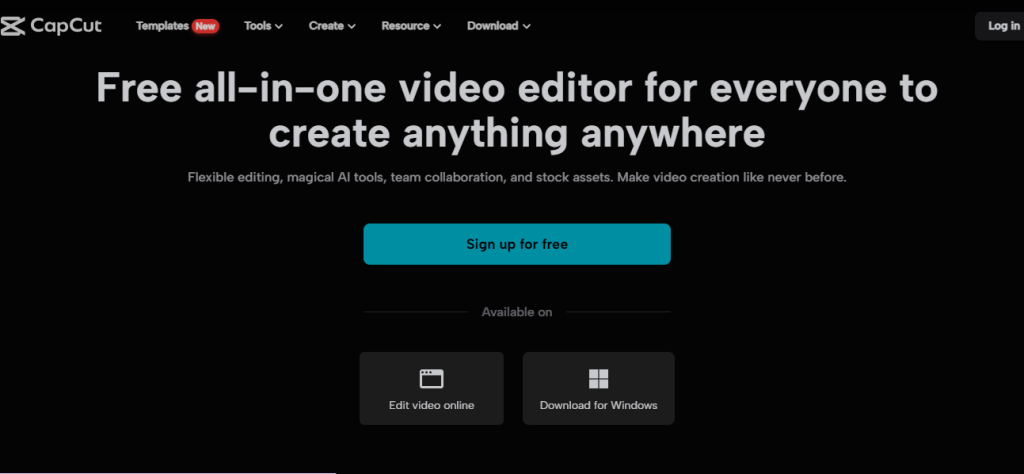
capcut

CapCut is a video editing app made by TikTok parent company ByteDance. With over 200 million monthly users, it’s one of the fastest-growing apps in the world and is taking full advantage of the booming video creator marketplace.

CapCut offers deep editing functionality, but the focus is on encouraging users to edit fun, engaging videos quickly and to share these across social media. One of the best ways to make your videos more engaging and to help them stand out in an increasingly oversaturated digital landscape is to use CapCut motion graphics.

These can come in the form of small, animated figures that dance and move around, giving your content a playful, casual feel that will make your viewers feel happy and comfortable.

CapCut motion graphics can also include things like arrows and pointers. These can be particularly useful for information tutorial videos, where certain elements might need to be highlighted to help viewers follow the tutorial correctly.

4. Slideshows

Slideshows are perhaps the most basic form of motion graphics, but they still have a place in today’s world.

Slideshows are simple sequences of images. They can be used to tell a story, convey a message, or simply show off some exciting, eye-catching images. Much of the creativity in slideshows comes from the transition effects used as one slide moves to the next. However, be careful not to overdo it with these transitions, as this can detract from the content of your slideshow.

Conclusion

Motion graphics are an incredibly important part of video editing. Use this guide to learn all about the different types and how they can be used in your videos.

Read Also:

Arnab is a professional blogger, having an enormous interest in writing blogs and other jones of calligraphies. In terms of his professional commitments, He carries out sharing sentient blogs.

View all posts

Leave a Reply

Your email address will not be published. Required fields are marked *

Related

SEO-friendly theme

How do you choose an SEO-friendly theme for your website?

When it comes to giving your website a very attractive look and functions, themes play a unique role. Website templates let you design your site one way, which can help you to gain all the important elements in one place. The theme you are picking has a large impact on how your customers will interact with you over your website. Well, beauty and functions are not everything that you should consider about a site's theme. You must have a look at its SEO aspects which will help your website to gain a better performance potential. Hence it is advisable to pick a theme that is SEO friendly from the very beginning. So what are the factors that you must consider while picking an SEO-friendly theme? Have a look. Speed potential: Speed is the first thing that you must have a look at while picking a theme. Google mostly prioritizes those themes which have better loading speed. In case your website loading speed is slow, then it can impact your website traffic. A theme that is heavier with plenty of elements can slow down your website. In turn, it will affect your overall site's performance and ranking. Thus, while choosing an SEO-friendly theme, you must check out its size. Go for an optimized theme with better load speed to improve your ranking performance. Get your services from SEO New York who is an expert in getting you the best kind of themes. Plugin Compatibility Plugin compatibility is one of the essential parts of any website. They add better functionality to your site and, at the same time, reduce your coding effort. Even though installing too many plugins can slow down your site, using a good theme can reduce that pain point. Before you select a theme, make sure it supports all the popular plugins. It is better to check all the documentation and features of the theme before you purchase. Compatibility over browsers The more your website becomes browser-friendly, the more it will get accepted by a large audience base. Hence you must consider whether the theme you have picked is browser friendly or not. Your website must be visible and attractive from every browser. In case a particular browser does not support the theme code of your website, then it might not load properly, which will make the design appear in a skewed form. Hence, it had to be cross-browser compatible. Mobile friendly It is needed not to say how compatible mobile devices are when it comes to offering a searching benefit on the move. Since billions of people rely upon mobile devices to browse important things, you must design your website to become suitable for it. It is better to go for a theme that is highly mobile responsive that will benefit your SEO. Responsiveness  Responsiveness is something that every user demands from a site that they are browsing. The responsiveness of a website is highly dependent on a theme. Apart from the desktops, the website must be able to get accessed from a varied range of devices. To offer a seamless experience to your customer, you must look at the responsiveness of a theme that will not at all hamper the performance of your website. Consider Reading: Small Business SEO Website Design Tips Clean code A website is made of plenty of codes. In case your codes are quite poorly written, then it can highly affect the security and speed. Also, it will affect your resources. Hence the same is also applicable for your WordPress themes. A good theme that you can choose must include a clean code that can make your website SEO highly secure and reliable. Also, it will offer less downtime. A theme with clean code will boost your page loading speed, and at the same time, it will boost up your SEO ranking. Customer-friendly navigation A theme must have a unique kind of navigation ease that can guide your visitors quite easily on your site. View all of your details on your template navigation so that you can give your users a unique experience. The proper amount of CTA buttons, quick hamburger menus, site map, etc., can give your site a unique look and great kind of performance. At the same time, it will help the site crawlers to understand your page better and index it faster. Conclusion It is always better to go with the themes which have a higher potential to offer you the ultimate of performance accuracy. Thus you should go for a theme that uniquely delivers all the above-mentioned features to leverage the SEO of your site. Read Also: Best SEO Practices Melbourne Businesses Should Follow SEO Agencies Are the Experts at Improving Your Website Content The Top SEO Tools for 2021

READ MOREDetails
Rago Fabrication Website

Seen the Rago Fabrication Website Guides & Videos?

I’ve got a 4Runner and I ordered an antenna mount for my new CB radio from the Rago Fabrication website. It took a couple of days to arrive and I was struck when I opened the packaging that the product itself was nice and robust and of high quality. I got to the weekend and I had a spare afternoon to try and install myself - as I wanted to save on the cost of having it professionally done. The problem is that I couldn’t quite work out how it bolted onto my Toyota, so I kinda thought “that was that” and that I should start calling around for a company to put it on for me. However, before I made that booking, I went back to the Rago Fabrication website to see if there was any help I could get. I was very pleasantly surprised. An Extensive Range of Install Guides & Videos: Most commercial websites out there will have some kind of FAQs section or an email address you can contact for post-sales support and whilst Rago’s site had one too, it also had much, much more. I don’t mind telling you that it blew my mind a little. I quickly found a video guide that detailed exactly how to fit my antenna mount in minute detail, so I was able to finish the fitting job myself and save quite a few dollars into the bargain. It wouldn’t be a stretch to say that the Rago Fabrication website over-delivered and then some! After I finished what I had to do for my vehicle, I went back again to see what else they had. I found video after video after guide after guide for customers to use for a wide range of products. It seemed that whatever product they sold, there was a way for those less technically minded to take care of their own installation. In fact, I found out that they have an entire YouTube channel dedicated to helping their customers. You can see it yourself by clicking this link. I Think Customer Service Really Matters: The quality of any merchandise you buy online is important - of course, it is. However, what also matters to people like me (and I think I speak for a lot of people) is great service. What these guides and videos have done for me as a customer is ensured that I go back again because I know I’ll be looked after. When a company takes this much care in providing these ‘how-to guides, it makes you realize that they’re going to be conscientious in lots of other areas too, like offering the best products. I Know Where I’m Going Next Time! I’m going to be upgrading and enhancing my 4Runner more over the next couple of years - as it’s a fun and enjoyable thing to do. What I know is that I’m going to be going back to the Rago Fabrication website again, as I now know what to expect - exactly what I need. Where you go is your prerogative, but if they don’t offer all of this great after-service, then I think you know where to go. Read Also: 7 Rules of Effective Ecommerce Web Design 5 Key Signs of Genuine Kundali Software Tips to Choose the Best Inventory Management Software Why Contract Management Software Is Essential for Your Tech Company

READ MOREDetails
Custom Banner

How To Design Your Custom Banner That Works

Whether you want to attract new customers or promote an event, a custom banner can be a powerful way to drive your message. But how do you design one that works? The first step is to consider your marketing goal. Once you know what you're trying to achieve, all of your other decisions will fall into place. Here Are Four Prime Steps To Design Your Custom Banner: 1. Colors When designing a custom banner, you want to be sure to choose colors that will help grab your audience's attention. The wrong colors can make your banner look dull, while too many can take away from your message. When it comes to choosing the right colors for your banner, the best approach is to use bright hues that stand out against a neutral background. These can be anything from radiant yellow to fiery red. A contrasting color like this makes your sign more eye-catching and helps potential customers identify it from a distance. It also helps create a visual hierarchy to help your audience better understand what you're advertising. For example, a fast food chain might use a combination of yellow and red for advertising its products because it's easy for people to recognize and remember. It's also a great contrast to the black background of their logo. You should also consider the type of font you'll be using for your custom banner printing. If your banner is intended for a small business, for example, it might be best to stick with plain text that's easy to read from a distance. If your banner is intended for an event, a more detailed font might be a good choice. However, if you're designing a one-time-use banner, it's best to avoid putting too much information on it. This is because people don't have time to read a lot of information at once, so it's important to keep it brief. Generally, you'll want to have a big font for your primary message and smaller text for any additional information, such as a description of an event or a contact number. The next thing you should keep in mind when choosing colors for your custom banner is how far the colors will be from each other. The farther the colors are from each other, the more likely they'll be to confuse people or distract from your main message. For this reason, it's important to choose a background color that compliments your business theme and a font that's easy to read. A quality online banner printing company can provide you with advice and recommendations for the perfect colors and designs for your business. 2. Typefaces Custom banners are one of the most effective advertising mediums for reaching new customers. But it’s important to design them right. This means choosing the best typefaces and keeping them simple enough to be read quickly by people driving by or walking by your store. The most important thing to remember when designing your custom banner is to choose a font that’s easy to read. There are many different font types to choose from, and selecting the right one can make or break your design. There are five main types of typefaces: Serif, Sans-Serif, Script, Condensed, and Italic. Each has a unique personality and can be used for different purposes. Serif typefaces typically feature slight decorative strokes at the ends of letters, which give them a traditional appearance. They’re popular for brands and products that want to create a sophisticated, classy, and trustworthy image. Another important consideration is the typeface’s weight. Font weights range from thin (also called hairline or light) to black, with a lot of different options in between. Using too thick or too thin fonts can make it difficult for people to read your message, and can even confuse them. Using too light or too dark can also have the same effect, so it’s crucial to know which option is most suitable for your needs. The best fonts for a custom banner are those that are easily readable in all sizes. For example, Verdana is a widely used typeface that’s easy to read on smaller devices. Sans-Serif typefaces are generally preferred for large banner signs that will be seen outdoors. These fonts are usually bold, but they can also come in regular and italic styles. They’re often used for titles and call-to-actions, but they can be a bit on the thin side when it comes to body text. If you’re planning on adding a lot of copy to your custom banner, it may be best to use a font like Quattrocento Sans. If you’re looking for a banner that mimics the look of typewriter letters, Veteran Typewriter is a good choice. This font is easy to read and emulates the typewriter letters that are commonly found in magazines. 3. Backgrounds If you want to make sure your banner is eye-catching, the background is a key component. You can choose from a range of options, including illustrations, color overlays, and custom backgrounds. When choosing a background, keep in mind that the size of the image will affect how it looks when printed on your banner. The best type to use is a vector file since these files can be scaled without losing image quality. It's also a good idea to save your design as a flattened file in Photoshop or Illustrator before sending it to a printing company. Another important consideration is glare. If the background of your banner is too bright or dark, it can cause your logos to appear distorted. You can avoid this by using an off-white color for your background, which will absorb light and minimize glare. It's also a good idea to choose a background that complements the main text and logos on your banner. This will ensure that your brand's colors stand out from the rest of the background, and your logos will pop. A background can also help convey a specific message, such as a call to action. For instance, if your business is based at an unremarkable location, a colorful banner could help you draw attention to your building and services. The right banner will communicate your message quickly and clearly. Whether you're promoting a new event or announcing a product launch, it's important to make your banner easy to read from a distance. This means avoiding fonts that are too chunky and contrasting colors and sizes. To design your custom banner, start by selecting a template from Canva's collection. Once you've done this, you can add images and other elements to your design. Before you start adding your elements, take some time to think about your message and what action you want people to take after they see your banner. This will guide the rest of your design and ensure that your message is clear and impactful. You can use Canva's free templates to get started on your design, or you can create a more professional look with a paid account. The site has thousands of images, so you'll be able to find the perfect one for your banner. You can even search for specific graphics if you'd like to incorporate a specific piece of artwork into your design. 4. Images If you're designing a custom banner for your business, it's important to use images that will grab the attention of viewers. The right images will help your message get across, entice people to visit your site and encourage them to take action. When designing a banner, you can either use a pre-made template or create your own from scratch. There are several factors that go into designing a banner, including color, text size and placement, and image quality. One of the best ways to make your banner stand out is to use contrasting colors. For example, a white background with red or yellow text will draw the eye. This will also make your message pop out in a crowd of competitors' ads. You can also add photos to your banner from the Web by using an online image editor. Kapwing, for example, is a collaborative image and video editing platform that allows you to use copyright-free content from huge image libraries like Unsplash and Pexels. Once you've selected the photo you want to use for your custom banner, resize it to fit your dimensions. You can do this by using the "Resize" button on the toolbar or by manually inputting the appropriate picture sizes. After you've resized the image, it's time to decide on a background color. You can choose a color that fits your brand's colors or another neutral shade that complements your design. You can change the color of your background in several places, including the Banner Styling menu and in your template's guide. When deciding on a background color, be sure to consider the opacity of your banner's text and graphics. A light background will make your text and graphics harder to read and will be less noticeable, while a dark background can help the elements of your banner stand out from the rest of the page. Once you've finished selecting your background color, it's time to add text to your banner. You can add text with the Text tool (the big letter "T" in the toolbar), or by clicking on the banner to access its text editing bar. This way, you can add any text to your custom banner and modify its size, fonts, and colors. Read Also: How To Make Sure You Get The Best Service From Your IT Supplier 5 Content Ideas to Use with Instagram Influencers 5 Benefits of Digitalization in Marketing

READ MOREDetails