Top 5 Graphic Design Trends for 2017

Published on: 25 November 2017 Last Updated on: 13 September 2024
Top 5 Graphic Design

The craze of graphic design has been on the trends for years, but that of 2017 is a great deal to talk about. When you talk of website designs, brandings, billboards, posters/fliers, and other varieties of graphic designs, 2017 trends are breaking the internet. There are lots of choices that are making the forefront which could be selected according to your desire.

We have made series of research through the page layout techniques, the typography, displays, color packaging to know the most suitable graphic designs that will suit your desire. Moreover, we are here to guide you through the trends that are on the top list, sit back relax and enjoy our top five list of this year’s award winning graphic design.

1. Launch Your Market with Cinemagraphs

The first on our top list is cinemagraphs; this simply portrays still photographs with a slight touch of movement in the same manner as a video clip. It is common in the form of GIFs in order to add more life to the photograph. With this design, the modern market is making use of this format to stand other competitors because it attracts the viewer’s attention instantly.

2. Minimalism Design At Is Best

The minimalism Design can be rooted back to the beginning of the 20th century; it became very popular as it focuses on the simple functionality for many brands and graphic designs. This year, the trend is increasing with a refined and elegant approach that creates a suitable balance that is appealing. Many brands and designs have adopted the use of minimalism as it is here to stay.

3. Apt Geometric Collages

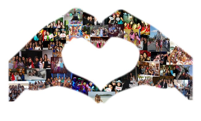
While we were younger, I could recall the number of hours we spent in creating collages. Yet, geometric collages are now rated as one of the award-winning graphic design in the year 2017. As the third on our list, it has emerged a lot of memorable images, magazines, movie posters, and most favorite cartoon characters. These designs involve the use of diversified elements into a single design which must be arranged in a geometric layout.

4. Modular Layouts for Text Management

Every viewer wants to hasten their communication with every design they come across, they tend to lose interest if the text is long and boring. In order to avoid such a scenario, modular layouts are here to organize your text in a clearly readable manner with simplicity.  As the popularity of this design is increasing, graphic designers are making use of it as the best platform to pass the message through text in short and precise manner.

5. Bold photography and sleek text

Basically, mixing bold photography and sleek text is the best captivation for most viewers in the world; be it ads and social media promotion, mobile devices, and brands such as Nike this design is key! This is because of its instant expression. This design simply interprets the visuals of your creativity to the world.

Read More:

Content Rally wrapped around an online publication where you can publish your own intellectuals. It is a publishing platform designed to make great stories by content creators. This is your era, your place to be online. So come forward share your views, thoughts and ideas via Content Rally.

View all posts

Leave a Reply

Your email address will not be published. Required fields are marked *

Related

Infographic

10 Best Infographic Examples In 2022

The academics Mrudula Joshi and Latika Gupta have defined infographics as, “pictorial representations of information intended to disseminate information quickly and clearly”. Additionally, they state that the quality of an infographic is determined by its content and its visual appeal. Infographics are a useful way of conveying information visually and can be used in a wide variety of applications. Businesses often use infographics to convey information to their employees, shareholders, and the general public. Infographics use the language of visual media to convey information in a manner that is unique and can transcend language. This allows infographics to be very accessible which helps businesses convey information efficiently and effectively. Checkout Ten Best Infographic Examples In 2022: This article will analyze 10 of the best examples of infographics in 2022 and discuss the effectiveness of the infographics' use of visual language to convey information. 1. Wyoming LLC Attorney: Everything Owned by Nestlé This infographic breaks down the considerable number of brands that are owned by the multinational giant Nestlé. Through its use of simple outlines, it separates the brands into their different industries which makes visually reading the information easier. This also conveys the message behind the infographic which is that Nestlé’s brands are overwhelming the market and are not competing with each other but with brands that Nestlé does not own. 2. World Resources Institute: The Carbon Budget Source: wri.org This infographic explains the carbon budget and its implications for society. This is a complex topic and it is effectively handled through a well-designed pathway that guides the reader through the infographic. This pathway is constructed in two ways: firstly the line which runs throughout the infographic and secondly through the gradual lightening of the background color. 3. World Bank: Climate Extremes, Regional Impacts, and the Case for Resilience This infographic illustrates the increasingly prevalent effects of global warming on people and places in Africa and Asia. The infographic uses color in a particularly effective manner. The orange and yellow hues contrast pleasantly with the shade of blue. Color psychology informs us that blue as a color evokes emotions of trust and orange evokes emotions of friendliness. The infographic uses both colors to create a welcoming but informative tone. Source: worldbank.org 4. Valentina D'Efilippo: Poppy Field Source: poppyfield.org This infographic uses the icon of the poppy to visually illustrate the number of deaths that have occurred during major conflicts since 1900. The size of the poppy represents the number of deaths that have occurred and the length of the stem represents the duration of the conflict. This is a visually striking infographic that creatively expresses statistics in a truly artistic manner. 5. Udacity: How to Pick Your First Programming Language Based on the Life You Want Source: udacity.com This infographic breaks down the programming job market by programming languages as well as gives beginner programmers a better understanding of the application of different programming languages. The infographic uses a pleasant yellow background and subtle pops of color to distinguish between the different programming languages. This allows the reader to immediately know which language is being discussed without needing to check each time. Additionally, the infographic uses creative graphs which are both informative and aesthetically pleasing. 6. Arnav Sameer: The Six Principles of Design This infographic dissects the six principles of design and the individual components which make up these principles. The infographic utilizes the elements of design that it discusses to enhance its visual appeal. This is satisfyingly coherent and it drives home the message of the infographic. Additionally, the use of color is very limited but this only serves to enhance the aesthetic of the infographic. Source: visual.ly 7. Juan Martinez: History of Life Source: behance.net This infographic presents the history of planet earth and life as we know it. It includes the different time periods of the earth as well as the positions of the continents and how they have shifted over time. It uses a strong circular design to draw the reader's eye to the center of the infographic. Additionally, further information is presented in a clear way that relates back to the central image. 8. Venngage: Netflix Font Psychology Source: venngage-wordpress.s3.amazonaws.com This infographic analyzes the font that popular Netflix shows use for their titles. It breaks down the different categories of fonts and what these fonts say about the shows as well as their audiences. The infographic utilizes an almost black background to make its limited use of color particularly emphatic. This also functions as a means of placing a great deal of emphasis on the white text which reveals the font each show decided to use. 9. Dorothy: A History of Hip-Hop Source: wearedorothy.com This infographic charts the history of the hip-hop movement using the style of a blueprint. It emphasizes the artists which have had the most significant cultural impact on hip-hop and link these artists to other prominent figures of the hip-hop movement. The design of the infographic encourages exploration of its intricacies through a web of interconnecting lines and bold use of only two colors. 10. Rick Slusher: The Architecture of Inception Source: rickslusher.com This infographic condenses the complex plot of the film Inception into a digestible and visually striking piece of media. Each line represents a character and the warped layers of the central shape represent the layers of dreaming that the characters experience. This infographic proves that almost anything can be represented visually in a clear manner, even something as convoluted as the plot of Inception. Final Thoughts This list has compiled the best examples of infographics and illustrated how diverse and creative the medium of infographics is. Each infographic manages to condense a great deal of information into an easily digestible and visually appealing piece of media. The use of infographics is tremendously diverse and these infographics demonstrate the manner in which the medium can be used for any number of purposes. Read Also: Is Instagram Algorithm Easy To Beat? 5 Benefits of Digitalization in Marketing Latest Trends of Graphic Design in London

READ MOREDetails
Personalized Inflatables

Crafting Personalized Inflatables: Aligning Designs With Your Unique Taste And Preferences

Do you want an inflatable in your own personal design? That's a great choice! Or maybe you want an inflatable sign for your business. Or maybe you're looking for something more fun, like a bounce house or an inflatable slide. Whatever you need, there is a wide variety of options to choose from. And if you can't find what you're looking for on the market, you can have it custom-made. How cool is that? Two of the most defining benefits of inflatables are their versatility and customizability. Versatility, because they can be used in a variety of settings, from indoor parties to large festivals. You can use them for party decoration, amusement park rides, advertising, and many more. And customizability, because they can be made to match your vision. If you have a specific need or preference, you can simply give your designs to an inflatable manufacturer and have it done in that exact image. You can choose the size, shape, color, and design of your inflatable. The ability to customize inflatables allows you to add a personal touch and create a unique design that is not available anywhere else. In this article, we will explore the idea of crafting inflatables that reflect your unique tastes and preferences, helping you to create designs that express your individuality. Let’s dive into it. Why Personalized Inflatables? The market is already saturated with generic inflatable designs. If you go online or visit inflatable stores, you will find almost the same designs everywhere. So if you want to stand out, you need to be different from the rest. And to be different, you need to be unique. Your custom inflatable design should not be ordinary, or else you will run the risk of looking like everyone else and having no special edge. Here are some more reasons to consider crafting personalized inflatables. Uniqueness Crafting your own personalized inflatable designs helps you to get a one-of-a-kind design that nobody else will have now - and in the future. This gives you a sense of exclusivity, as you know that your inflatable is unique and that no one else has the same one. Express Your Individuality It also allows you to express your own personal style and creativity, as you can choose the colors, patterns, and design elements that you want. As a result, your inflatables become an extension of your personality. This can be particularly valuable for businesses that want to advertise their brand identity to potential customers. For instance, if they want to appear as a fun brand, they can use certain blow up inflatables or replicas of their products to mesmerize potential customers and get them hooked on it. Memorability Something that stands out is sure to be remembered. People will remember the unique inflatable that caught their eye and was different from the others. So if you want to create an inflatable that truly leaves a lasting impression on people, you should definitely consider creating a personalized inflatable. How to Craft Personalized Inflatables The process of creating your own personalized inflatables begins when you have a clear idea of what you want. It may seem like a daunting task, but don't be discouraged; the inflatable manufacturer will handle most of the heavy lifting. With the right guidance and a touch of creativity, your unique inflatable vision can come to life. Here is a simple breakdown of the process. Choose the Right Type of Inflatable Consider your specific needs and goals when choosing an inflatable. What do you need it for? Will you be using it for a business exhibition? If so, you may want to consider a product replica, inflatable signage of your business logo, or regular inflatables designed with your brand elements. The Design Concept Think creatively about your inflatable design. What message do you want to communicate, or what theme do you want to explore? You could sketch it out on paper or simply describe your ideas to an inflatable manufacturer. They will have a designer create a visual representation of your concept. Material and Size Once you are happy with the design, you can move on to choosing the material for your inflatable. PVC and nylon are the most popular choices, but you should make your decision based on your needs. Both materials have different strengths and prices. Nylon is generally stronger than PVC. So if you need something that can withstand rough handling and the test of time, nylon may be a better choice. However, keep in mind that it is more expensive. The size is also important. You need the exact size of the inflatable that meets your needs, as this will help ensure that it fits properly and is not too small or too large. Measure the dimensions of the area where you want to put them. Complete Your Order Make payment. Then wait. It usually takes a while for your inflatable designs to be manufactured. Finally, when your inflatable is ready to go, make sure to inflate it properly according to the instructions provided. Then sit back, relax, and watch as your inflatable designs come to life! Just remember to take good care of your inflatable so that it lasts as long as possible. In Conclusion If you think the world is already too full of generic designs, then personalized inflatables are the way to go. With these custom creations, you can express your individuality and capture attention like never before - whether it's for personal celebrations, marketing campaigns, or special events. Trust me, they're sure to make an impact! Read Also: Where To Display Large Halloween Inflatables: Transform Your Front Yard, School Front, And More What Type Of Inflatables Should You Opt For At Your Business Event 6 Steps to make Your Trade Show a Success

READ MOREDetails
Exploring Strategies For Engagement And Conversion

Interactive Website Tools: Exploring Strategies For Engagement And Conversion

Beyond the aesthetics of modern web design lies a realm of functionalities designed to entice, intrigue, and encourage action. It's not just about displaying information anymore; it's about creating a dynamic dialogue between the site and its visitors. From clever countdown widgets that build anticipation to popups that capture attention at just the right moment, interactive tools are redefining the digital journey. As you embark on this exploration, you'll discover how these tools can be the key to not only attracting eyeballs but also driving tangible results. So, are you ready to unlock the next level of online engagement and conversion? Let's dive deeper. Interactive Tools For Websites: Why It Is Crucial In the vast universe of the Internet, websites often face the challenging task of standing out amidst a sea of competitors. It's no longer enough to simply be online; success hinges on how well a website can interact with its users. This is where interactive tools make a monumental difference. The Link Between Engagement And Conversion Every click, scroll, or hover on a website tells a story — a story of a user's journey from a curious visitor to a potential customer. Engagement is the first step in forging a connection. When visitors are actively interacting, they're investing their time and emotion into what the site has to offer. This active participation paves the way for conversions, whether it's signing up for a newsletter, making a purchase, or any other desired action. Simply put, higher engagement can often translate into higher conversion rates. Benefits Of Interactive Features For Visitors And Businesses For visitors, interactive features offer a personalized, immersive experience. Instead of passively consuming content, they're invited to participate, making their online journey more memorable and impactful. Whether it's a quiz that offers tailored product recommendations or a chatbot providing instant support, these features make the user feel valued and understood. For businesses, the advantages are manifold. Interactive tools can lead to increased dwell time, providing more opportunities for branding and message reinforcement. They offer valuable insights into user behavior, preferences, and pain points, allowing businesses to fine-tune their strategies. Pioneering Engagement Tools: A Closer Look Delving into the world of pioneering engagement tools reveals a medley of innovative strategies designed to enthrall users and drive conversions. Here's a closer look at some game-changing tools that have redefined the way we interact online. Countdown Widgets How They Work: At its core, countdown widgets for websites are digital timers, ticking away the seconds and minutes of a particular event or deadline. Be it heralding the launch of a new product, highlighting the end of a sale, or marking the start of a webinar, these widgets play on human psychology. The ticking clock creates a palpable sense of urgency and anticipation, compelling users to act before time runs out. To maximize the effectiveness of countdown widgets, it's crucial to employ them judiciously. Overuse can desensitize users to a sense of urgency. Moreover, always ensure that the event or deadline you're counting down to holds genuine value for the user. Pairing the widget with compelling visuals and concise, action-driven text can further amplify its impact. Popups [caption id="" align="alignnone" width="2400"] Popups[/caption] Different Types Of Popups: Popups are versatile tools that can serve various functions. Informational popups. These are designed to update users about essential website changes or privacy policies. They're typically concise and straightforward, ensuring users are informed without overwhelming them. Promotional popups. They are the digital equivalents of storefront sale signs. These might advertise a limited-time offer or discount. Feedback popups. They might ask for star ratings, brief comments, or even detailed reviews, helping businesses understand their strengths and areas of potential enhancement. Email subscription popups. These popups invite users to stay connected by subscribing to newsletters, updates, or exclusive offers. Exit-intent popups. Triggered when the system detects a user is about to close the tab or navigate away, exit-intent popups present a final, compelling offer or message. The key to popups is moderation. Bombarding users with incessant popup messages can swiftly turn intrigue into irritation. Timing is crucial. For instance, an exit-intent popup can be a last-ditch effort to retain their attention. Similarly, understanding the user's journey can help in strategically placing popups for maximum effectiveness without being intrusive. Interactive Surveys And Quizzes Surveys and quizzes engage users actively, making them feel part of a two-way conversation. When a user takes a quiz, they're not just absorbing information; they're sharing insights about their preferences and needs. This enables websites to tailor content and offers precisely to the user, enhancing relevancy and driving engagement. Beyond personalization, these interactive tools are goldmines of data. By analyzing responses, businesses can pinpoint audience segments, refine product offerings, and sharpen their marketing tactics. In essence, every user interaction becomes an opportunity for businesses to learn, adapt, and evolve. Live Chat Features Live chat serves as a digital concierge, connecting users with businesses in real time. No more waiting on hold or navigating through tedious email threads. With just a click, users can pose questions, raise concerns, or simply chat, fostering a sense of immediacy and personalized attention. Gamification Elements   Games aren't just for fun; they're powerful engagement drivers. By incorporating gamification elements like points, badges, or leaderboards, websites transform mundane tasks into exciting challenges. Whether it's completing a profile, sharing content, or making a purchase, gamification rewards users for their actions, making their digital journey feel more like an adventure than a chore. User Testimonials And Reviews Nothing vouches for a brand like the voice of its customers. User testimonials and reviews provide an unfiltered glimpse into real experiences, offering prospects both validation and reassurance. These authentic narratives, beaming with praise or constructively critical, solidify a brand's credibility, paving the way for trust and long-term loyalty. Avoiding Overwhelm: Less Can Be More In the intricate dance of digital engagement, it's not always about having more tools, but about wielding them wisely. While it might be tempting to incorporate every interactive feature available, bombarding users with too many stimuli can lead to cognitive overload. It's like walking into a room with blaring music, flashing lights, and a crowd vying for your attention all at once. The key is to curate and prioritize. A well-placed popup can be effective, but combine it with constant notifications, quizzes, and live chat prompts, and you risk alienating the user. Remember, the goal is to guide and engage, not to overwhelm. By being discerning in our choice of interactive elements, we can ensure that users not only stay but also enjoy their digital journey.

READ MOREDetails